
Insights & Tutorials
Blog
Power BI tutorials, tips, and best practices from the Flexa Intel team.
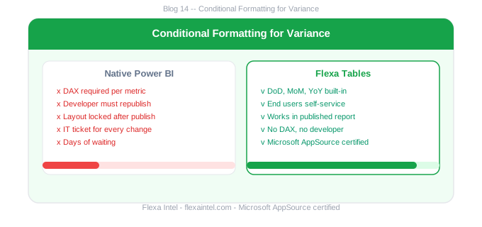
Power BI Conditional Formatting Variance Columns: Red Green
Apply red/green conditional formatting to Power BI variance columns, red for negative and green for positive, automatically and without custom DAX rules.
by AdminApril 1, 2026


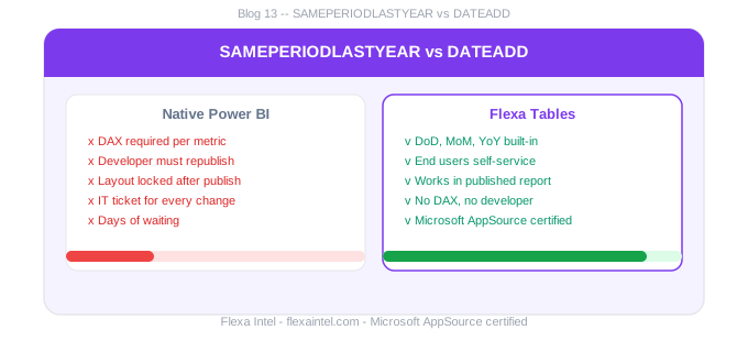
Power Bi SamePeriodLastyear vs DateAdd Differences Guide
SAMEPERIODLASTYEAR vs DATEADD in Power BI: how they differ, when to use each, their limitations, and when to skip DAX entirely for variance analysis.
by AdminApril 1, 2026
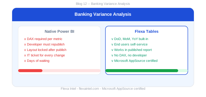
Power BI for Banking Reporting: Variance Analysis Finance Teams
Power BI banking reports with self-service variance analysis: MoM, YoY and budget variance across P&L, NII, NIM and cost-to-income, with no DAX needed.
by AdminApril 1, 2026
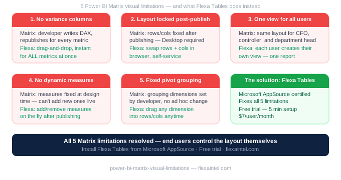
Power BI Matrix Visual Limitations Finance Teams
The Power BI Matrix visual has 5 limitations that frustrate finance teams every reporting cycle. Learn what it can't do natively and workarounds that work.
by AdminApril 1, 2026
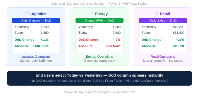
Power BI Day over Day (DoD) Analysis: Operations Teams
Add Day-over-Day (DoD) variance columns to published Power BI reports without DAX, built for operations, logistics and supply chain monitoring teams.
by AdminApril 1, 2026
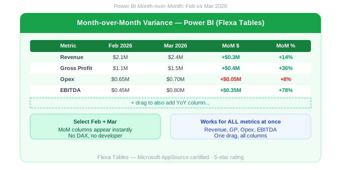
Power BI Month over Month Comparison Without DAX
Add Month-over-Month (MoM) variance columns to published Power BI reports in seconds, without DATEADD or PREVIOUSMONTH DAX measures. No code needed.
by AdminApril 1, 2026
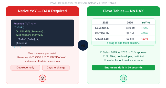
Power BI Year-over-Year (YoY) Comparison Without DAX
Skip SAMEPERIODLASTYEAR. Learn how finance teams add Year-over-Year (YoY) comparison columns to published Power BI reports without writing DAX measures.
by AdminMarch 31, 2026
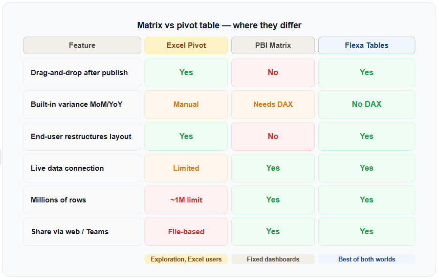
Excel Pivot Table in Power BI
Can you use an Excel-style pivot table in Power BI? The short answer is: not natively. Here's what works, what doesn't, and the best solution in 2026.
by AdminMarch 27, 2026
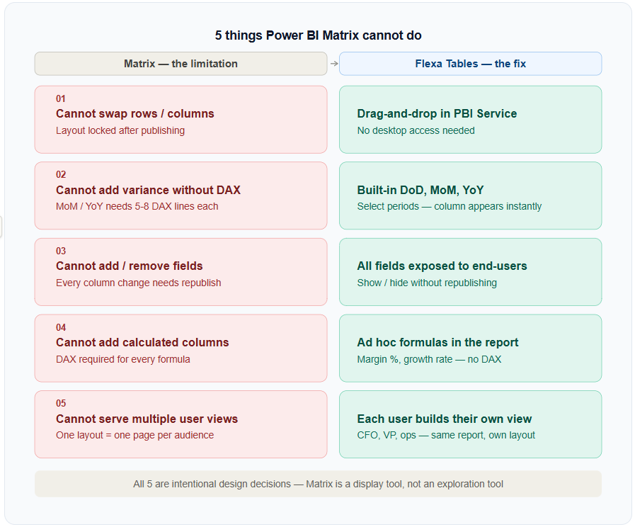
Power BI Matrix Limitations
The Power BI Matrix is a solid display visual, but it has 5 hard limitations that frustrate analysts. Here's what they are and how to work around them.
by AdminMarch 27, 2026
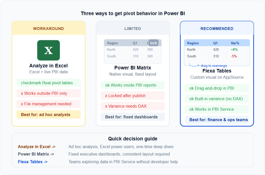
Power BI Matrix vs Pivot Table
Power BI Matrix and Excel pivot tables look similar but work completely differently. Here's the exact comparison — and what to do when Matrix falls short.
by AdminMarch 27, 2026
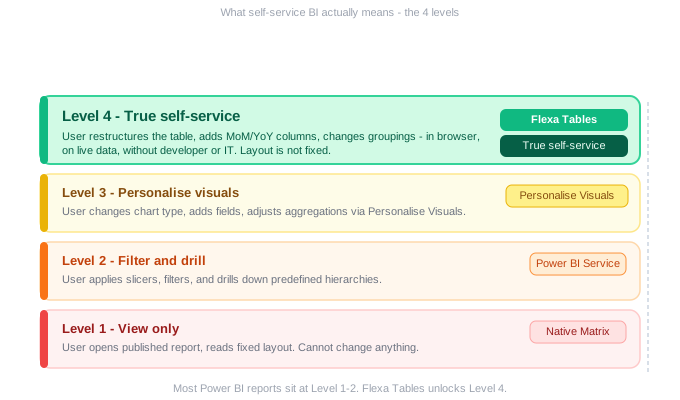
Power BI Self-Service Analytics: What It Actually Means for End Users (2026)
What Power BI self-service means for end users: the 4 levels of capability, where the Matrix visual falls short, and how to unlock real self-service.
by AdminMarch 24, 2026
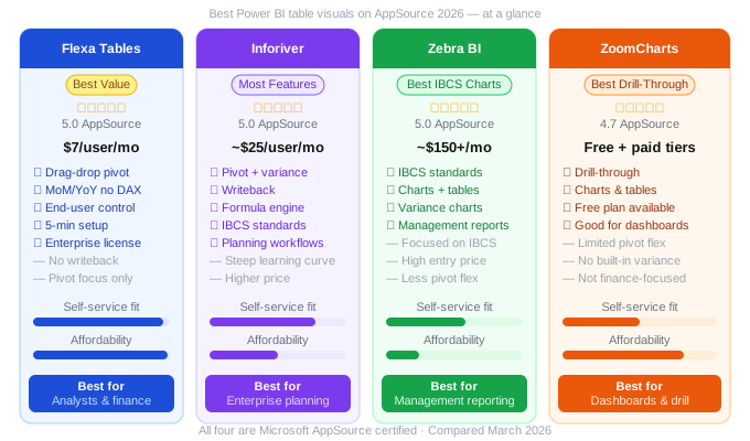
Best Power BI Table Visuals on AppSource in 2026 (Honest Comparison)
An honest comparison of the best Power BI table visuals on AppSource: Flexa Tables, Inforiver, Zebra BI and ZoomCharts on features, price and self-service.
by AdminMarch 24, 2026