Excel Pivot Table in Power BI
If you've come from Excel, the first thing you'll try to recreate in Power BI is the pivot table. You'll drop some fields into a Matrix visual, drag rows and columns — and it'll look right. Then you publish the report, and your end-users can't do anything with it. That's the moment the difference becomes clear.
What Power BI Matrix Can Do
The Matrix visual in Power BI is a genuinely powerful data display tool. It handles hierarchies, drill-down, conditional formatting, and large datasets well. Here's what it does correctly:
- Display data in rows, columns, and values as configured by the report developer
- Drill down and up along predefined hierarchies (Year to Quarter to Month)
- Expand and collapse row groups
- Apply slicers and filters to change what data is shown
- Show subtotals and grand totals
- Apply conditional formatting (background color, data bars)
For fixed executive dashboards where the structure is always the same, Matrix works well.
What Power BI Matrix Cannot Do
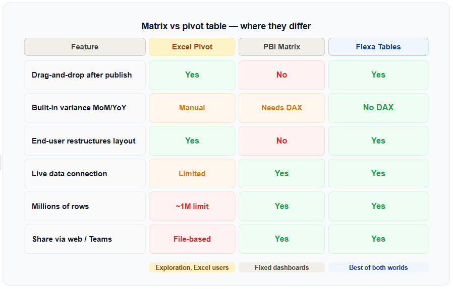
The core limitation: Once a Power BI report is published to Power BI Service, the Matrix layout is fixed. End-users cannot drag fields, swap rows and columns, or restructure the table without going back to Power BI Desktop.
Specifically, end-users in a published report cannot:
- Swap rows and columns — e.g., switch from "Region in rows, Year in columns" to the inverse
- Add or remove fields from the table on the fly
- Add variance columns (DoD, MoM, YoY) without pre-built DAX measures
- Create completely different views of the same data in one session
Every one of these changes requires a developer to go back to Power BI Desktop, make the change, and republish the report. This is the bottleneck that keeps finance and operations teams stuck in Excel.
What a Real Pivot Table Does
In Excel, a pivot table is an exploration tool. You drag fields into rows and columns, swap them around, add calculated fields, and restructure the entire view in seconds — without touching the underlying data. The key word is after the fact: the exploration happens after the data is set up, not during.
This is fundamentally different from how Power BI Matrix works. Matrix is a presentation tool. Pivot tables are exploration tools. Both have value, but they solve different problems.
When the Gap Becomes a Real Problem
The Matrix-vs-pivot-table distinction matters most in two scenarios:
1. Finance teams that need ad hoc variance
Finance Analysts and FP&A teams need to compare periods constantly: this month vs last month, this quarter vs the same quarter last year, actual vs budget. In Excel, they add a variance column in 30 seconds. In Power BI Matrix, a developer has to write and maintain a DAX measure for every single comparison. See how teams solve this in variance analysis in Power BI without DAX.
2. Executives and managers who need self-service
When an executive asks "can I see this broken down by region instead of by product?" — that's a pivot operation. In a Matrix report, the answer is "we'll update the report and republish." In a true pivot table, the executive does it themselves in 10 seconds. More on how end-users can restructure reports.
How to Close the Gap in Power BI
The solution is a custom visual that adds Excel-style pivot behavior inside Power BI. Flexa Tables is a Microsoft-certified visual on AppSource that brings drag-and-drop pivoting and built-in variance analysis to published Power BI reports.
The one-liner: Flexa Tables gives Power BI the pivot and comparison features that most users currently go to Excel to get — without exporting data or writing DAX.
The setup takes under 5 minutes: install from AppSource, add to your existing report canvas, configure initial fields, and publish. End-users in Power BI Service can then drag fields, add variance columns, and restructure the table themselves.
For a full walkthrough of how dynamic pivoting works in practice, see the complete guide to dynamic pivot tables in Power BI.
Try Flexa Tables Free on AppSource
Add a real pivot table to your Power BI report in under 5 minutes. No DAX, no exports, no credit card.
Get Free Trial on AppSource


