Power BI Matrix vs Pivot Table
You cannot use a native Excel pivot table inside Power BI. Power BI has a Matrix visual that looks similar, but it lacks post-publish drag-and-drop flexibility. For true Excel-style pivot behavior inside a published Power BI report, you need a custom visual like Flexa Tables.
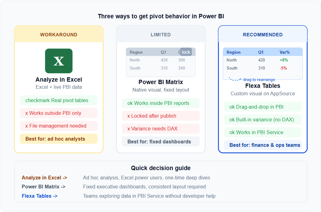
Three Ways to Get Pivot Table Behavior with Power BI
Depending on your workflow, there are three approaches — each with different tradeoffs.
Option 1: Analyze in Excel
Connect an Excel workbook to your Power BI dataset. You get real Excel pivot tables with live Power BI data — but users work in Excel, not in the Power BI report.
Option 2: Power BI Matrix
The native option. Works well for fixed display layouts, but the structure is locked after publishing. No drag-and-drop, no ad hoc variance for end-users.
Option 3: Flexa Tables (Custom Visual)
A Microsoft-certified custom visual on AppSource that brings drag-and-drop pivoting and built-in variance analysis inside published Power BI reports. End-users restructure the table in Power BI Service — no Excel, no developer needed.
Option 1: Analyze in Excel — When It Works
"Analyze in Excel" is a built-in Power BI feature that opens Excel with a live connection to your Power BI dataset. You can then build real Excel pivot tables — with full drag-and-drop, calculated fields, and all the familiar behavior.
When to use it
- Your users are comfortable in Excel and prefer working there
- You need highly complex pivot analysis that goes beyond standard reporting
- You're doing one-time ad hoc analysis, not regular reporting
When it breaks down
- Users need to analyze data inside the Power BI report — not in a separate Excel file
- You want to share a single report URL that works for everyone
- Your organization has governance rules that restrict Excel file sharing
Option 2: Power BI Matrix — What It Does and Doesn't Do
The Matrix visual in Power BI is the native equivalent of a pivot table. It handles drill-down hierarchies, conditional formatting, and subtotals well. But there's one limitation that matters for Excel users: the layout is fixed after publishing.
If you've built a Matrix with Region in rows and Year in columns, that's what every user sees. They cannot swap the axes, add a variance column, or restructure the view. For fixed executive dashboards, this is fine. For teams that need to explore data, it forces everyone back to Excel.
For a full breakdown of Matrix limitations, see 5 Things Power BI Matrix Cannot Do.
Option 3: Flexa Tables — Excel Pivot Behavior Inside Power BI
Flexa Tables is a Microsoft-certified custom visual that adds pivot table behavior to published Power BI reports. It's the closest thing to an Excel pivot table that works natively inside Power BI Service.
| Capability | Excel Pivot | Power BI Matrix | Flexa Tables |
|---|---|---|---|
| Drag rows/columns after publish | Yes | No | Yes |
| Built-in variance (MoM/YoY) | Manual | Needs DAX | Yes |
| Works in Power BI Service | No | Yes | Yes |
| Live data from Power BI model | Via connection | Yes | Yes |
| Share via Power BI URL | No | Yes | Yes |
| No file management needed | No | Yes | Yes |
Flexa Tables installs from Microsoft AppSource in under 5 minutes and works with your existing data model — no changes to DAX measures or data sources required. See the complete guide to dynamic pivot tables in Power BI for a step-by-step setup walkthrough.
Which Option Should You Choose?
Use "Analyze in Excel" if your users primarily work in Excel and need complex ad hoc analysis that goes beyond standard reporting. This is a good fit for data analysts doing deep financial modeling.
Use Power BI Matrix if you're building fixed executive dashboards where the layout never needs to change. Matrix is the right tool for governed, consistent display.
Use Flexa Tables if you want your end-users to be able to explore data, pivot views, and compare periods — all inside a published Power BI report without developer involvement. This is the right fit for finance and operations teams that currently run parallel Excel workbooks alongside their Power BI reports.
Frequently Asked Questions
Get Excel-Style Pivot Tables Inside Power BI
Flexa Tables is free to try on Microsoft AppSource. Setup takes under 5 minutes.
Get Free Trial on AppSource


