Power BI Matrix Limitations
If you've spent time building Power BI reports for finance or operations teams, you know the pattern. You publish a clean Matrix report, users start asking questions, and within a week someone is back in Excel doing the analysis they couldn't do in the report. Understanding why — specifically — is the first step to fixing it.
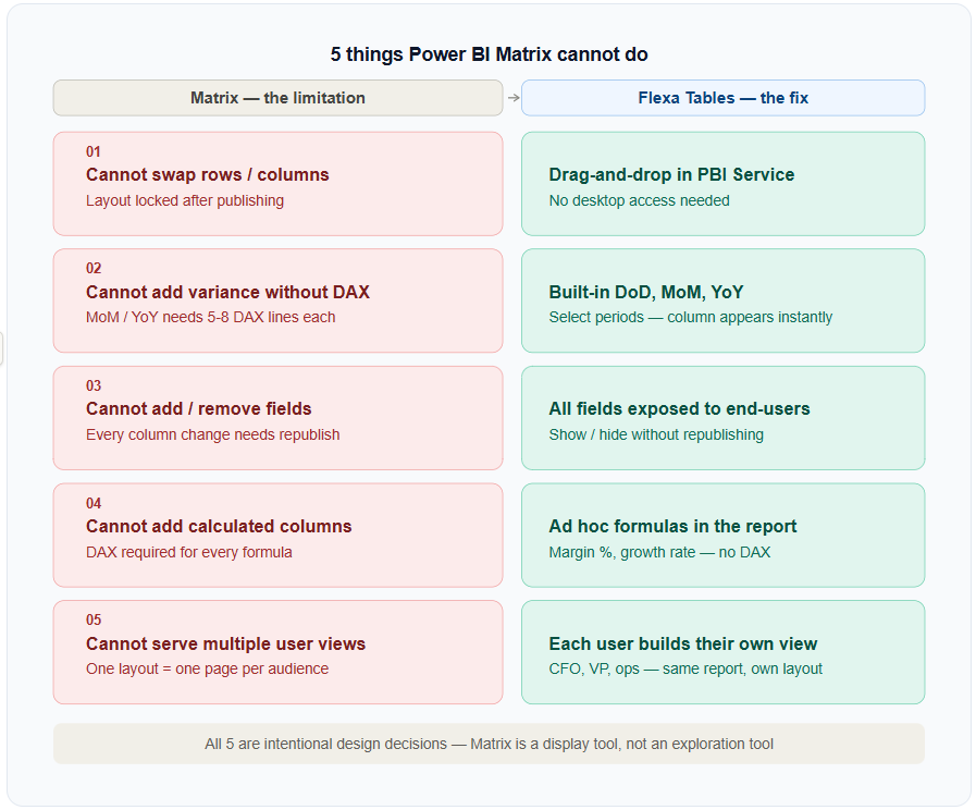
Cannot Swap Rows and Columns After Publishing
In Excel, a pivot table lets you drag "Region" from rows to columns in three seconds. In Power BI Matrix, this is a developer task. Once the report is published to Power BI Service, the layout is locked. End-users can filter, drill, and expand — but they cannot restructure the table.
This becomes a problem immediately when a finance manager says "can I see this with years across the top instead of products?" The answer in a Matrix report is: "we'll update it and republish." The answer in a real Power BI pivot table is: drag it yourself.
Use Flexa Tables. End-users can drag rows to columns and vice versa directly in the published report in Power BI Service — no developer required, no republishing needed.
Cannot Add Variance Columns Without DAX
Month-over-month comparison, year-over-year change, day-over-day delta — these are the most common requests in any financial or operational Power BI report. In Excel, you add a calculated column in 30 seconds. In Power BI Matrix, you need a developer to write and maintain DAX measures for every single comparison.
A typical MoM variance measure alone is 5–8 lines of DAX. For DoD, MoM, and YoY across Revenue, Margin, Units, and 3 other metrics — you're looking at 20+ measures to maintain. This is why finance teams still have Excel spreadsheets running alongside Power BI reports.
Flexa Tables has built-in DoD, MoM, and YoY variance. Select two time periods and the comparison column appears instantly — no DAX, no developer. See the full walkthrough in variance analysis in Power BI without DAX.
Cannot Add or Remove Fields on the Fly
In Power BI Matrix, the developer decides which fields appear in the table. End-users can use slicers to filter what's shown, but they cannot add a new dimension or remove one without the developer modifying the report in Power BI Desktop and republishing.
This creates a constant stream of "can you add [X] column to the report?" requests. Each change requires a developer to open the file, make the change, test, and republish — even if the column already exists in the data model.
Flexa Tables exposes all columns from your data source and lets end-users choose what to display. No republishing required. This also significantly reduces the number of report pages you need to maintain.
Cannot Create Calculated Columns Without DAX or Data Model Changes
Need to show margin percentage alongside revenue? Or a growth rate? In Matrix, any calculated value requires a pre-built DAX measure. Users cannot create ad hoc calculations inside the table — and adding measures requires either DAX expertise or going back to Power BI Desktop.
This is a significant blocker for Finance Analysts who are used to adding a quick formula column in Excel during analysis. The Power BI equivalent requires a full development cycle.
Flexa Tables allows end-users to add calculated columns on the fly — margin %, growth rate, ratios — directly inside the published report. No DAX, no data model changes, no developer required.
Cannot Let Different Users See Different Views of the Same Data
A CFO wants to see revenue by region. A regional VP wants to see revenue by product. An operations manager wants to see units by day. With Power BI Matrix, you either build three separate report pages (one per view) or accept that one layout has to serve everyone.
Separate pages mean more maintenance. One-size-fits-all layouts mean someone always has to export to Excel to get the view they actually need. This is why Excel persists in organizations that have invested heavily in Power BI.
Flexa Tables lets each user create their own view within the same published report. The CFO, the regional VP, and the operations manager all start from the same table and restructure it to their own needs. No separate pages, no exports.
The Pattern Across All Five Limitations
All five of these limitations have the same root cause: Power BI Matrix was designed as a developer-controlled display tool. The developer defines the layout, and end-users work within it. This is the right design for fixed executive dashboards. It's the wrong design for analytical workflows where users need to explore data.
The solution isn't to replace Power BI — it's to add a layer on top that enables exploration without breaking the underlying report structure. That's what a proper Power BI pivot table does.
Key insight: None of these are Power BI bugs. They're intentional design decisions. The Matrix is optimized for consistency and governance. If you need exploration, you need a different tool on top of it.
For a full guide to how dynamic pivoting works inside Power BI, including setup instructions, see Dynamic Pivot Tables in Power BI: The Complete Guide (2026).
Fix All Five Limitations With One Visual
Flexa Tables is available free on Microsoft AppSource. Setup takes under 5 minutes.
Get Free Trial on AppSource


