99% of the Time, These 6 Power BI Visuals Are All You Need for an Impactful Dashboard
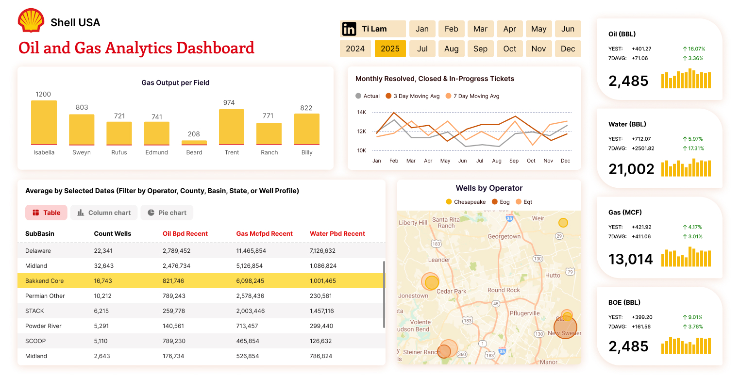
Hey there, Power BI enthusiasts! If you’ve ever spent hours crafting a dashboard only to wonder if it’s truly effective, you’re not alone. Building a dashboard that wows your business users doesn’t require a gallery of fancy visuals, it’s about using the right tools to tell your data’s story clearly. After working with reports like the Call Center dashboard (tracking answered/resolved calls and satisfaction ratings), I’ve found that 99% of the time, these 6 Power BI visuals are all you need to create an impactful dashboard. Let’s dive into them!
1. Card: Highlight Key Metrics
The Card visual is your go-to for showcasing critical numbers at a glance. Whether it’s total sales, the number of resolved calls in your Call Center report, or a satisfaction rating, Cards make key metrics pop. Keep them front and center, place them in the top-left corner following the Z-pattern (as I mentioned in my design secrets blog) to grab attention immediately.
Why It Works: Business users love quick insights without digging through charts.
2. Line Chart: Track Trends Over Time
Need to see how performance evolves? The Line Chart is perfect for visualizing trends, like monthly resolved tickets or sales growth over quarters. It’s simple yet powerful, letting you spot patterns or anomalies with ease.
Why It Works: Its clean design helps users focus on the story the data tells over time.
Do check out:Top 5 Third-Party Power BI Visuals You Gotta Check Out in 2025
3. Bar/Column Chart: Make Comparisons Easy
For comparing categories, say, tickets by agent or sales by region, the Bar or Column Chart is your best friend. Bars work great for horizontal comparisons, while columns shine for vertical stacks. Use them to highlight top performers in your Call Center report, like the Top 10 Agents list.
Why It Works: It’s universally understood, making it ideal for business users who need quick comparisons.
4. Donut Chart (Max 3-4 Categories): Show Part of a Whole
Want to display proportions, like the percentage of tickets resolved versus in progress? A Donut Chart does the trick, keep it to 3-4 categories max to avoid clutter. It’s a sleeker alternative to a pie chart and works well for metrics like satisfaction ratings by star level.
Why It Works: It’s visually appealing yet simple, as long as you limit the categories.
5. Table: Dive Into Details
When users need the nitty-gritty, say, a breakdown of ticket statuses or agent stats, a Table visual is essential. Enhance it with tools like Flexa Tables (which you’ve explored before) for custom pivoting and variance analysis, turning raw data into actionable insights.
New to Flexa Tables? Start here: Power BI Pivot Table: Add Excel-Style Pivoting Without DAX
Why It Works: It provides the detail-hungry business user with all the specifics they crave.
6. Slicers: Empower Filtering
Slicers let users filter data on their own, like narrowing your Call Center report by year or issue type. Place them strategically (e.g., on the left) to enhance interactivity without overwhelming the dashboard.
Why It Works: It puts control in the users’ hands, aligning with my tip from “6 Must-Know Tips for New Power BI Developers” to minimize bookmarks.
Why Stick to These Visuals?
Except for rare, specialized requirements, I stick to these universally recognized visuals. Why? Because business users, your audience, need clarity, not confusion. A fancy 3D Sankey chart might look cool, but if it leaves users scratching their heads, it’s a fail. Prioritize readability and simplicity over flashiness. These six visuals cover most use cases, from tracking trends (Line Chart) to comparing categories (Bar/Column Chart) to drilling into details (Table). They’re proven to work across industries, whether you’re analyzing sales, finance, or call center performance.
Take your Call Center report, for instance. A Card for total tickets, a Line Chart for monthly trends, a Bar Chart for agent comparisons, a Donut Chart for status breakdowns, a Table (enhanced with Flexa Tables) for detailed stats, and Slicers for filtering by year, all these create a dashboard that’s both impactful and easy to use.
Simple Is Best, Do You Agree?
Here’s my take: Don’t use a visual just because it looks trendy or has cool animations. If it doesn’t serve a clear purpose or enhance understanding, skip it. Simplicity ensures your dashboard communicates effectively, saving time for both you and your users. I’d love to hear your thoughts, do you agree that these six visuals are enough, or do you have a favorite outside this list?
For more Power BI tips, check out my other posts like “Top 5 Design Secrets for Power BI Reports” or “5 Ways to Pivot Data More Effectively in Power BI.” Thanks for reading, and happy dashboarding!


