Top 5 Design Secrets for Power BI Reports That’ll Wow Your Users
Hey there, Power BI enthusiasts! Creating a Power BI report isn’t just about crunching numbers, it’s about presenting those numbers in a way that’s clear, engaging, and easy to understand. A well-designed report can make your insights pop and keep your users coming back for more. But here’s the thing: some design choices can make or break your report’s success. Today, I’m sharing my top 5 design secrets for Power BI reports that’ll take your dashboards to the next level. Let’s dive in!
1. Skip the Title, Not Everything Needs One
You might think every visual or page in your report needs a big, bold title to explain what’s going on. But here’s a secret: sometimes, less is more. If your visual is straightforward, like a KPI card showing total sales, or if the context is already clear from the page layout, a title can just add clutter. Users are smarter than you think; they can often figure out what they’re looking at without a label screaming at them.
How to Apply It: Use titles only when they add value, like for complex visuals or to clarify a specific insight. For simpler elements, let the data speak for itself. And if you’re worried about clarity, a subtle tooltip can do the trick without taking up space.
Do Check out: Power BI Templates Free Download
2. Rounded Corners Are Overrated, Don’t Overdo It
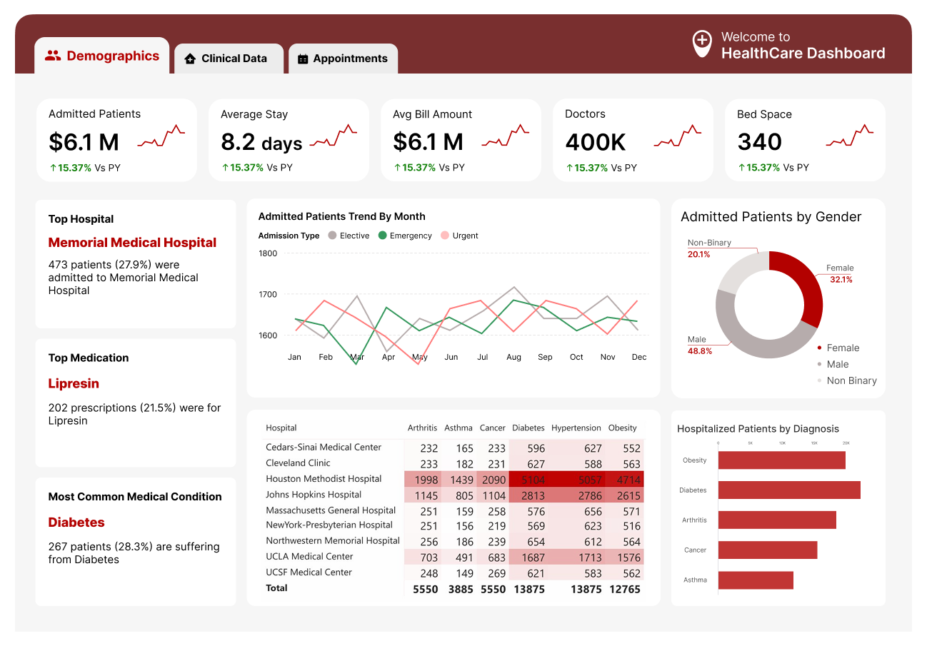
Rounded corners on visuals have been a trendy design choice for a while, and sure, they can look modern. But slapping rounded corners on everything, charts, cards, slicers, can make your report look like it’s trying too hard to be cute. It’s like putting a bow on every single gift, even the socks. After a while, it just feels distracting and takes away from the data itself.
How to Apply It: Stick to sharp, clean edges for most visuals to keep things professional and focused. If you really love rounded corners, use them sparingly, like on a key KPI card to draw attention, but don’t make it the default for everything. Your report will feel sharper and more polished.
3. Small & Grey Fonts Can Make Things Look Premium
Big, bold fonts might seem like the way to go to grab attention, but here’s a little design secret: small, grey fonts can give your report a sleek, premium vibe. Think about luxury brands, they don’t scream with giant text; they use understated, elegant typography to create a sense of sophistication. In Power BI, small, grey fonts for labels, annotations, or secondary info (like axis labels or tooltips) can make your main data stand out while keeping the overall look clean and refined.
How to Apply It: Use a font size of 8-10 for non-critical text (like axis labels or notes) and a light grey color (like #666666). For primary data, like KPI numbers, stick to a larger size (12-14) and a darker color (like black or dark grey). I recommend Segoe UI, it’s clean and professional, as I’ve mentioned in my dashboard design tips before.
4. Fewer Visual Types = Lower Cognitive Load
It’s tempting to use every cool visual in Power BI, bar charts, line graphs, donut charts, heatmaps, you name it. But here’s the secret: the fewer types of visuals you use, the easier it is for your users to process the information. When every visual looks different, your users have to work harder to understand what they’re seeing, which increases cognitive load and makes your report feel overwhelming. A consistent set of visuals creates a smoother, more intuitive experience.
How to Apply It: Stick to 2-3 visual types per report. For example, use bar charts for comparisons, line charts for trends, and tables for detailed data. Avoid throwing in a donut chart just because it looks “fun”, unless it genuinely adds value. This approach also ties into my earlier blog on third-party visuals (like Flexa Tables): choose visuals your users already know to keep things familiar.
5. Humans Confuse Front-End Attractiveness with Insights Richness
Here’s a psychological secret: people often judge the quality of your insights based on how pretty your report looks. A visually appealing design can trick users into thinking your report is packed with deep insights, even if the data itself is simple. On the flip side, a poorly designed report might make users overlook valuable insights because it looks “cheap.” Humans are wired to associate attractiveness with quality, so use this to your advantage!
How to Apply It: Focus on a clean, modern design to boost perceived value. Use a simple color palette (no more than 3 colors, like blue, grey, and a pop of orange), plenty of white space, and consistent formatting (like the Z-pattern layout I’ve talked about before). Even if your data isn’t groundbreaking, a polished look will make users trust it more. But don’t overdo it, balance attractiveness with clarity so the design doesn’t overshadow the insights.
Why These Design Secrets Matter
At the end of the day, a Power BI report isn’t just about the data, it’s about how you present it. These design secrets help you create reports that are not only functional but also intuitive and visually appealing. By skipping unnecessary titles, avoiding overused trends like rounded corners, using small grey fonts for a premium feel, limiting visual types to reduce cognitive load, and leveraging the psychology of attractiveness, you’ll make reports that users love to interact with.
Think about it: a report that’s easy on the eyes and the brain is a report that gets used. And isn’t that the whole point? So, next time you’re designing a Power BI report, keep these secrets in mind and watch your adoption rates soar.
Your Turn to Shine
Which of these design secrets are you going to try in your next Power BI report? Or do you have your own design tricks that always wow your users? If you found this helpful, check out my other blogs, like “7 Fastest Ways to Kill Power BI Report Adoption” or “Top 5 Hottest Third-Party Visuals of 2025,” for more tips to level up your Power BI game. Thanks for reading, and happy designing!


