Top 5 Third-Party Power BI Visuals You Gotta Check Out in 2025
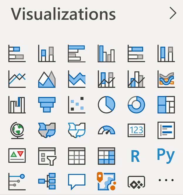
Hey there! So, Power BI is awesome for visualizing data, right? But sometimes the default visuals just don’t cut it. That’s where third-party visuals come in, they add so much more creativity and power to your dashboards, making your data stories pop. In 2025, there are some seriously cool third-party visuals making waves in the Power BI community, and the one everyone’s obsessed with is Flexa Tables. Let’s check out the top 5 visuals of the year, I’m starting with the one I know you’ll love!
1. Flexa Tables – Your New Best Friend for Dynamic Tables (A Total Essential in 2025!)
Okay, let me tell you about Flexa Tables, it’s been blowing everyone’s minds in 2025, and I totally get why. This visual takes boring tables and turns them into super interactive tools that feel like Excel but way better, thanks to Power BI. You can drag and drop to pivot your data, compare dates like day-over-day or year-over-year, and even calculate variances, all in one place. It’s perfect for stuff like sales, finance, or inventory tracking. What makes it so awesome is how it lets you access all your data columns, so you’re not stuck with limitations. Plus, you can mix charts right into your tables for a killer visualization experience. I’m talking about saving months of work with just a few clicks, it’s that good. If you’re into deep data analysis, like tracking financial metrics or inventory trends, or even energy stuff like hedge and load, you need this in your life. You can grab it on Microsoft AppSource, trust me, you won’t regret it!
For a complete guide to adding pivot tables to Power BI, see: Power BI Pivot Table: Add Excel-Style Pivoting Without DAX
2. ZoomCharts Drill Down Visuals – Dig Into Your Data Like Never Before
Next up is ZoomCharts Drill Down Visuals, which are super cool for 2025. They let you dive deep into your data with stuff like zooming, drilling down, and even multi-touch support. Say you’re looking at sales data or customer stats, you can start with the big picture and zoom all the way into the tiny details without breaking a sweat. People love how interactive and smooth it is, and it works great on any device. It’s perfect for tricky datasets where you need to dig into different levels, like supply chain stuff or financial reports. Oh, and big companies like SEB are raving about how fast and easy it is to use. Definitely worth checking out!
3. Zebra BI Charts – Your Go-To for Financial Reports
Zebra BI Charts are still killing it in 2025, especially if you’re into financial reporting. They’ve got everything you need, like waterfall charts, small multiples, and expandable subtotals, which make creating things like profit and loss statements a breeze. You can add grand totals or column subtotals with one click, and the design is so clean that spotting trends is super easy. It’s awesome for financial analysts or anyone who needs to show clear reports to their boss or clients. They even have a free version, and you can try the pro features if you want to take it up a notch. Pretty sweet deal if you ask me!
4. Deneb by Daniel Marsh-Patrick – Custom Visuals, No Coding Needed
Deneb has been getting a ton of love in 2025, and I’m not surprised. It’s built by Daniel Marsh-Patrick, a Power BI pro, and it lets you create custom visuals using Vega and Vega-Lite without touching any code. So if you’re not a coder but want to make something totally unique, like a fancy bar chart or a heatmap, you can do it with Deneb. It’s perfect for anyone who wants to go beyond the basics, like making a custom KPI tracker or a cool map. It takes a bit of learning to get the hang of it, but once you do, it’s so worth it for creating dashboards that stand out.
5. Chiclet Slicer – Make Filtering Look Good
Last but not least, Chiclet Slicer is still a crowd-pleaser in 2025. It’s way better than the regular Power BI slicer because you can customize it a ton, like adding images to your slicer options or using cross-highlighting. It’s not just functional; it looks awesome too, like if you’re filtering sales data with product images. It’s great for dashboards where you want to impress with both design and usability, like marketing or retail reports. Pro tip: stick it on the left or top of your dashboard (like I mentioned in my dashboard design post) so it’s easy to use.
Why These Third-Party Visuals Are Such a Breakthrough in 2025
These third-party visuals aren’t just pretty, they’re legit tools that fix what Power BI’s default visuals can’t do. This year, they’re hotter than ever because they make your dashboards more interactive (like Flexa Tables and ZoomCharts), simplify tricky reports (like Zebra BI), and make everything look and feel better (like Chiclet Slicer). They even handle super specific needs, like financial reports or custom visuals (like Deneb). Just a heads-up though, make sure to check if they’re certified on AppSource. Certified ones are tested by Microsoft to be safe, but if they’re not certified, you’ll need to trust the developer for updates and support.
Try These Visuals Out Today!
Wanna level up your Power BI dashboards? Start with Flexa Tables, it’s hands-down the best one of 2025! You can find all these visuals on Microsoft AppSource, so go download them and play around. Whether you’re crunching numbers for finance, marketing, or just love data, these top visuals will make your dashboards look amazing and work even better.


