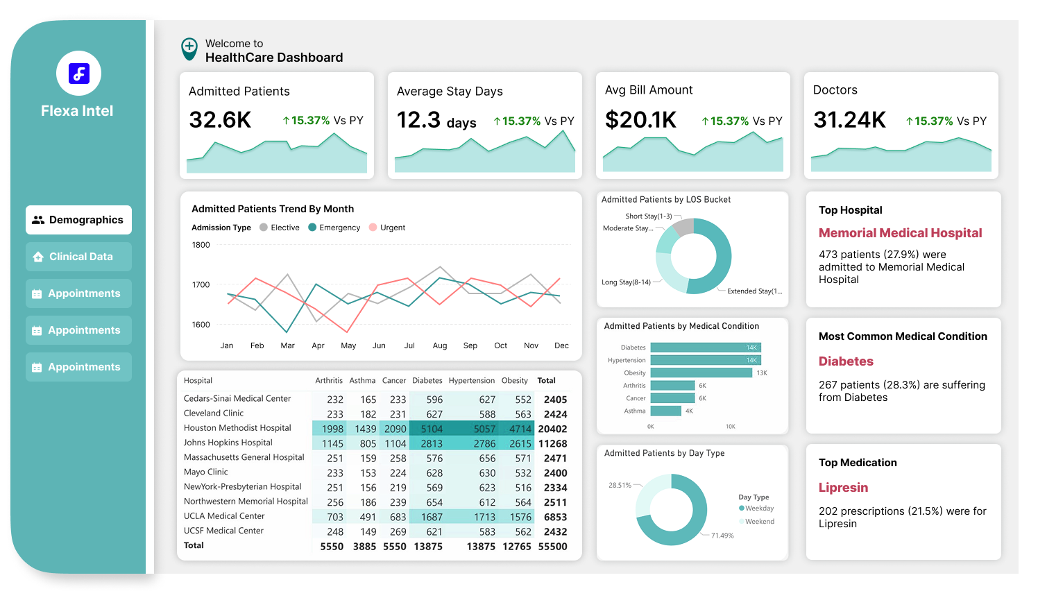
7 Fastest Ways to Kill Power BI Report Adoption (And How to Avoid These Mistakes!)
Hey there, Power BI fans! So, you’ve spent hours (or maybe days) building what you think is the ultimate Power BI report, sleek visuals, tons of data, and all the bells and whistles. But then… crickets. Nobody’s using it. Your users are either confused, frustrated, or just straight-up ignoring your masterpiece. What went wrong? Well, you might’ve accidentally fallen into some classic traps that kill report adoption faster than you can say “dashboard.” Let’s break down the 7 fastest ways to make sure your Power BI report gets zero love, and how to fix them so your users actually want to use it!
1. Put Everything on One Page
Ever seen a dashboard that looks like someone tried to cram an entire encyclopedia onto a single page? Yeah, don’t do that. Throwing every chart, table, and slicer onto one page might seem like a great idea to “give users everything they need,” but it’s a surefire way to overwhelm them. They’ll take one look, feel their brain melt, and close the report faster than you can blink.
Fix It: Break your report into smaller, focused pages. Each page should have a clear purpose, like an overview, a deep dive into sales, or a specific KPI analysis. Think of it like chapters in a book: make it easy to navigate and digest.
2. Assume Users Will “Figure It Out”
You might know your report inside and out, but your users? Not so much. If you leave them to fend for themselves without any guidance, they’ll get lost in a sea of visuals and filters. Assuming they’ll “figure it out” is like handing someone a 500-piece puzzle with no picture on the box, they’ll give up before they even start.
Fix It: Add tooltips, clear labels, and even a “How to Use This Report” page if needed. Make it dummy-proof! A little hand-holding goes a long way to make users feel confident and keep them coming back.
3. Make Sure the Layout Is Different on Every Page
Consistency is your friend, but if you decide to mix things up by using a different layout on every page, different fonts, colors, and visual placements, you’re basically creating a chaotic maze. Users won’t know where to look, and they’ll get frustrated trying to reorient themselves on each page. It’s like walking into a new store layout every time you switch aisles, annoying, right?
Fix It: Stick to a consistent design across all pages. Use the same color scheme, font (Segoe UI is a great pick, as I mentioned in my dashboard design blog), and layout structure. For example, keep slicers on the left or top, KPIs at the top-left, and detailed visuals on the bottom-right (following the Z-pattern I talked about before). Consistency builds familiarity, and familiarity builds adoption.
Do check out: Power BI Templates Free Download
4. Build Complex Visuals Nobody Ever Used
I get it, those fancy third-party visuals like Deneb or ZoomCharts (from my recent blog on top visuals of 2025) are tempting to play with. But if you’re building super complex visuals that your users have never seen before, they won’t know what to do with them. A 3D Sankey diagram with 10 layers might look cool to you, but to your users, it’s just a confusing mess.
Fix It: Stick to visuals your users already know, like bar charts, line graphs, and tables, unless there’s a clear reason to use something more advanced. If you do use a complex visual, make sure it’s worth the learning curve and pair it with a simple explanation or tooltip.
5. Hide Key Metrics in Hidden Pages
Imagine your users opening your report, looking for the one metric they care about, like total sales or profit margin, and… it’s nowhere to be found. You’ve buried it on a hidden page or a tab they’d never think to click on. That’s a fast track to making your report irrelevant. If users can’t find what they need right away, they’ll go elsewhere for their data.
Fix It: Put the most important metrics front and center on the first page. Use the Z-pattern layout to place key KPIs where users’ eyes naturally go first (top-left). If you have to use hidden pages, add clear navigation buttons or a table of contents so users know where to look.
6. Use Technical Terms No One Understands
If your report is full of jargon like “YoY variance,” “LTM EBITDA,” or “MAU growth rate,” and your users aren’t data nerds, they’ll feel like they’re reading a foreign language. Nothing kills adoption faster than making users feel dumb because they don’t understand your labels or metrics.
Fix It: Use plain language that matches your audience’s knowledge level. For example, instead of “YoY variance,” say “Change from Last Year.” If you must use technical terms, add a glossary or tooltip to explain them in simple words. Your goal is to make everyone feel included, not intimidated.
7. Never Check How Long It Takes to Load
You’ve built an amazing report with 20 visuals, 10 data sources, and a gazillion calculations. But when your users open it, they’re staring at a loading screen for 30 seconds, or worse, it crashes. If your report takes forever to load, users will lose patience and ditch it for something faster (like a good ol’ Excel sheet). Slow performance is a silent adoption killer.
Fix It: Test your report’s load time before sharing it. Optimize by reducing the number of visuals, simplifying calculations, and using data aggregation where possible. Power BI’s Performance Analyzer is your best friend here, it’ll show you exactly what’s slowing things down so you can fix it.
Don’t Let Your Report Die, Make It Lovable!
Building a Power BI report that people actually use isn’t just about the data, it’s about the user experience. Avoid these 7 adoption killers, and you’ll be on your way to creating reports that your team can’t stop raving about. To recap: don’t overwhelm users with too much on one page, guide them instead of assuming they’ll figure it out, keep your layouts consistent, use familiar visuals, make key metrics easy to find, speak their language, and always check performance. Follow these tips, and your Power BI report will be the star of the show, not a dusty file nobody opens.
Have you made any of these mistakes before? Or do you have your own tips for boosting report adoption? Drop a comment, I’d love to hear from you! Thanks for reading, and let’s make Power BI reports that people actually love to use!


