Power BI Management Reporting
Power BI Management Reporting: Replace Your Monthly PDF Pack (2026)
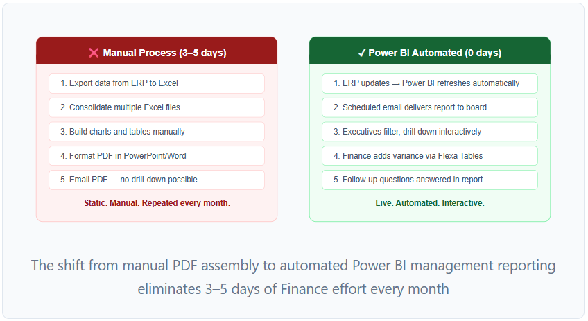
1. Before and After: Manual vs Automated Management Reporting
The management pack is the highest-value automation target in Finance reporting. It's produced every month, takes significant time to assemble, and produces a static output that can't answer the follow-up questions it inevitably generates. Power BI solves all three problems simultaneously.
2. The 5-Page Management Reporting Structure
The standard management reporting pack in Power BI has five pages. Each page is designed for a specific audience and question — and the pages are ordered so that a board member can read front-to-back and get a complete picture without drilling down into detail they don't need.
- 4–6 KPI cards: Revenue, EBITDA, Cash Position, YTD Variance vs Budget
- One 12-month trend line (revenue or EBITDA)
- One variance bar by business unit
- Commentary text box: 3–5 bullet points of key messages from Finance
- Single period slicer (month selector)
- No scrolling — fits on one screen
- Matrix with Revenue, COGS, Gross Profit, OpEx, EBIT rows
- Month columns (current year) + YTD column
- YoY variance column (absolute and %)
- Conditional formatting: green/red by favorable direction
- Drill-through to GL account detail on any row
- Slicers: Entity, Cost Center
- Matrix: GL accounts in rows, Actuals/Budget/Variance/Variance% in columns
- Waterfall chart: budget-to-actuals bridge by department
- KPI cards: Total Actuals, Total Budget, Total Variance
- Slicers: Department, Month, Cost Center
- Flexa Tables visual: allows self-service variance column selection
- Waterfall chart: opening balance → operating CF → investing → financing → closing balance
- KPI cards: Cash Position, Cash Runway (months), DSO, DPO
- Line chart: 13-week rolling cash position (actuals + forecast)
- Table: top 10 cash movements in the period
- Line chart: actuals for completed months + forecast for remaining months (combined view)
- KPI cards: Full-year forecast total, vs original budget gap
- Bar chart: remaining months forecast by business unit
- Commentary: key assumptions and risks in the current forecast
3. Design Principles for Board-Level Reports
Management reporting has stricter design constraints than operational reporting. Board members and executives scan rather than read — they need to extract the key message from each page in under 60 seconds. These five principles separate management reports that get used from those that get ignored:
1. One question per page
Each page answers one specific question: "Are we on budget?" (Page 3), "How is cash trending?" (Page 4), "Are we on track for the year?" (Page 5). If a page tries to answer two questions, it answers neither clearly. When adding a new metric, first ask: which page's question does it support? If none, it probably doesn't belong in the management pack.
2. Consistent color coding across all pages
Green = favorable/above target. Red = unfavorable/below target. Amber = within 5% of target. Apply this consistently on every KPI card, every variance column, every trend line — across all five pages. Board members learn the color language after the first meeting and scan future reports much faster.
3. Conditional formatting on every number that has a target
Every KPI card, every variance column, every trend indicator should have conditional formatting. A revenue figure with no context (up or down vs what?) forces the reader to do mental arithmetic. A revenue figure with a green arrow (+5.1% vs budget) communicates immediately. See the budget vs actuals guide for the exact conditional formatting setup including sign-aware formatting for P&L expense lines.
4. Maximum five visuals per page
The most common management report design mistake is density — cramming twelve metrics onto one page because "the board might want to see it." Density makes every metric harder to read. Five visuals per page is the maximum; three or four is better. Use drill-through pages for detail — the summary page links to a detail page rather than showing everything at once.
5. Commentary alongside numbers
Numbers without context generate follow-up emails. A revenue figure that's 5% below budget with a commentary note — "Q2 shortfall driven by APAC deals delayed to Q3; expected to recover" — answers the question before it gets asked. Add a text box to the Executive Summary and at least one detail page. Update it monthly as part of the report preparation process.
4. Automating Refresh and Distribution
The management pack only saves Finance time if it runs without manual intervention. Three components make the automation complete:
Scheduled refresh
In Power BI Service: Workspace → Dataset → Settings → Scheduled refresh → On. Set to daily (or weekly if the data source only updates weekly). For ERP-connected reports, configure the refresh to run after the ERP nightly export completes — typically early morning.
-- Recommended refresh schedule for monthly management packs:
Daily refresh:    06:00 AM (after nightly ERP export)
Monthly deadline: 5th working day of month = Management Pack is ready
No manual assembly required after initial setup
Automated email delivery
In Power BI Service: Report → Subscribe → Add subscribers. Add the CFO, Controller, and board members' emails. Set delivery to the 5th working day of each month at 08:00 AM. They receive a PDF snapshot or link to the live report — depending on whether they have Power BI Pro licenses.
Power BI App for permanent access
Package the management reporting pack as a Power BI App: Workspace → Create App → add report pages → configure audience (board members, ExCo). The App provides a stable URL and consistent navigation that doesn't change when report pages are updated. Board members bookmark the App URL rather than a specific report link.
5. Self-Service for Board Members and Executives
Board meetings generate follow-up questions that the management pack didn't anticipate. "Can you show me the APAC variance by product line?" or "What's the MoM trend on operating expenses?" — these questions currently require Finance to build a new cut of the data and email it before the next meeting.
Flexa Tables on the Budget vs Actuals page (Page 3) lets board members and ExCo answer these questions themselves:
- Add a MoM variance column to any financial table — without IT involvement
- Switch the comparison from Actuals vs Budget to Actuals vs Prior Year — one click
- Restructure the table from GL Account rows to Cost Center rows — drag and drop
For the pivot table flexibility that Finance Directors need — rearranging row and column dimensions to explore a different cut of the P&L — Flexa Tables handles this in Power BI Service without any changes to the underlying report.
6. Four Mistakes That Kill Management Report Adoption
Mistake 1 — Building for Finance, not for the board
Finance builds detailed GL-level reports because they find them useful. The board finds them overwhelming. The management pack should have a strict hierarchy: headline first, detail available via drill-through. If board members have to wade through 20 GL rows to find the headline, they'll stop using the report and ask Finance to send a summary email instead.
Mistake 2 — No commentary
A report with numbers and no context generates more work for Finance, not less — every board member emails asking what the variance means. Add a commentary text box to the Executive Summary and update it monthly. Three to five bullet points of plain English explaining the key variances and what Finance is doing about them reduce follow-up emails by 80%.
Mistake 3 — Too many pages
A 12-page management pack gets skimmed. A 5-page pack gets read. Keep the management reporting pack to five pages. Create separate, deeper reports for operational detail (departmental cost tracking, GL drill-down, forecast accuracy) and link to them via drill-through. The management pack is the entry point, not the encyclopedia.
Mistake 4 — Not training the audience
Board members and ExCo who receive a Power BI App link for the first time will often ask for the PDF back — not because the report is worse, but because they don't know how to use it. A 15-minute walkthrough at the board meeting where the report first goes live — showing how to use slicers, drill-through, and mobile view — dramatically improves adoption. Include a one-page "how to use this report" PDF with the first distribution.
Add self-service variance to your management pack
Flexa Tables lets board members and executives add MoM, YoY, and scenario variance columns in the published management report — no IT, no Desktop, no waiting. Microsoft-certified, free trial on AppSource.
Get Free Trial on AppSource →FAQ
What is management reporting in Power BI?
A multi-page Power BI report consolidating financial and operational metrics for senior leadership — replacing the monthly PDF board pack. Standard structure: Executive Summary, P&L, Budget vs Actuals, Cash Flow, Outlook. Unlike PDFs, it refreshes automatically and allows interactive exploration.
How do I automate management reporting in Power BI?
Configure scheduled refresh in Power BI Service (daily or weekly), set up email subscriptions for board members and ExCo, and package the report as a Power BI App for stable permanent access. With this setup, the management pack refreshes and distributes itself — Finance no longer manually assembles a PDF each month.
What should a Power BI management report include?
Five pages: Executive Summary (KPI cards + trend + commentary), P&L Income Statement, Budget vs Actuals, Cash Flow, and Forecast Outlook. Each page answers one specific question. Maximum five visuals per page, consistent green/red color coding, and a commentary text box on at least two pages.
How do I distribute a Power BI management report to the board?
For board members with Power BI Pro licenses: share via Power BI App — stable URL, controlled access. For board members without Pro licenses: configure email subscription to deliver a PDF snapshot automatically on the reporting date. Both approaches eliminate the manual PDF assembly process.
How long does it take to build a Power BI management reporting pack?
With clean data (ERP export or staging database), a 5-page management pack typically takes 2–4 weeks: 1 week data model, 1–2 weeks report pages, 1 week UAT and deployment. Using a pre-built PBIX template reduces this to 1–2 weeks. The longest delays are data quality issues and stakeholder sign-off, not Power BI development.
What is the difference between a management report and a dashboard in Power BI?
A Power BI dashboard is a single-page canvas in Power BI Service that pins tiles from multiple reports for a quick overview. A management report is a multi-page PBIX report built in Power BI Desktop with full interactivity, drill-through, and complex financial layouts. Finance teams use reports (not dashboards) for the management pack — dashboards are better for real-time operational monitoring. See the financial dashboard examples guide for the distinction in practice.


