Power BI Financial Dashboard Examples
Power BI Financial Dashboard Examples: 7 Layouts Finance Teams Actually Use (2026)
Most guides on Power BI financial dashboards show screenshots and stop there. This guide goes further: for each of the seven dashboard types, you'll find the specific KPIs to include, the visuals that work best, layout guidance, and — where relevant — the limitations of native Power BI visuals that trip up Finance teams.
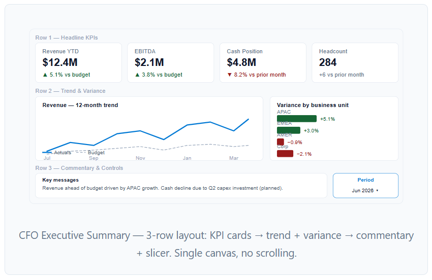
The CFO dashboard is a single-screen summary designed for 60-second consumption. Executives don't want to drill down — they want to see immediately whether the business is on track and where the biggest deviations are. Every element on this dashboard should answer one of three questions: where are we, how does that compare to plan, and what's trending.
KPIs to include
Best visuals
Layout
Top row: 4 KPI cards (Revenue, EBITDA, Cash, Headcount). Middle row: one 12-month trend line + one variance bar by business unit. Bottom row: commentary text box with key messages and a single slicer for reporting period. Keep the page to a single canvas — no scrolling, no drill-through from this page.
The P&L dashboard is the most technically demanding financial dashboard in Power BI because the income statement format has requirements the native Matrix visual doesn't handle automatically: custom row ordering, calculated subtotals, and sign-aware variance formatting. Done correctly, it replaces the monthly Excel P&L pack entirely.
KPIs to include
Best visuals
Layout
Page 1 — Summary: 4 KPI cards + waterfall chart showing revenue bridge from prior month to current. Page 2 — Detail: full P&L Matrix with month columns, MoM and YoY variance columns, conditional formatting (green for favorable, red for unfavorable). Page 3 — Trend: 12-month line charts for Gross Profit Margin % and EBIT Margin % side by side.
Budget vs actuals is the most-requested financial dashboard type in Power BI and the one that drives the most IT tickets when it's not self-service. Finance teams need to compare Actuals against Budget (and sometimes Forecast) across multiple dimensions — by department, by GL account, by month — and the answer changes every time someone asks a slightly different question.
KPIs to include
Best visuals
Layout
Page 1 — Overview: KPI cards for total Actuals, Budget, Variance $, Variance %. Horizontal bar chart ranking departments by variance (largest overrun at top). Page 2 — Detail: Matrix with GL accounts in rows, Actual/Budget/Variance/Variance% in columns, filterable by department and month. Page 3 — Waterfall: bridge from budget to actuals, broken down by major variance driver.
Cash flow is where a visually wrong dashboard is actually dangerous — showing the wrong closing balance or incorrect operating cash flow can lead to real decisions made on bad information. The waterfall chart is the dominant visual here because it naturally represents cash movement as a bridge from opening to closing balance.
KPIs to include
Best visuals
Layout
Page 1 — Cash position: Opening balance KPI card + waterfall chart showing operating/investing/financing movements to closing balance + 13-week rolling cash line chart. Page 2 — Working capital: DSO trend, DPO trend, inventory days (if applicable) as line charts. Page 3 — Forecast: 8-week forward cash forecast vs actuals line chart.
The management reporting pack replaces the monthly PDF deck Finance teams spend days assembling in Excel and PowerPoint. In Power BI, it's a multi-page report that combines P&L summary, budget vs actuals, cash position, and forward-looking commentary in a single governed report that updates automatically on scheduled refresh.
Standard pages
- Page 1 — Executive summary: 1-page view of all headline metrics with commentary text box
- Page 2 — P&L summary: Top-level P&L with MoM and YoY variance, not GL-level detail
- Page 3 — Budget vs actuals: YTD performance by business unit or department
- Page 4 — Cash and working capital: Cash bridge + DSO/DPO trend
- Page 5 — Outlook: Rolling forecast vs budget for the remaining months of the year
Best visuals
The departmental cost dashboard gives budget owners visibility into their own spending without granting access to the full company P&L. Row-level security (RLS) in Power BI restricts each department head to their own cost center data, so a single report serves the whole organisation while maintaining data confidentiality.
KPIs to include
Best visuals
RLS setup
Create a security table mapping [Email] to [CostCenter]. In Power BI Desktop, define a role with a DAX filter: [CostCenter] = USERPRINCIPALNAME() (if the cost center code maps to email) or join through the security table. Department heads then see only their own data when they access the report in Power BI Service.
Committed scenario (open POs + approved spend) alongside Actual to show true budget exposure.
The rolling forecast dashboard tracks how the financial outlook changes month by month as new actuals come in and the forecast is updated. Unlike a static budget comparison, this dashboard shows forecast accuracy over time — which months were consistently underforecast, which business units have the least predictable revenue, and whether the current forecast is converging to or diverging from the original budget.
KPIs to include
Best visuals
Layout
Page 1 — Full-year view: one line chart showing actuals for completed months + forecast for remaining months, with the original budget as a reference line. KPI cards showing current forecast total vs budget total and the gap. Page 2 — Monthly detail: Matrix with months in columns, showing Actuals (for past months), Forecast (for future months), and Budget — side by side with variance. Page 3 — Accuracy analysis: scatter plot with each business unit's historical forecast accuracy (x-axis = months forecasted ahead, y-axis = forecast vs actuals %).
Which Visuals to Use (and Which to Avoid)
| Use case | Best visual | Avoid |
|---|---|---|
| Headline KPI (revenue, EBITDA) | KPI card with vs-target indicator | Gauge chart (poor for context) |
| P&L / budget vs actuals detail | Matrix with variance columns | Stacked bar (loses row structure) |
| Cash flow bridge | Waterfall chart | Stacked bar (can't show direction) |
| Revenue trend over time | Line chart (single series) | Area chart (hard to compare) |
| Dept/segment comparison | Clustered bar (horizontal) | Pie/donut (terrible for comparison) |
| Budget vs actuals by dept | Bullet chart or clustered bar with target line | Donut (no variance context) |
| P&L with period variance | Matrix + Flexa Tables for self-service variance | Card-per-metric (doesn't scale) |
| Forecast accuracy over time | Scatter plot or line (forecast vs actuals) | Single KPI card (loses trend) |
Add self-service variance to any financial dashboard
Flexa Tables lets Finance users add MoM, YoY, and Actual vs Budget variance columns in published Power BI reports — no DAX, no developer, no waiting. Used by Finance teams at Accenture, Intel, and BP. Free trial on Microsoft AppSource.
Get Free Trial on AppSource →FAQ
What should a Power BI financial dashboard include?
It depends on the audience. For a CFO dashboard: revenue, EBITDA, cash position, and variance vs budget — all as KPI cards with trend lines. For a P&L dashboard: revenue, gross profit, operating expenses, and EBIT broken down by month with variance columns. For a budget vs actuals dashboard: actual vs budget variance by department and GL account, with a waterfall chart for bridge analysis. Every financial dashboard should have scheduled refresh, drill-through to transaction level, and mobile-responsive layout.
What visuals work best for a Power BI financial dashboard?
KPI cards for headlines, waterfall charts for bridge/cash flow analysis, line charts for trends, Matrix visuals for detailed P&L or budget tables, and clustered bar charts for department comparisons. Avoid pie charts — they make comparison harder. For detailed table analysis with variance columns, Flexa Tables adds self-service MoM/YoY variance beyond what the native Matrix supports.
How do I build a CFO dashboard in Power BI?
Structure it across three pages: (1) Executive summary — 4–6 KPI cards, one trend line, one variance bar chart; (2) P&L detail — Matrix with month columns and YoY comparison; (3) Cash flow — waterfall chart with opening to closing balance. Use scheduled refresh so the dashboard updates automatically. Keep the executive summary to a single canvas with no scrolling.
What is the difference between a Power BI financial dashboard and a financial report?
In Power BI, a dashboard is a single-page canvas in the Power BI Service that pins tiles from multiple reports for a high-level overview. A report is a multi-page file built in Power BI Desktop with full interactivity, drill-through, and complex layouts. Finance teams typically use reports for detailed P&L and budget vs actuals work — dashboards are better for executive KPI monitoring where a one-screen summary is the goal.
Can I download free Power BI financial dashboard templates?
Yes. Flexa Intel offers free Power BI templates including financial reporting layouts at flexaintel.com/Power-BI-dashboard-examples-PBIX. Microsoft also provides sample financial datasets via Power BI Desktop. When using any template, replace the sample data connection with your own source and validate that DAX measures reference your actual table and column names.
How do I add variance columns to a Power BI financial table without writing DAX?
Flexa Tables (Microsoft AppSource) lets Finance users add DoD, MoM, and YoY variance columns directly in the published Power BI report — no DAX, no Power BI Desktop access required. Users select the two periods to compare and the variance column appears instantly. This is useful for finance dashboards where stakeholders need different period comparisons on demand without IT involvement.


