
Power BI dashboard samples are pre-built report files (.PBIX) covering real-world use cases like sales performance, financial P&L, HR analytics, and operations. They let teams skip setup time, learn dashboard design patterns, and adapt proven layouts to their own data. The most effective samples include pivot tables and variance columns so Finance and operations users can explore data themselves after publishing — without waiting on a developer.
Starting a Power BI project from a blank canvas is harder than it looks. Not because of the tool — but because good dashboard design requires both data expertise and layout instinct. Power BI dashboard samples solve this by giving you a proven starting point: real structure, real design patterns, real insights already built in.
1. What Are Power BI Dashboard Samples?
A Power BI dashboard sample is a pre-built .PBIX file containing a complete report — data model, visuals, layout, and DAX measures already configured. You open it in Power BI Desktop, swap in your own data source, and have a production-ready dashboard in hours instead of days.
Samples differ from templates in one important way: templates are empty shells with styling applied; samples contain actual representative data so you can see exactly how the final report behaves before connecting your own data.
Template vs Sample — the key difference
2. Key Insights from Effective Dashboard Samples
The best dashboard samples aren't just pretty — they encode design decisions that took real teams months of iteration to discover. Here are the insights that consistently appear in high-adoption dashboards:
High-performing samples avoid overloading a single chart. Each visual answers exactly one question — revenue trend, not revenue + margin + volume combined.
A number means nothing without comparison. Effective samples show MoM, YoY, or Budget vs Actuals next to every key metric — not as an afterthought.
Summary at the top, detail below. Users should be able to answer "how are we doing?" in 5 seconds, then drill down for the "why".
The best samples are built for the audience, not the developer. End-users can filter, slice, and explore without filing a support ticket.
3. Real-World Applications by Industry
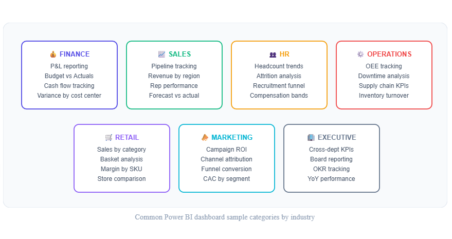
Different industries use Power BI dashboard samples differently. Here's what effective applications look like across the most common use cases:
Common Power BI dashboard sample categories by industry
Finance & Accounting
Finance dashboards are the most complex to build from scratch — P&L structures vary by company, fiscal calendars are non-standard, and variance calculations require careful DAX. A good Finance sample solves all of this upfront. Look for samples that include Budget vs Actuals, MoM variance, and drill-down by cost center or department.
One limitation of most Finance samples: once published, Finance teams can't add or switch variance columns themselves. They have to ask the developer to update the report. Adding a pivot table custom visual to Finance samples gives the team the self-service flexibility Excel users expect — without rebuilding the whole report.
Sales & Revenue
Sales dashboards need to be fast and self-service. Reps and managers shouldn't need a BI developer to answer "how am I tracking vs last quarter?" The best sales samples include pre-built period comparisons (MoM, QoQ) and territory filters that work without rebuilding the report. Variance analysis without DAX is particularly valuable here — sales metrics change frequently and maintaining a growing stack of DAX measures per metric slows teams down.
HR & People Analytics
HR dashboards require careful handling of headcount data — attrition, tenure bands, and department breakdowns need to be accurate to the day. Good HR samples include a headcount snapshot (current state) and a trend view (how it changed over time), plus demographic splits that HR Business Partners can filter themselves.
4. What Separates a Good Sample from a Great One
| Feature | Basic Sample | Great Sample |
|---|---|---|
| Data model | Flat table, single source | Star schema, multiple fact tables, date dimension |
| Variance analysis | Absent or hardcoded | MoM, YoY, Budget vs Actuals — user-selectable |
| Post-publish flexibility | Layout fixed after publish | End-users can restructure, add columns, change filters |
| DAX complexity | Basic SUM/COUNT measures | Time intelligence, dynamic periods, calculated tables |
| Documentation | None | Field descriptions, measure notes, data source guide |
5. How to Use Dashboard Samples Effectively
Download the .PBIX file and spend 20 minutes navigating every page before changing anything. Note which visuals are doing the heavy lifting and which DAX measures power them.
Before connecting your data source, compare column names and data types. Most samples use generic names (Date, Amount, Category) — map these to your actual field names in Power Query before swapping the source.
A well-built sample's date dimension table is worth keeping — it handles fiscal year, week numbers, and time intelligence correctly. This is typically the hardest part to rebuild from scratch.
The biggest gap in most PBIX samples: end-users can't restructure the layout or add variance columns after the report is published. Adding Flexa Tables to any sample gives Finance and ops teams drag-and-drop pivot restructuring and one-click MoM/YoY — directly in Power BI Service.
6. Free Power BI Dashboard Samples — Download Now
Flexa Intel's dashboard gallery includes 100+ free Power BI dashboard samples across Finance, Sales, HR, Operations, Marketing, Retail, and Executive reporting. Every sample includes:
- Complete .PBIX files — open directly in Power BI Desktop, no sign-up required
- Real data models — star schema, date dimension, multiple measures pre-built
- Pivot + variance built in — Flexa Tables included so Finance teams can restructure and add MoM/YoY after publishing
- Industry-specific layouts — not generic charts, but layouts proven for each department's actual reporting needs
Download 100+ Free Power BI Dashboard Samples
Finance, Sales, HR, Operations, Retail — all free, open instantly in Power BI Desktop
Browse Dashboard Gallery →7. Frequently Asked Questions
Trung built Flexa Tables after seeing Finance teams struggle with the gap between Excel pivot flexibility and Power BI's post-publish rigidity. He writes about practical Power BI reporting for teams that need self-service analytics without the DAX overhead.


