Quick Answer
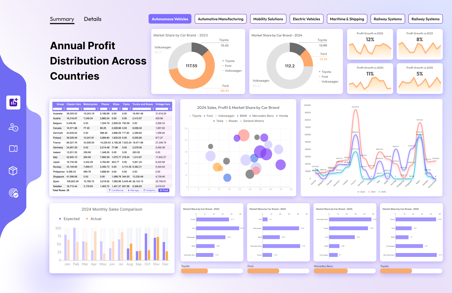
Great dashboard design comes down to 8 principles: clean background, limited color palette (max 3), consistent font (Segoe UI), grouped slicers, Z-pattern layout, white space, ruthless decluttering, and stealing colors from professional examples. The data table at the bottom-right of your layout — where users drill into specifics — is where a
pivot table visual or
variance analysis layer makes the biggest difference for Finance and analytics reports.
8
design principles that work for any Power BI dashboard
3
maximum colors in your palette — more than that and readability suffers
10px
minimum spacing between visual elements — the white space rule
Designing a dashboard can feel intimidating, especially if you're aiming for something that's both functional and visually appealing. But here's the good news: it's not as hard as you think. With a few smart design choices, you can create dashboards that are clean, professional, and easy to understand. Here are the go-to tips that will elevate your dashboard game.
1. Keep Your Background Clean and Simple
The foundation of a great dashboard starts with its background. The rule of thumb:
✅ Dashboard background: Choose a light, neutral color (soft gray or beige). This helps your visuals pop without overwhelming the viewer.
✅ Visual background: Set each visual tile to white. A clean canvas makes your charts stand out regardless of the data colors.
✅ No borders or shadows: Skip them on visual tiles — they add unnecessary clutter and distract from the data.
🚫 Big no-no: Never use a picture as your dashboard background. It's a recipe for chaos. Keep it simple to let your data shine.
2. Stick to a Limited Color Palette
Color can make or break your dashboard's readability.
✅ Max 3 main colors: Pick three primary colors and stick to them. If you need more variety, use different shades of those three.
✅ Set up a theme: Predefine your colors in Power BI's "Customize Theme" settings. This ensures consistency across all visuals without manual formatting every time.
✅ Find beautiful palettes: Visit colorhunt.co and browse their "Trending Palettes" section — professionally designed color combos that look polished out of the box.
3. Choose the Best Default Font
Typography matters more than you might think. A good font ensures your text is readable and professional:
✅ Go-to font: Segoe UI. It's clean, modern, and highly readable even at small sizes — ideal for dashboards.
🚫 Avoid uneven fonts: Steer clear of fonts with inconsistent letter and number widths (like Comic Sans). They make dashboards look unprofessional and are harder to scan quickly.
4. Organize Navigation and Slicers Smartly
A well-organized dashboard makes navigation intuitive without any instruction needed:
✅ Group slicers together: Place all navigation elements and slicers in one spot — either on the left side or at the top of the dashboard. This keeps the layout tidy and ensures users can filter data without hunting around.
For Finance dashboards: A well-placed slicer lets users filter by period, department, or entity — but it doesn't let them
add a new variance column or restructure the table. For that level of self-service, a
variance analysis visual like Flexa Tables handles variance columns directly in the published report without any developer involvement.
5. Follow the Z-Pattern for Layout
Arrange elements based on how the human eye naturally moves — following a Z-pattern from top-left to bottom-right:
| Position | What goes here |
|---|
| Top-left (Overview) | Dashboard title, key KPIs, summary metrics — the most important numbers, visible immediately |
| Bottom-right (Details) | Detailed data tables for drilling down — users get the big picture first, then explore specifics. This is where a pivot table visual fits naturally for flexible data exploration. |
6. Let Your Dashboard Breathe with White Space
White space is your friend — it makes your dashboard feel airy and easy on the eyes.
✅ Spacing rule: Keep at least 10px of space between graphs and visual elements. This prevents the dashboard from feeling cramped and helps users focus on each piece of data independently.
7. Declutter Ruthlessly
A clean dashboard is a usable dashboard. Remove anything that isn't absolutely necessary:
🚫 Elements to cut: Gridlines, axis titles, legends, tooltips — anything that can be removed without sacrificing clarity. If the data still makes sense without it, it doesn't belong on your dashboard.
The goal is to keep things as minimal and distraction-free as possible while ensuring the story your data tells is crystal clear.
8. Get Inspired and Steal Colors Like a Pro
Need inspiration for your dashboard design? Here's the workflow:
✅ Explore samples: Visit Adobe Stock and search for "Dashboard" to find professionally designed examples across industries.
✅ Steal colors: Install the Eyedropper Chrome extension. Hover over any dashboard you love, grab the Hex Codes of the colors, and apply them to your own design. It's a foolproof way to nail your color scheme without starting from scratch.
Final Thoughts: Dashboard Design That Never Fails
With these 8 tips, you're well on your way to creating dashboards that are not only functional but also visually stunning. To recap: keep your backgrounds clean, limit your colors, choose a readable font, organize your slicers, follow the Z-pattern, add white space, declutter, and draw inspiration from the pros.
One thing these design principles won't solve on their own: what happens after you publish. Slicers filter data, but they can't let Finance users add a new variance column or restructure a table. For the detail-table area at the bottom-right of your Z-pattern layout, pairing good design with a flexible visual like Flexa Tables gives users the self-service they need without breaking the clean design you've built.
FI
Flexa Intel Team
Microsoft-certified Power BI custom visuals — Flexa Tables, Charts, Design & Analytics