
Tim Hortons sales and beverage analytics dashboard
Overview
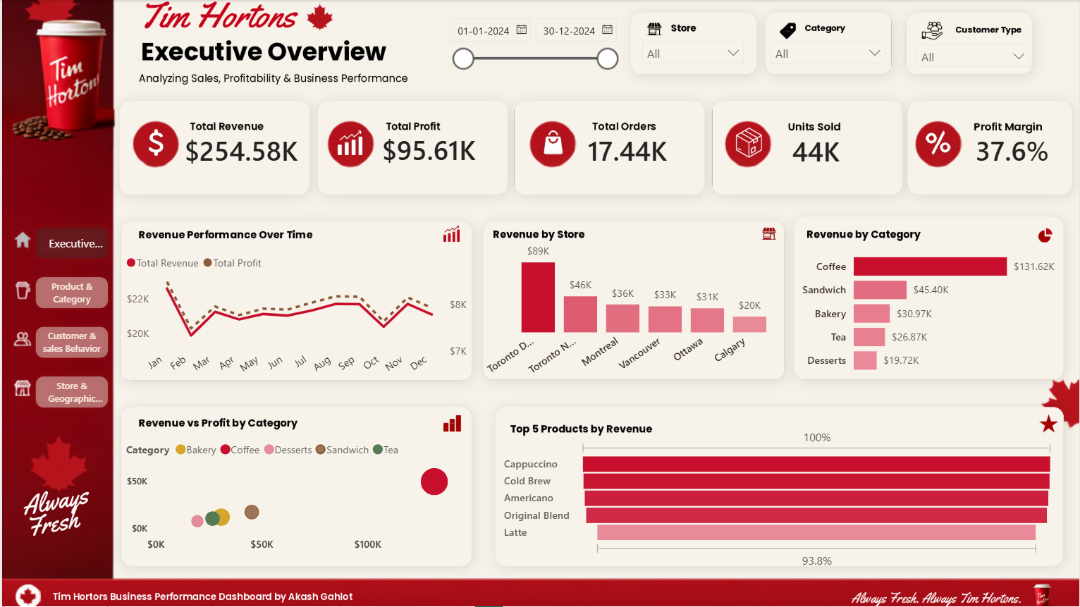
This Power BI dashboard provides a comprehensive analysis of Tim Hortons
beverage products and nutritional
performance. It helps users explore beverage categories, compare nutritional values, and identify product trends through interactive visualizations and KPI tracking.
Key metrics
- Total beverages
- Average calories
- Average sugar
- Average caffeine
Dashboard insights
- Beverage category distribution
- Category-wise calorie comparison
- Average caffeine across beverage types
- Nutritional trends by beverage category
- Product distribution analysis
- Interactive filtering by beverage type and nutritional attributes
Business value
The dashboard helps stakeholders understand customer product preferences, identify high-calorie and high-sugar beverage segments, compare caffeine levels across categories, and support product optimization, menu planning, and health-focused business decisions.
Tools and techniques used
- Power BI
- DAX measures
- Power Query
- KPI cards
- Interactive slicers
- Bar charts
- Column charts
- Donut charts
- Data modeling and visualization
Industry
Food & Beverage / Restaurant & Retail Analytics
Reviews
No reviews yet — be the first to review this template.
Other Templates
If you find this website helpful, share it with friends and colleagues to boost their Power BI skills and work efficiency!
Like this site? Share it