Power BI Student Evaluation Level Dashboard Template (Free PBIX Download)
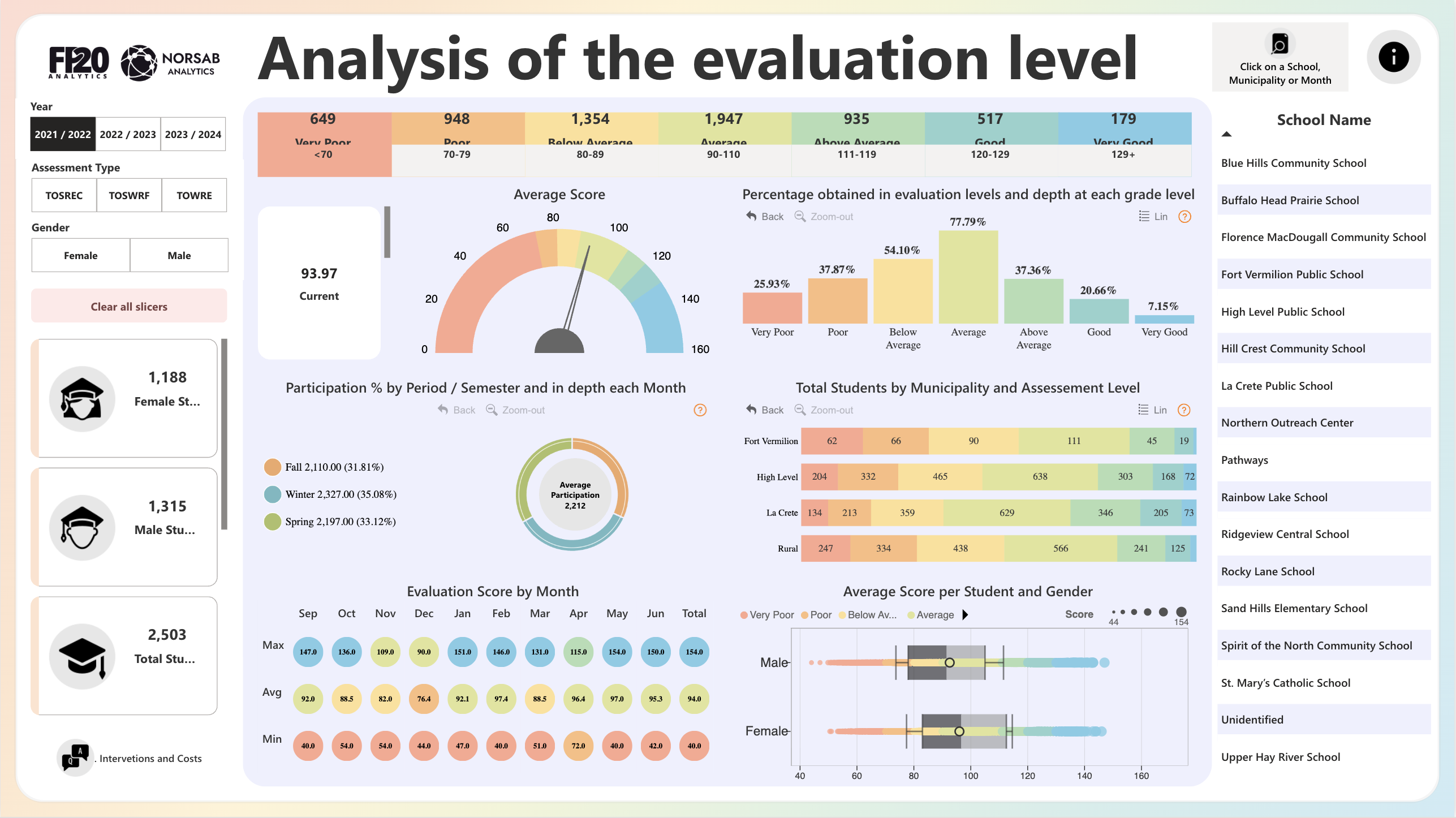
This dashboard analyzes academic evaluation performance for 2,503 students across multiple schools in Northern Alberta (Fort Vermilion School Division area), covering the 2021/2022 academic year with drill-down capability by semester, month, municipality, and gender. It serves school district administrators, education policy analysts, and curriculum coordinators who need to identify underperforming student cohorts, track participation consistency, and benchmark schools against regional norms. The integration of assessment type filters (TOSREC, TOSWRF, TOWRE), gender-level score distribution via box plots, and municipality-level heat maps makes this one of the more analytically complete K–12 education dashboards available in the Power BI template ecosystem.
1. What's Inside This Template
KPI Banner — Student Distribution by Evaluation Level
| LevelScore RangeStudent Count | ||
| Very Poor | <70 | 649 |
| Poor | 70–79 | 948 |
| Below Average | 80–89 | 1,354 |
| Average | 90–110 | 1,947 |
| Above Average | 111–119 | 935 |
| Good | 120–129 | 517 |
| Very Good | 129+ | 179 |
Color-coded from red (Very Poor) to teal (Very Good). Total implied: ~6,529 assessment records — significantly higher than 2,503 students, indicating multiple assessments per student across types and periods.
Gauge Chart — Average Score Current average: 93.97, sitting just inside the "Average" band (90–110) on the color-coded gauge scaled 0–160. The needle position confirms the cohort is marginally above the floor of the Average tier — not a comfortable center, but a borderline performance that is one bad semester from slipping into Below Average.
Left Panel — Filters & Student Counts
| FilterOptions | |
| Year | 2021/2022, 2022/2023, 2023/2024 |
| Assessment Type | TOSREC, TOSWRF, TOWRE |
| Gender | Female, Male |
Student counts for 2021/2022: 1,188 Female, 1,315 Male, 2,503 Total.
Donut + Bar Chart — Participation % by Period/Semester and Month
| SemesterParticipation CountShare | ||
| Winter | 2,327 | 35.08% |
| Spring | 2,197 | 33.12% |
| Fall | 2,110 | 31.81% |
| Average | 2,212 | — |
Winter leads participation — likely reflecting standardized mid-year testing mandates. Fall trails by 217 students vs Winter, suggesting onboarding lag at the start of the academic year.
Dot Matrix — Evaluation Score by Month
| MonthMaxAvgMin | |||
| Sep | 147.0 | 92.0 | 40.0 |
| Oct | 136.0 | 88.5 | 54.0 |
| Nov | 109.0 | 82.0 | 54.0 |
| Dec | 90.0 | 76.4 | 44.0 |
| Jan | 151.0 | 92.1 | 47.0 |
| Feb | 146.0 | 97.4 | 40.0 |
| Mar | 131.0 | 88.5 | 51.0 |
| Apr | 115.0 | 96.4 | 72.0 |
| May | 154.0 | 97.0 | 40.0 |
| Jun | 150.0 | 95.3 | 42.0 |
| Total | 154.0 | 94.0 | 40.0 |
Bar Chart — Percentage Obtained in Evaluation Levels by Grade Level
| Level% of Students | |
| Very Poor | 25.93% |
| Poor | 37.87% |
| Below Average | 54.10% |
| Average | 77.79% |
| Above Average | 37.36% |
| Good | 20.66% |
| Very Good | 7.15% |
Note: percentages appear to represent cumulative or cross-grade penetration rates, not a distribution summing to 100% — likely showing "% of grade levels where students appear in this band."
Stacked Bar Chart — Total Students by Municipality and Assessment Level
| MunicipalityVery PoorPoorBelow AvgAverageAbove AvgGoodVery Good | |||||||
| Fort Vermilion | 62 | 66 | 90 | 111 | 45 | 19 | — |
| High Level | 204 | 332 | 465 | 638 | 303 | 168 | 72 |
| La Crete | 134 | 213 | 359 | 629 | 346 | 205 | 73 |
| Rural | 247 | 334 | 438 | 566 | 241 | 125 | — |
Box Plot — Average Score per Student and Gender Scored on a 40–160 scale. Both Male and Female distributions are shown with color-coded overlays by evaluation level band. Male median appears slightly higher than Female based on the center dot position, but interquartile ranges overlap substantially — suggesting the gender gap is not statistically dominant. The "Very Poor" (red dot) outliers are visible for both genders at the low end (~44).
School Name Panel (Right) 17 named schools listed as clickable filters — enabling school-level drilldown for every visual on the page. This is the primary navigation mechanism for school-level performance comparison.
2. Key Insights
2.1. 63.8% of students score Below Average or worse — the cohort is structurally underperforming, not just showing a long tail. Adding Very Poor (649) + Poor (948) + Below Average (1,354) yields 2,951 records out of the ~6,529 assessment total — approximately 45% of records. But more critically, only 179 students (7.1%) reach Very Good. With the average at 93.97 — barely inside the Average band — this is a cohort where the center of gravity is the low-middle of the scale, not the mean of a normal distribution. Any intervention strategy needs to target the Below Average band (1,354 students) first, as it represents the largest single group with the most recoverable score gap.
2.2. December is the academic low point — average drops to 76.4, the only month falling into the "Poor" band. Every other month averages 82.0–97.4. December alone breaks into Poor territory at 76.4, with a minimum of 44.0. This is almost certainly driven by pre-holiday assessment fatigue, incomplete rosters, or a structural gap between Fall and Winter semester assessment schedules. The January rebound to 92.1 confirms this is a seasonal dip, not a sustained decline. Schools scheduling high-stakes assessments in December are likely systematically underreporting student capability.
2.3. Rural municipality has the highest Very Poor + Poor headcount (581 students) relative to its Average cohort (566) — it is the only municipality where struggling students outnumber average performers. In High Level and La Crete, Average-band students outnumber the combined Very Poor + Poor group by a meaningful margin (638 vs 536 and 629 vs 347 respectively). Rural inverts this: 581 below-Poor vs 566 Average. This signals a structural resource or support gap in rural delivery that is not present in the municipality-based school clusters. Rural students need disproportionate intervention investment.
2.4. La Crete significantly outperforms Fort Vermilion in the upper bands despite similar district context. La Crete places 346 + 205 + 73 = 624 students in Above Average, Good, and Very Good combined. Fort Vermilion places only 45 + 19 = 64 students in those same bands. Even accounting for the population difference (La Crete is roughly 4x larger), the upper-tier rate for Fort Vermilion is approximately 16% vs La Crete's ~36%. This gap is large enough to warrant a school-by-school pedagogy comparison between the two municipalities.
2.5. Winter participation leads all semesters (35.08%), but the margin over Spring (33.12%) and Fall (31.81%) is smaller than expected — participation is unusually balanced across the year. Most K–12 systems show a pronounced Fall participation spike (new enrollments, baseline assessments) and a Spring drop (attrition, absenteeism). This cohort's participation is within 3.3 percentage points across all three semesters, suggesting either mandatory assessment compliance across all periods or a small enough district that dropout/absence effects are statistically muted at 2,212 average participation.
2.6. The gender score distribution overlap is substantial — the box plot shows no actionable performance gap between Male and Female students at the population level. While Male median appears marginally higher, the interquartile ranges for both genders span the same evaluation level bands with comparable width. The "Very Poor" outliers appear in both distributions at roughly similar frequency. This means gender-targeted interventions are not supported by this data at the district level — though school-level or assessment-type-level filtering may reveal localized gender gaps not visible in the aggregate.
3. Who This Template Is For
- School District Administrators and Superintendents in K–12 public education systems who need a single dashboard to monitor evaluation score distributions across all schools, identify which municipalities carry the highest share of underperforming students, and track whether participation rates are consistent across all three assessment periods.
- Education Policy Analysts and Curriculum Coordinators who need to correlate assessment type (TOSREC, TOSWRF, TOWRE — reading fluency and word recognition assessments) with score outcomes by grade level and gender, and want a ready-built Power BI structure they can connect to their own student information system (SIS) export.
- BI Developers building school performance reporting systems who need a production-grade template with gauge charts, color-coded KPI bands, dot matrix month-by-month breakdowns, box plots for gender analysis, and municipality-level stacked bars — all pre-wired with cross-filter slicers for year, assessment type, gender, and individual school.
4. How to Use
- Download the PBIX file from the Flexa Intel gallery.
- Open in Power BI Desktop (any recent version; custom visuals for the gauge and dot matrix may prompt installation on first open).
- Connect your data source — typical sources include: a student information system (SIS) CSV/Excel export with columns for Student ID, School, Municipality, Gender, Assessment Type, Assessment Date, Score, and Academic Year; or a SQL database with a normalized student assessment schema.
- All KPI bands, the gauge, participation donut, monthly dot matrix, municipality stacked bars, and gender box plot update automatically. The School Name panel on the right acts as a page-level filter — clicking any school name cross-filters every visual simultaneously.
The municipality stacked bar chart shows student counts per evaluation band effectively, but the report lacks a structured tabular breakdown where administrators can compare all 17 schools side by side — ranked by average score, with color-coded conditional formatting showing which schools are above or below the district average and how that changed year over year. Flexa Tables is a Microsoft-certified Power BI visual that adds sortable, multi-level tabular reporting with variance columns and conditional formatting — ideal for building a School × Assessment Type × Year performance matrix that sits alongside the existing visuals in this template.
Other Templates
 Free Education
Power BI Udemy Course Analytics Dashboard Template (Free PBIX Download)
 Free
Free Power BI Competitive Marketing Analysis Dashboard Template (Free PBIX Download)
 Free Operations & Production
Chevron Crude Oil Price Dashboard – Key Insights (2023–2025)
If you find this website helpful, share it with friends and colleagues to boost their Power BI skills and work efficiency!
Like this site? Share it