Power BI Project Management Dashboard Template (Free PBIX Download)

Introduction: This Power BI Project Management Dashboard gives PMOs and portfolio managers a complete view of 99 projects totaling $412M in costs and $874M in projected benefits — a 2.12x benefit-cost ratio. It tracks project distribution across four regions, five departments, four status categories, five delivery phases, and three complexity levels, with individual project BCR rankings and a cost trend line. Built for organizations managing large project portfolios who need executive-level visibility into where value is being created, where projects are stalling, and which initiatives are delivering the strongest returns.
What's Inside This Template
Top KPI Banner
| MetricValue | |
| Total Projects | 99 |
| Project Costs | $412M |
| Project Benefits | $874M |
| Benefit Cost Ratio | 2.12 |
A 2.12 benefit-cost ratio means every $1 invested in this project portfolio is projected to return $2.12 — a strong but not exceptional BCR for a mixed portfolio. Public sector infrastructure projects typically target BCR > 1.5; private sector technology transformations target BCR > 3.0. At 2.12, this portfolio sits comfortably above break-even but has room to improve through project selection optimization — retiring low-BCR projects and reallocating budget to high-BCR initiatives.
Filters: Region | Status | Project Name — three slicers enabling instant portfolio segmentation.
Complexity Distribution (horizontal bar)
| ComplexityCount | |
| High | 40 |
| Low | 30 |
| Medium | 29 |
40% of projects are High complexity — the largest single complexity bucket. A healthy portfolio typically shows an inverse distribution (more Low, fewer High complexity) to manage execution risk. Having 40 High-complexity projects running simultaneously against only 29 Medium and 30 Low complexity projects suggests either a transformation-heavy portfolio (deliberate strategic choice) or complexity classification inflation — where project managers over-classify to justify resources or timelines.
Project Cost Trend Line
The line chart shows project cost trajectory across what appears to be project sequence or time periods:
| PointCost | |
| Start | $114M |
| Drop 1 | $68M |
| Drop 2 | $65M |
| Recovery | $71M |
The sharp drop from $114M to $65M (43% decline) followed by a partial recovery to $71M suggests either a front-loaded cost profile where early projects consumed disproportionate budget, a period of cost reduction/restructuring mid-portfolio, or the line represents individual project costs sorted descending — confirming a classic long-tail distribution where a few large projects dominate total spend. The $114M outlier at the start is the key: one or two mega-projects are likely consuming 25–30% of the entire portfolio budget.
Region Distribution (Donut)
| RegionShare | |
| North | 36.84% |
| East | 26.32% |
| West | 19.74% |
| South | 17.11% |
North dominates at 36.84% — more than double South's share (17.11%). The 19.73pp gap between North and South is the most significant geographic imbalance in the portfolio. Whether this reflects genuine business concentration in the North region, a historical investment bias, or under-investment in South/West markets depends on the organizational context — but it is the first question any regional stakeholder from South or West will ask when reviewing this dashboard.
Status Distribution
| StatusCount | |
| Completed | 21 |
| Cancelled | 20 |
| In-Progress | 20 |
| On-Hold | 15 |
This is the most alarming section of the entire dashboard. 20 Cancelled projects out of 99 total = 20.2% cancellation rate. For context, industry benchmarks place average project cancellation rates at 10–15% for IT projects and 5–8% for capital projects. A 20% cancellation rate signals systemic issues: poor upfront feasibility assessment, scope creep leading to abandonment, budget reallocation mid-execution, or stakeholder misalignment at project initiation.
Only 21 projects (21.2%) are Completed — meaning the portfolio has more Cancelled projects (20) than Completed ones (21), and nearly equal numbers across all four statuses. 15 projects On-Hold adds another dimension: 35 projects (35.4%) are either Cancelled or On-Hold — more than one-third of the portfolio is not actively progressing. Combined with 20 In-Progress, only 41% of all projects are either done or actively moving forward.
Benefit Cost Ratio by Project (Top 5)
| ProjectBCR | |
| Soul Spartans | 3.8 |
| Stratos | 3.7 |
| White Feather | 3.5 |
| Only Project... | 3.5 |
| Associations... | 3.5 |
All five top BCR projects are significantly above the portfolio average of 2.12. Soul Spartans at 3.8 returns $3.80 per $1 invested — 79% above the portfolio average. The tight clustering of the top 5 between 3.5–3.8 suggests these are similar project types or from similar departments. Identifying what these projects have in common (department, region, complexity level, phase structure) is the highest-value analysis this dashboard enables — if those characteristics can be replicated in future project selection, the portfolio BCR could be meaningfully improved.
Department Distribution (Horizontal Bar)
| DepartmentProjects | |
| Supply Chain | 22 |
| Warehouse | 17 |
| eCommerce | 14 |
| Sales and Marketing | 12 |
| Admin & BI | 11 |
Supply Chain leads with 22 projects (22.2% of portfolio) — nearly double Admin & BI (11). The top 5 departments shown account for 76 of 99 projects, with 23 projects presumably spread across unlisted departments. Supply Chain + Warehouse together = 39 projects (39.4%) — indicating this is an operations-heavy organization, likely a retailer, distributor, or logistics company, where physical goods flow and inventory management are the primary investment priorities.
The eCommerce department at 14 projects is notable: in a Supply Chain-dominated portfolio, 14 eCommerce projects suggest a simultaneous digital transformation agenda running alongside operational optimization. The relative BCR of eCommerce vs Supply Chain projects would be the key strategic question — are digital investments delivering better returns than operational ones?
Status by Phase (Lollipop Chart)
| PhaseProjects | |
| Phase 1 — Explore | 11 |
| Phase 2 — Develop | 15 |
| Phase 3 — Plan | 14 |
| Phase 4 — Implement | 18 |
| Phase 5 — Measure | 18 |
Phase 4 (Implement) and Phase 5 (Measure) are tied at 18 projects each — the two largest phase buckets. This is an unusual distribution: standard project portfolios show a funnel shape (more projects in early phases, fewer in late phases as projects complete or are culled). Having equal numbers in Implement and Measure as in the earlier phases suggests either a mature portfolio where most initiatives have passed through exploration, or a measurement-heavy methodology where projects stay in Phase 5 — Measure for extended periods post-implementation.
Phase 1 — Explore having the fewest projects (11) means the pipeline of new initiatives entering the portfolio is relatively thin — fewer new projects are being initiated than are completing or being cancelled. If this pattern continues, total project count will decline over time.
Key Insights
- 20 Cancelled out of 99 projects (20.2%) is a portfolio governance red flag that dwarfs all other findings. At $412M total costs across 99 projects, the average project cost is ~$4.16M. If cancelled projects consumed even 30% of their budgeted costs before cancellation, the portfolio has absorbed approximately $25M in sunk costs from failed initiatives. The dashboard does not show Cancelled project costs separately — this is the single most important missing metric for a PMO dashboard and should be added to the next iteration.
- BCR of 2.12 is a portfolio average that almost certainly conceals a bimodal distribution — top 5 projects at 3.5–3.8 BCR vs. a long tail of projects below 2.0 or even below 1.0 (negative ROI). The portfolio average is being propped up by high-performing projects while underperformers drag it down. Filtering the BCR chart to show all 99 projects ranked would immediately reveal how many projects sit below the 1.0 break-even threshold — those are the candidates for cancellation before they consume more budget.
- North region at 36.84% of the portfolio while South sits at 17.11% — a 19.73pp gap — requires a strategic rationale. If organizational revenue, operations, or market opportunity is not proportionally North-concentrated, this allocation represents either a historical investment bias or a structural resource constraint in South that is limiting project initiation. Either way, it is a portfolio rebalancing conversation the PMO needs to have.
- Phase 4 — Implement and Phase 5 — Measure both at 18 projects signals execution bottleneck risk. Having 36% of all active projects in the two heaviest resource-consumption phases simultaneously creates competition for implementation teams, change management capacity, and measurement infrastructure. If these 36 projects are concentrated in the same departments (Supply Chain + Warehouse = 39 projects), the operational disruption risk during this implementation wave is significant.
- Supply Chain (22) + Warehouse (17) = 39 projects (39.4%) concentrated in physical operations while eCommerce has 14 — this portfolio profile matches a traditional retailer or distributor accelerating digitalization. The critical strategic question is sequencing: if Supply Chain/Warehouse transformation projects are prerequisites for eCommerce projects to succeed, the current portfolio may have the right mix; if they are competing for the same organizational bandwidth, the concentration creates execution risk across all three departments simultaneously.
- Soul Spartans at BCR 3.8 — 79% above portfolio average — is the benchmark project the PMO should be studying. Every characteristic of this project (department, region, complexity, team, methodology, phase structure, stakeholder engagement model) should be documented and used as the template for future project selection and design. The gap between the top project (3.8) and the portfolio average (2.12) represents the value creation potential of improving project design and selection criteria across the full portfolio.
Who This Template Is For
- PMO Directors and Portfolio Managers at mid-to-large organizations who need a single-page executive dashboard showing portfolio-level cost, benefits, BCR, status distribution, and phase progression across regions and departments — replacing static PowerPoint portfolio reviews with an interactive Power BI report
- CFOs and Investment Committee Members evaluating project portfolio ROI, tracking benefit realization against projected BCR, and identifying which projects to accelerate, pause, or cancel based on return profile
- BI Developers building project governance dashboards for operations-heavy organizations (retail, logistics, supply chain, manufacturing) who need a production-ready template combining KPI cards, cost trend analysis, regional donut, department bar chart, complexity tracker, phase lollipop, and BCR ranking in a single layout
How to Use
- Download the PBIX file
- Open in Power BI Desktop
- Connect your project portfolio data source — the model requires a projects table with project name, region, department, status, phase, complexity, budgeted cost, projected benefits, and actual cost fields (compatible with Excel-based project registers, MS Project exports, or Jira/ServiceNow portfolio data)
- Use Region, Status, and Project Name slicers to cross-filter all visuals; the BCR bar chart and status distributions update instantly to show filtered portfolio performance
"The project status and phase breakdown in this dashboard uses native Power BI bar and lollipop charts. To display your full project register as a structured table with expandable department hierarchies, BCR variance-to-target columns per project, and traffic-light conditional formatting by status and phase — Flexa Tables is a Microsoft-certified Power BI visual purpose-built for structured portfolio reporting with full drill-down and conditional formatting control."
Other Templates
 Free Sales & Revenue
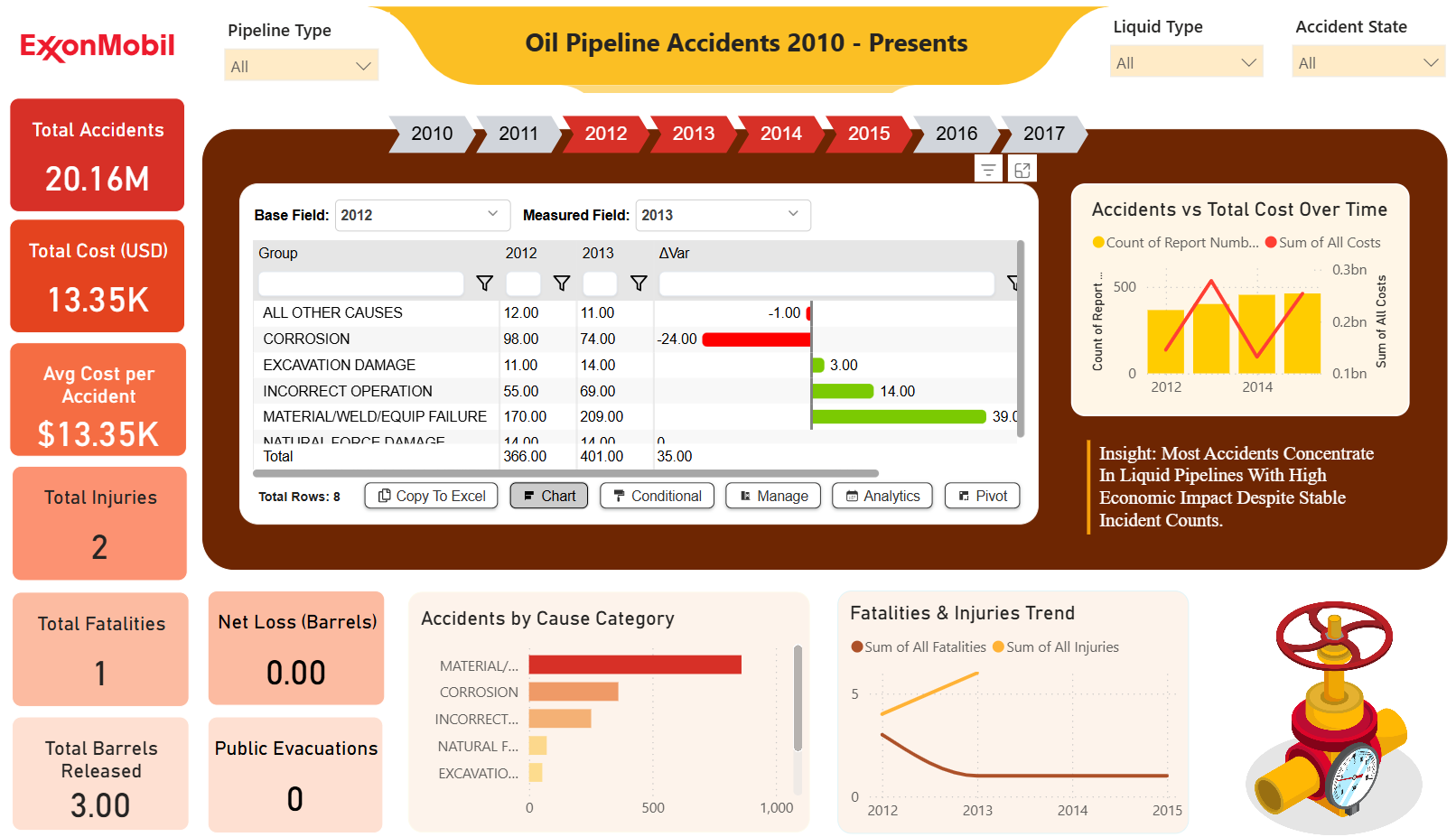
ExxonMobil Oil Pipeline Accidents Dashboard (2010–Present) – Key Insights
 Free Finance & Accounting
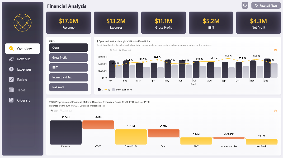
Power BI Financial Analysis Dashboard Template (Free PBIX Download)
 Free Sales & Revenue
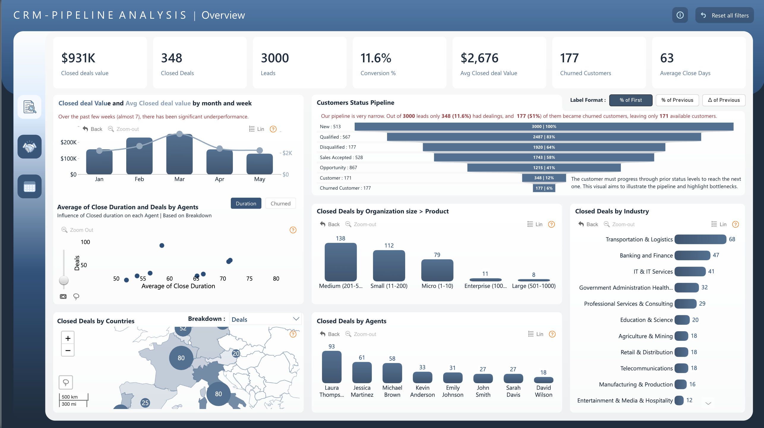
Power BI CRM Pipeline Analysis Dashboard Template (Free PBIX Download)
If you find this website helpful, share it with friends and colleagues to boost their Power BI skills and work efficiency!
Like this site? Share it