Power BI North America Retail Supply Chain & Sales Analysis Dashboard Template (Free PBIX Download)
Introduction
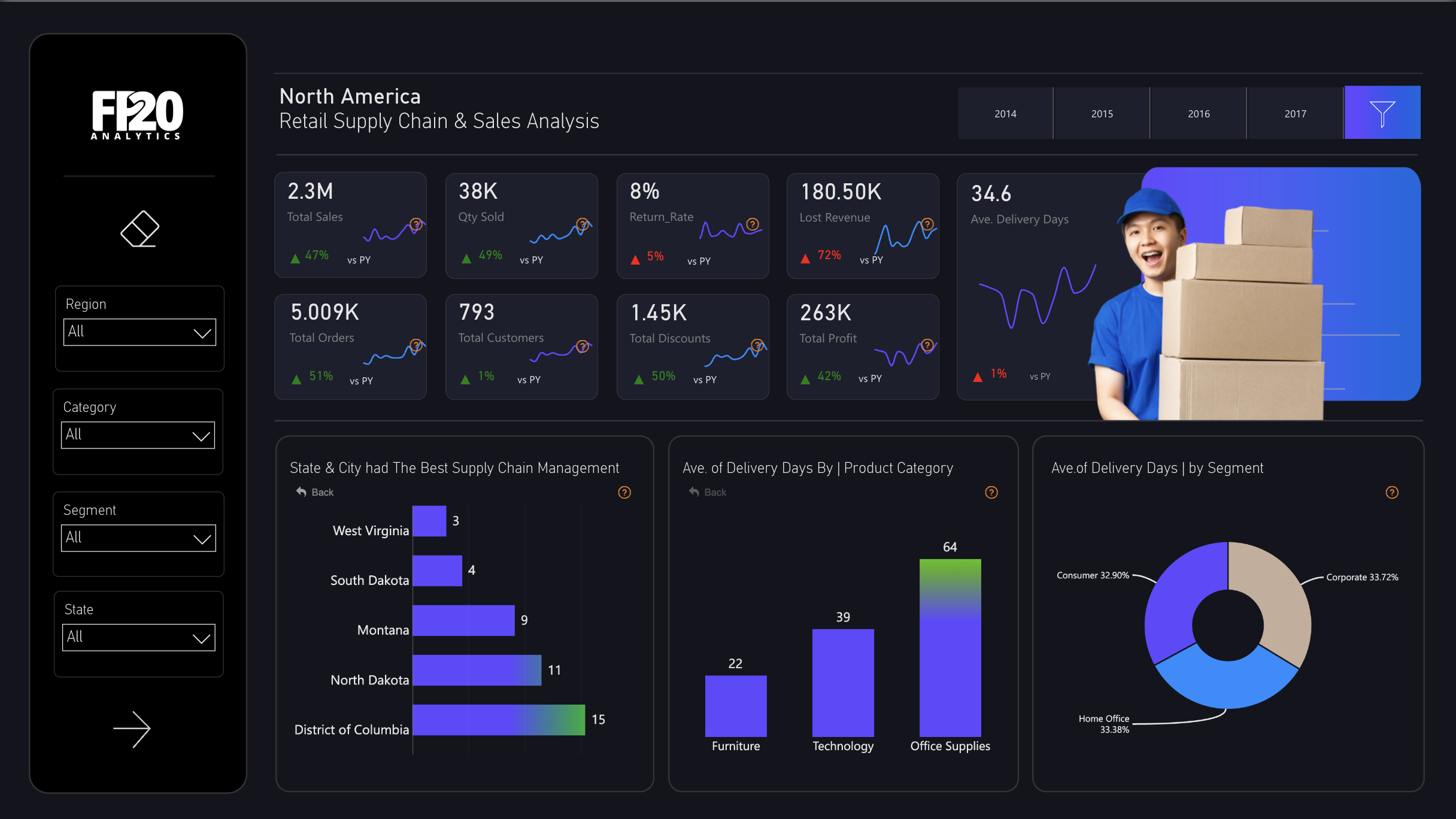
This dashboard gives retail operations leaders a unified view of supply chain health and commercial performance across North America — connecting sales volume, order fulfillment, return rates, discount exposure, and delivery efficiency in a single dark-theme analytical surface. It serves Supply Chain Directors, Retail Operations Managers, and CFOs who need to simultaneously track revenue growth and the hidden cost leakages (returns, discounts, delivery delays) that erode that growth. The year-over-year comparison across all eight KPIs — spanning 2014 to 2017 — makes performance trajectory immediately visible without requiring separate trend reports.
What's Inside This Template
KPI Grid — Eight-Metric Operational Scorecard
Row 1 — Revenue & Volume:
| MetricValueYoY vs PY | ||
| Total Sales | 2.3M | +47% |
| Qty Sold | 38K | +49% |
| Return Rate | 8% | +5% (worsening) |
| Lost Revenue | 180.50K | +72% (worsening) |
Row 2 — Orders, Customers & Profitability:
| MetricValueYoY vs PY | ||
| Total Orders | 5,009K | +51% |
| Total Customers | 793 | +1% |
| Total Discounts | 1.45K | +50% |
| Total Profit | 263K | +42% |
The revenue story is strong on the surface — 47% sales growth, 51% order growth — but the risk signals are embedded in the same row: Lost Revenue surged 72%, Return Rate worsened by 5 percentage points, and Average Delivery Days stands at 34.6. Profit grew only 42% against 47% sales growth, confirming margin compression.
The most alarming single number: Lost Revenue of 180.50K against Total Profit of 263K — lost revenue equals 68.6% of realized profit. Every percentage point improvement in return rate or discount control has an outsized impact on the bottom line.
Bar Chart — States with Best Supply Chain Management (Fewest Delivery Days)
| StateAvg Delivery Days | |
| West Virginia | 3 |
| South Dakota | 4 |
| Montana | 9 |
| North Dakota | 11 |
| District of Columbia | 15 |
West Virginia leads supply chain efficiency at just 3 days — likely due to proximity to distribution hubs or low order density enabling faster fulfillment. District of Columbia at 15 days is the slowest among the top performers, still well below the national average of 34.6 days. The chart title says "best" — meaning these are the five fastest states, not the slowest — making the national 34.6-day average look dramatically worse by comparison.
Bar Chart — Average Delivery Days by Product Category
| CategoryAvg Delivery Days | |
| Furniture | 22 |
| Technology | 39 |
| Office Supplies | 64 |
Office Supplies at 64 days is the most counterintuitive finding in the entire dashboard. Typically the simplest product category to fulfill, Office Supplies takes nearly 3× longer than Furniture and 1.6× longer than Technology. This points to either a last-mile distribution problem specific to small-parcel, high-SKU-count orders, or a supplier-side stockout pattern in the Office Supplies category.
Technology at 39 days is expected given complexity and import dependency. Furniture at 22 days outperforming both is the positive surprise — likely reflecting dedicated freight logistics for large-item delivery.
Donut Chart — Average Delivery Days by Customer Segment
| SegmentShare of Delivery Days | |
| Corporate | 33.72% |
| Home Office | 33.38% |
| Consumer | 32.90% |
Delivery day distribution across the three segments is nearly perfectly equal — within 0.82 percentage points across all three. This means no customer segment receives preferential fulfillment speed, which is either a deliberate equity policy or a sign that no segment-based SLA prioritization exists at all.
Year Filter (2014–2017)
The top navigation allows single-year or multi-year filtering, enabling point-in-time vs cumulative analysis across all visuals simultaneously.
Key Insights
Lost Revenue at 180.5K equals 68.6% of Total Profit (263K) — the single most urgent financial risk in this dashboard. A 72% YoY surge in lost revenue growing faster than the 47% sales growth confirms that return and discount leakage is scaling with volume, not being controlled as the business grows. Without intervention, lost revenue will exceed profit within the next growth cycle.
Office Supplies averaging 64 delivery days — nearly 3× Furniture — exposes a fundamental supply chain mismatch. The category with the highest order frequency, lowest unit value, and simplest fulfillment requirements is the slowest to deliver. This is a systemic distribution failure, not a product complexity issue, and represents the highest-ROI optimization opportunity in the supply chain.
Return Rate worsening by 5 percentage points YoY while Qty Sold grew 49% means absolute return volume approximately doubled. An 8% return rate on 38K units sold implies ~3,040 returned items. If average unit value is ~$60 (2.3M ÷ 38K), that's ~$182K in returned goods — consistent with the 180.5K Lost Revenue figure. Returns are not a tail-risk — they are already the primary profit leak.
Customer count grew only 1% (793 total) while orders grew 51% — meaning existing customers drove nearly all volume growth. Average orders per customer increased from roughly 3.3 to approximately 5.0 — a 52% increase in purchase frequency. This is a strong retention and upsell signal, but also means the business is highly concentrated: 793 customers generating 2.3M in sales implies an average customer value of ~$2,900, making churn risk significant.
Profit grew 42% against 47% sales growth — a 5-point margin compression. The culprits are visible: Discounts grew 50% (faster than sales), Lost Revenue grew 72% (far faster than sales), and Delivery Days at 34.6 imply operational cost overhead. The business is scaling revenue but not scaling profitability — a pattern that becomes unsustainable past a certain volume threshold.
West Virginia's 3-day delivery average vs the 34.6-day national average is an 11.5× efficiency gap that the dashboard does not explain but clearly signals. Identifying what West Virginia does differently — warehouse proximity, carrier contracts, order density — and replicating it in underperforming states is the highest-leverage supply chain action available from this data.
Who This Template Is For
- Supply Chain Directors and VP of Operations at North American retail or wholesale companies who need a single dashboard connecting fulfillment speed, return rate, and lost revenue to overall profitability — with state-level and category-level drill-down to identify where operational investment will yield the highest margin recovery.
- CFOs and Finance Business Partners in retail who need to present the true cost of supply chain inefficiency — returns, discounts, and delivery overhead — alongside revenue growth metrics in a board-ready format that makes the profit compression story immediately visible.
- BI Developers and Analysts in retail or distribution who need a ready-to-use Power BI template connectable to an ERP (SAP, NetSuite, Dynamics 365) or order management system export, with pre-built YoY comparison logic, delivery day calculations, and segment/category breakdowns already structured for immediate use.
How to Use
Download the PBIX file from the Flexa Intel gallery. Open in Power BI Desktop (2023 or later for dark theme and gradient visual support). Connect your data source — typically an ERP or OMS export (SAP, NetSuite, Shopify Plus, Dynamics 365) with fields for order ID, order date, ship date, delivery date, product category, customer segment, state, sales amount, quantity, discount, return flag, and profit. All visuals update automatically — the eight KPI cards with YoY sparklines, state supply chain ranking, category delivery bars, segment donut, and year filter all recalculate from your connected data.
This dashboard visualizes supply chain KPIs and delivery performance powerfully but lacks a structured state-by-category matrix table — no ranked view showing each state's average delivery days per product category, return rate, lost revenue, and profit contribution side by side. Flexa Tables is a Microsoft-certified Power BI visual built for exactly this — multi-column supply chain reporting with conditional formatting by delivery tier, sortable state rankings, and expandable region-to-state-to-city hierarchies, making monthly operations reviews and carrier performance briefings significantly faster and more actionable.
Other Templates
 Free Sales & Revenue
Power BI Blinkit Grocery Sales Dashboard Template (Free PBIX Download)
 Free Retail & E-commerce
Power BI Electronic Product Reviews Dashboard Template (Free PBIX Download)
 Free Sales & Revenue
Adidas US Sales (2020–2021)
If you find this website helpful, share it with friends and colleagues to boost their Power BI skills and work efficiency!
Like this site? Share it