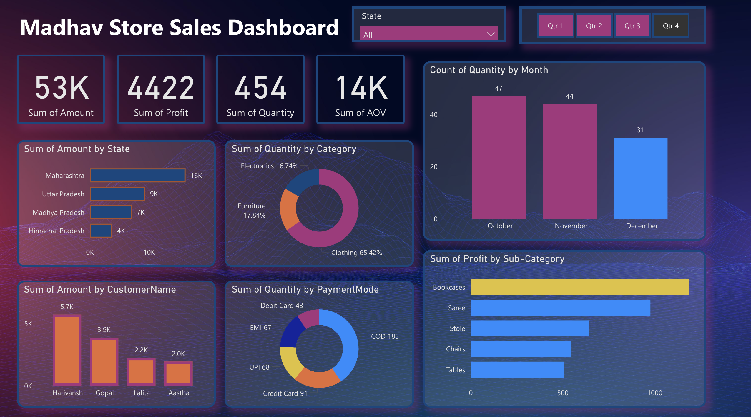
Power BI Madhav Store Sales Dashboard Template (Free PBIX Download)
Introduction
This dashboard gives retail store owners and sales managers a compact but complete view of store performance — connecting revenue by geography, product category mix, payment behavior, customer concentration, and sub-category profitability in one dark-theme interactive surface. It serves Small Business Owners, Retail Analysts, and E-commerce Operations Managers who need to understand where revenue comes from, which product lines drive profit, and how payment preferences vary across their customer base. The quarterly filter and monthly quantity trend make it equally useful for period-end reviews and real-time operational decisions.
What's Inside This Template
KPI Banner — Core Store Metrics
| MetricValueInterpretation | ||
| Sum of Amount | 53K | Total revenue in period |
| Sum of Profit | 4,422 | Net profit |
| Sum of Quantity | 454 | Total units sold |
| Sum of AOV | 14K | Average Order Value aggregate |
The profit margin implied by these figures is striking: 4,422 profit on 53K revenue yields an 8.3% net margin — thin for a retail operation. Average unit value is 53K ÷ 454 = ~117 per unit, confirming a mid-range consumer goods store. AOV at 14K (likely representing aggregated order value rather than a per-order average) suggests multi-item basket behavior among top customers.
Bar Chart — Sum of Amount by State
| StateRevenue | |
| Maharashtra | 16K |
| Uttar Pradesh | 9K |
| Madhya Pradesh | 7K |
| Himachal Pradesh | 4K |
Maharashtra dominates at 16K — 78% more than the second-ranked state (Uttar Pradesh at 9K) and 4× Himachal Pradesh. These four states account for the entirety of visible revenue, confirming this is a regionally concentrated Indian retail operation. Maharashtra's outsized share likely reflects proximity to Mumbai's high-density consumer base or the store's primary location.
Donut Chart — Sum of Quantity by Category
| CategoryShare | |
| Clothing | 65.42% |
| Furniture | 17.84% |
| Electronics | 16.74% |
Clothing is the overwhelming volume driver at nearly two-thirds of all units sold. Furniture and Electronics split the remainder almost equally. This is a classic general merchandise store profile where apparel drives transaction frequency while Furniture and Electronics drive ticket size. The near-equal Furniture/Electronics split (17.84% vs 16.74%) suggests neither category dominates the non-apparel mix.
Bar Chart — Count of Quantity by Month (Q4 visible: Oct–Dec)
| MonthUnit Count | |
| October | 47 |
| November | 44 |
| December | 31 |
The current view is filtered to Q4 (Qtr 4 tab active). October leads Q4 at 47 units — likely pre-Diwali demand in an Indian retail context. Volume drops steadily through November (44) and December (31), a 34% decline from October to December. This counter-seasonal pattern relative to Western retail (where December peaks) aligns with Indian festive calendar buying concentrated in October (Navratri, Dussehra, Diwali).
Bar Chart — Sum of Amount by Customer Name
| CustomerAmount | |
| Harivansh | 5.7K |
| Gopal | 3.9K |
| Lalita | 2.2K |
| Aastha | 2.0K |
The top 4 customers generate 13.8K in revenue — 26% of total store revenue (53K) from just 4 individuals. Harivansh alone at 5.7K represents 10.8% of total revenue. This extreme customer concentration is a significant business risk — losing the top 2 customers would remove ~18% of revenue immediately.
Donut Chart — Sum of Quantity by Payment Mode
| Payment ModeUnits | |
| COD (Cash on Delivery) | 185 |
| Credit Card | 91 |
| UPI | 68 |
| EMI | 67 |
| Debit Card | 43 |
COD dominates at 185 units — 40.7% of all transactions — reflecting the persistent cash-preference culture in Indian retail, particularly in Tier 2 and Tier 3 markets. Digital payments (UPI + Credit Card + Debit Card + EMI) collectively account for 269 units (59.3%), indicating the store has meaningful digital payment adoption. UPI at 68 units and EMI at 67 units are nearly identical, suggesting installment financing and instant digital transfers serve similar customer segments.
Bar Chart — Sum of Profit by Sub-Category
| Sub-CategoryApprox. Profit | |
| Bookcases | ~1,000+ (dominant) |
| Saree | ~800 |
| Stole | ~500 |
| Chairs | ~450 |
| Tables | ~420 |
Bookcases are the single highest-profit sub-category by a wide margin — significantly outperforming all others including Saree (the top Clothing sub-category). This is the most counterintuitive finding in the dashboard: in a store where Clothing drives 65% of unit volume, a Furniture sub-category (Bookcases) leads profit contribution. High margin on low-volume Furniture items offsets the thinner margins typical in apparel.
Key Insights
Bookcases generate more profit than any apparel sub-category despite Clothing representing 65% of unit volume — a classic high-volume/low-margin vs low-volume/high-margin split. The store's profit engine is not its bestselling category. Any decision to reduce floor space or inventory allocation for Furniture to expand Clothing would directly harm profitability despite boosting transaction count.
Harivansh and Gopal together account for ~18% of total revenue (9.6K of 53K) from just 2 customers. This concentration makes the store's revenue highly vulnerable to personal relationship risk. If either customer shifts to a competitor, the impact is immediately visible in monthly totals. A loyalty or retention program targeting the top 10 customers by spend is not optional — it is a business continuity measure.
COD at 40.7% of transactions in a store with 8.3% net margin creates a structural cash flow and operational cost problem. COD orders carry return risk, delivery confirmation delays, and handling costs that digital payments eliminate. If COD orders have even a slightly higher return rate than digital payments, the effective margin on COD transactions could be near zero or negative. Incentivizing UPI or Credit Card payments with small discounts would improve both margin and cash flow simultaneously.
October's 47-unit Q4 peak followed by December's 31-unit low (-34%) is a Diwali demand pattern, not a December Christmas pattern. This is critical for inventory planning: the store should overstock in September for October demand, not in November for December. Western retail planning templates built around December peaks will systematically misalign this store's procurement calendar.
Maharashtra generating 16K vs Himachal Pradesh's 4K — a 4× revenue gap — on presumably similar store operations suggests either dramatically different customer density or pricing strategy by region. If these are multiple store locations, Maharashtra's model should be the operational benchmark for the underperforming states. If these are delivery/shipping geographies, Maharashtra's dominance reflects the store's core serviceable market and expansion into other states is early-stage.
The near-parity between UPI (68 units) and EMI (67 units) reveals two opposite buyer profiles coexisting in the same customer base. UPI buyers are making instant, low-friction decisions — likely for lower-ticket Clothing items. EMI buyers are financing larger purchases — likely Furniture or Electronics. Marketing and product placement strategies for these two groups should be entirely different, but the dashboard currently treats them as interchangeable payment methods.
Who This Template Is For
- Small and Mid-Size Retail Store Owners in India who need a ready-to-use Power BI dashboard to track sales by state, customer, and product category without a dedicated analytics team — connectable to a simple Excel sales ledger or Tally export in under an hour.
- E-commerce and D2C Operations Managers managing multi-state Indian retail distribution who need to monitor regional revenue concentration, payment mode preferences by market, and seasonal demand patterns across quarterly periods.
- BI Students and Power BI Beginners who want a clean, well-structured retail dataset dashboard as a learning template — covering bar charts, donut charts, KPI cards, slicers, and profit analysis in a single-page layout that demonstrates core Power BI visual design patterns.
How to Use
Download the PBIX file from the Flexa Intel gallery. Open in Power BI Desktop (2023 or later). Connect your data source — typically a retail sales Excel file or CSV export from a POS system (Tally, Vyapar, Zoho Books, or a custom spreadsheet) with fields for order date, customer name, state, product category, sub-category, quantity, amount, profit, and payment mode. All visuals update automatically — KPI cards, state revenue bars, category donut, monthly quantity bars, customer spend chart, payment mode donut, and profit sub-category bars all recalculate from your connected data. Use the State dropdown and quarterly tabs (Qtr 1–4) to filter all visuals simultaneously.
This dashboard visualizes store performance across geography, category, and payment mode effectively but lacks a structured customer-level profit table — no ranked view showing each customer's total spend, units purchased, payment mode preference, primary category, and profit contribution side by side. Flexa Tables is a Microsoft-certified Power BI visual built for exactly this — multi-column retail customer reporting with conditional formatting by revenue tier, sortable rankings, and expandable state-to-customer hierarchies, making monthly sales reviews and customer retention conversations significantly faster and more data-driven.
Other Templates
 Free
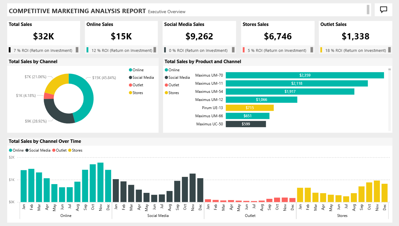
Free Power BI Competitive Marketing Analysis Dashboard Template (Free PBIX Download)
 Free Marketing
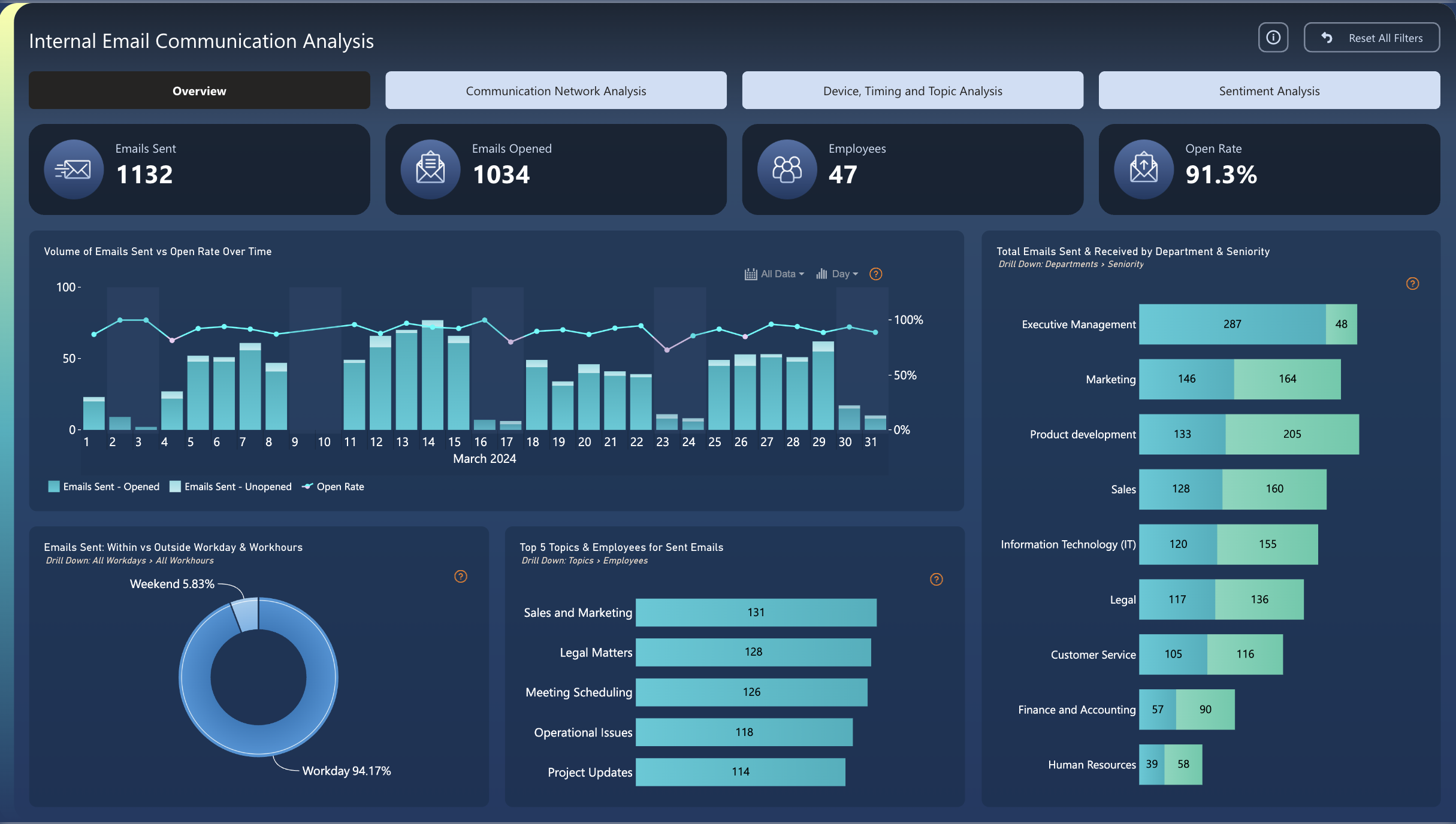
Power BI Internal Email Communication Dashboard Template (Free PBIX Download)
 Free Operations & Production
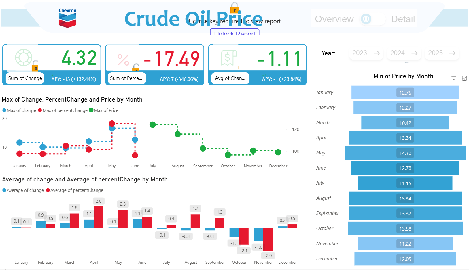
Chevron Crude Oil Price Dashboard – Key Insights (2023–2025)
If you find this website helpful, share it with friends and colleagues to boost their Power BI skills and work efficiency!
Like this site? Share it