Power BI HR Analysis Dashboard Template — Workforce & Retention Analytics (Free PBIX Download)
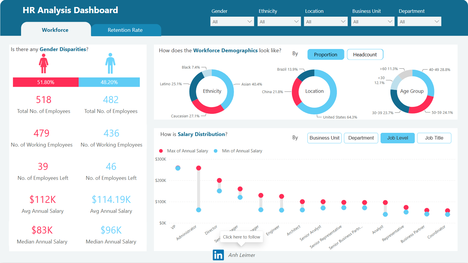
Introduction: This Power BI HR Analysis Dashboard gives HR directors and people analytics teams a complete workforce composition view across 1,000 employees — breaking down gender disparity, ethnicity distribution, geographic location, age group, attrition count, salary ranges by job level, and retention rate in a two-tab layout (Workforce + Retention Rate). Unlike standard HR dashboards that report headcount in aggregate, this template uses side-by-side gender comparison for every metric — making pay equity analysis, attrition disparity, and demographic representation gaps immediately visible without any additional filtering.
What's Inside This Template
Filters (top bar): Gender | Ethnicity | Location | Business Unit | Department — five cross-filtering slicers enabling instant segmentation of all visuals simultaneously.
Two-Tab Structure: Workforce (active) | Retention Rate — the Workforce tab covers current state composition and salary; Retention Rate tab covers attrition patterns and retention trends.
Gender Disparity Panel (left)
Side-by-side female (pink) vs male (blue) comparison across all workforce metrics:
| MetricFemaleMale | ||
| Gender Share | 51.80% | 48.20% |
| Total Employees | 518 | 482 |
| Working Employees | 479 | 436 |
| Employees Left | 39 | 46 |
| Avg Annual Salary | $112K | $114.19K |
| Median Annual Salary | $83K | $96K |
Female majority workforce (51.80%) with slightly lower average salary ($112K vs $114.19K, -1.9% gap) and significantly lower median salary ($83K vs $96K, -13.5% gap). The average vs median divergence is the most analytically important salary finding: a 1.9% mean gap but 13.5% median gap means the female salary distribution is more compressed at the lower end — fewer high-earning female outliers pulling up the average, but the typical female employee earns $13K less than the typical male employee.
Male attrition is higher in absolute numbers (46 left vs 39 left) despite having fewer total employees (482 vs 518). Male attrition rate: 46/482 = 9.5%. Female attrition rate: 39/518 = 7.5%. Males leave at a rate 27% higher than females — a meaningful retention disparity that the Retention Rate tab presumably explores further.
Working employees: Female 479/518 = 92.5% active. Male 436/482 = 90.5% active. Both close, female retention marginally better.
Workforce Demographics (center/right)
By Ethnicity (Donut):
| EthnicityShare | |
| Asian | 40.4% |
| Caucasian | 27.1% |
| Latino | 25.1% |
| Black | 7.4% |
Asian employees at 40.4% are the plurality — the largest single ethnicity group, significantly above Caucasian (27.1%). In a US-based technology, finance, or professional services firm, this distribution is consistent with industry demographic patterns in major tech hubs (San Francisco, Seattle, New York). Black representation at 7.4% is below the US workforce average of ~13% — a DEI gap that HR leadership would need to address in hiring pipeline and retention programs.
By Location (Donut):
| LocationShare | |
| United States | 64.3% |
| China | 21.8% |
| Brazil | 13.9% |
Three-country workforce with US as home base (64.3%) and two significant offshore/international locations — China (21.8%) and Brazil (13.9%). The China + Brazil combined share of 35.7% means over one-third of the workforce is international, creating management complexity around time zones, legal entities, compensation structures, and cultural integration. The Ethnicity donut's high Asian share (40.4%) combined with China being 21.8% of location confirms the China office is a significant headcount contributor.
By Age Group (Donut):
| Age GroupShare | |
| 40–49 | 28.8% |
| 50–59 | 24.1% |
| 30–39 | 23.7% |
| >60 | 11.3% |
| <30 | 12.1% |
52.9% of the workforce is aged 40–59 — a mature, mid-to-late career majority. The <30 cohort at only 12.1% signals a thin early-career pipeline. When the 40–49 cohort (28.8%) enters retirement age over the next 10–15 years, the organization faces a knowledge transfer and succession planning crisis if the <30 pipeline doesn't grow substantially. The >60 cohort at 11.3% means approximately 113 employees are at or approaching retirement age — immediate succession planning territory.
Salary Distribution by Job Level (Dumbbell/Range Chart)
The chart shows Min and Max annual salary (blue dot = min, red dot = max) for each job title, sorted roughly by seniority left to right:
| Job LevelMin SalaryMax SalaryRange | |||
| VP | ~$75K | ~$295K | $220K spread |
| Administrator | ~$240K | ~$295K | Narrow, high floor |
| Director | ~$130K | ~$200K | $70K spread |
| Senior Manager | ~$130K | ~$155K | $25K spread |
| Manager | ~$90K | ~$155K | $65K spread |
| Engineer | ~$80K | ~$120K | $40K spread |
| Architect | ~$80K | ~$120K | $40K spread |
| Senior Analyst | ~$75K | ~$105K | $30K spread |
| Senior Representative | ~$75K | ~$105K | $30K spread |
| Senior Business Partner | ~$80K | ~$100K | $20K spread |
| Analyst | ~$75K | ~$95K | $20K spread |
| Representative | ~$65K | ~$90K | $25K spread |
| Business Partner | ~$65K | ~$85K | $20K spread |
| Coordinator | ~$60K | ~$90K | $30K spread |
VP has the widest salary range ($220K spread) — a $75K minimum to $295K maximum across VPs indicates either highly variable VP scope (functional VPs vs business VPs) or significant tenure-based compensation variation within the VP band. The Administrator band showing a very high floor (~$240K) is unusual and likely reflects a specialized executive assistant or chief of staff role, not a standard administrative position.
Four toggle views available: Job Level (active) | Business Unit | Department | Job Title — enabling salary equity analysis across any organizational dimension without building separate reports.
Key Insights
- The $13K median salary gap between female ($83K) and male ($96K) employees — a 13.5% disparity — is the most legally and reputationally significant finding in this dashboard. Mean gap of 1.9% looks manageable; median gap of 13.5% reveals the real story: female employees are clustered in lower-salary roles even though a few high earners bring the female average close to male average. This is the classic "women are underrepresented in senior roles" pattern. The salary distribution chart by gender would confirm whether this is a level-composition issue (fewer women at VP/Director) or a within-level pay gap. Either way, the 13.5% median gap requires an equity audit.
- Male attrition rate of 9.5% vs female 7.5% — a 27% higher male exit rate — is counterintuitive given lower male median salary ($96K vs $83K female). Higher-paid employees leaving at higher rates suggests the attrition driver is not compensation but career progression, culture, or external opportunity pull. Male employees may be more aggressively recruited by competitors, or internal promotion pipelines may not be meeting male career expectations at the rate female employees are experiencing. The Retention Rate tab would reveal whether this gap is concentrated in specific job levels, departments, or locations.
- 52.9% of the workforce aged 40–59 with only 12.1% under 30 creates a structural succession planning crisis in 10–15 years. When the 40–49 cohort (288 employees) begins exiting over the next decade, the pipeline of <30 employees (121) is 42% of the cohort size — meaning the organization cannot replace natural attrition from the 40s cohort through organic early-career hiring at current rates. Graduate recruitment, internship conversion, and early-career development programs need to be structurally increased now to avoid a talent cliff.
- Black representation at 7.4% against a US workforce average of ~13% is the DEI gap most visible in the ethnicity chart. In a 1,000-person organization, closing the gap from 7.4% to 13% would require hiring 56 additional Black employees — achievable through targeted HBCU partnerships, diverse slate requirements for open roles, and retention programs addressing the specific factors driving Black attrition. The dashboard's ethnicity filter enables a more granular analysis: whether Black underrepresentation is concentrated in specific job levels (likely senior roles) or uniform across the organization.
- VP salary range spanning $75K to $295K — a $220K spread — indicates either a broken compensation band or deliberately uncapped executive compensation. A $75K minimum VP salary alongside $295K maximum VPs in the same band means entry-level VPs earn less than some Directors or Senior Managers. This creates internal equity tension and potential compression issues where newly promoted VPs earn less than their former direct reports. Band normalization or creating an explicit VP band minimum above Director maximum would resolve this.
- China (21.8%) + Brazil (13.9%) = 35.7% international workforce with likely significant local compensation differences means the global average salary figures ($112K female, $114K male) are blended across three distinct labor markets. US-only average is almost certainly $140–160K+; China and Brazil would be $40–70K in USD equivalent. The gender pay gap analysis is only meaningful when filtered to a single country — a mixed global salary analysis conflates geographic pay differentials with gender equity findings. The Location filter exists precisely for this — but HR analysts must use it, not rely on the global average.
Who This Template Is For
- HR Directors and Chief People Officers who need a board-ready workforce composition dashboard showing gender disparity, ethnicity representation, age group distribution, and salary equity in a single page — replacing quarterly manual Excel HR reports with an interactive Power BI workforce analysis tool
- Compensation and Benefits Analysts using the salary distribution range chart to identify pay band compression, outlier salaries within job levels, and gender pay equity gaps across Business Unit, Department, Job Level, and Job Title dimensions
- People Analytics Teams and HR Business Partners building DEI reporting infrastructure that makes demographic representation and attrition disparity visible at the department and business unit level — with the five-filter panel enabling instant segmentation by any combination of Gender, Ethnicity, Location, Business Unit, and Department
How to Use
- Download the PBIX file
- Open in Power BI Desktop
- Connect your HRIS data source — the model requires an employee table with employee ID, gender, ethnicity, location/country, business unit, department, job level, job title, annual salary, employment status (active/left), and hire/exit dates (compatible with Workday, SAP SuccessFactors, BambooHR, or any HRIS CSV export)
- Use Gender, Ethnicity, Location, Business Unit, and Department slicers to cross-filter all demographics and salary visuals simultaneously; toggle between Proportion and Headcount views for demographic donuts; switch Salary Distribution between Job Level, Department, Business Unit, and Job Title for multi-dimensional pay equity analysis; navigate to the Retention Rate tab for attrition trend analysis
"The salary distribution range chart and workforce metrics in this dashboard use native Power BI visuals. To display a structured compensation table with expandable job level hierarchies, gender pay gap columns per level, ethnicity representation variance vs benchmark, and conditional formatting flagging pay equity risks — Flexa Tables is a Microsoft-certified Power BI visual purpose-built for structured HR and compensation reporting with full drill-down and formatting control."
Other Templates
 Free Finance & Accounting
Financial Performance Overview
 Free Sales & Revenue
Car Sales Dashboard – Key Insights (YTD 2023)
 Free Finance & Accounting
Power BI CFO Cash Flow Statement Dashboard Template (Free PBIX Download)
If you find this website helpful, share it with friends and colleagues to boost their Power BI skills and work efficiency!
Like this site? Share it