Power BI Financial Analysis Dashboard Template (Free PBIX Download)
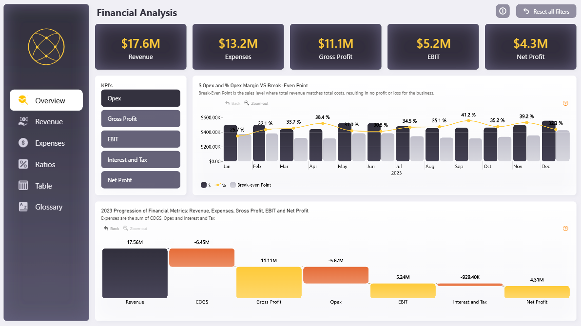
Introduction: This Power BI Financial Analysis dashboard delivers a full-year income statement overview in a single page — from top-line revenue down to net profit — with monthly break-even tracking and a waterfall decomposition of how each cost layer erodes gross revenue. Designed for finance teams who need both executive summary and operational detail without switching between reports.
What's Inside This Template
Top KPI Banner Five headline cards give an instant full-year snapshot:
- Revenue: $17.6M
- Expenses: $13.2M (total cost load = 75% of revenue)
- Gross Profit: $11.1M
- EBIT: $5.2M
- Net Profit: $4.3M
The gap between Gross Profit ($11.1M) and EBIT ($5.2M) — a $5.87M drop — is entirely explained by Opex, which the bottom chart confirms.
Opex $ and Opex Margin % vs Break-Even Point (Monthly) This is the analytical core of the Overview page. It overlays three data series monthly across all of 2023:
- Opex in dollars (dark bars) — actual operating expense per month
- Opex Margin % (gold line) — Opex as a percentage of revenue, ranging from 29.7% (Jan) to 41.2% (Oct)
- Break-Even Point (gray bars) — the revenue threshold where total costs equal total revenue, resulting in zero profit
Key pattern: Opex margin peaks at 41.2% in October and 39.2% in November, the two highest months of the year — suggesting either seasonal cost spikes or revenue softness in Q4. January shows the lowest Opex margin at 29.7%, indicating the most efficient month operationally.
The break-even bars remain relatively flat across the year, meaning fixed cost structure is stable — the margin volatility is driven by variable Opex movement, not structural cost changes.
2023 Waterfall: Revenue → COGS → Gross Profit → Opex → EBIT → Interest & Tax → Net Profit This waterfall is the clearest P&L decomposition visual in the dashboard. Reading left to right:
| StepValueImpact | ||
| Revenue | +$17.56M | Starting point |
| COGS | -$6.45M | 36.7% of revenue consumed by cost of goods |
| Gross Profit | $11.11M | 63.3% gross margin |
| Opex | -$5.87M | The single largest profit eroder after COGS |
| EBIT | $5.24M | 29.8% EBIT margin |
| Interest & Tax | -$929.4K | Relatively contained at 5.3% of EBIT |
| Net Profit | $4.31M | 24.5% net margin |
The Opex bar (-$5.87M) is nearly as large as the COGS bar (-$6.45M) — meaning operating overhead is almost as costly as production. This is a signal for management to scrutinize whether Opex is being deployed efficiently relative to revenue generated.
Multi-Page Navigation The left sidebar reveals this is a multi-tab report: Overview, Revenue, Expenses, Ratios, Table, Glossary. The Overview page shown here is the executive entry point; deeper drill-down exists in dedicated tabs.
Key Insights
- Net margin of 24.5% is healthy for most industries, but the Opex-to-revenue ratio averaging ~35% across the year is the number to watch — it's the primary lever management can pull to improve EBIT without touching pricing or COGS.
- Q4 Opex margin spike (Oct: 41.2%, Nov: 39.2%) is the biggest anomaly in the dataset. Either revenue dipped in Q4 while costs held fixed, or discretionary spend accelerated. Worth drilling into the Expenses tab to identify the category driver.
- Interest & Tax at only $929K against $5.24M EBIT (17.7% effective drag) suggests low debt load — this is a business largely self-funded or with minimal leverage, which keeps net profit close to EBIT.
- Break-even point remains stable all year — the gray bars in the monthly chart don't fluctuate significantly, confirming the cost base is predominantly fixed. Scaling revenue without proportionally scaling Opex would deliver strong margin improvement.
- The Glossary tab is a notable UX decision — embedding financial term definitions inside the report itself makes this template usable by non-finance stakeholders without external reference material.
Who This Template Is For
- CFOs and Finance Managers who present monthly P&L performance to boards and need a clean, professional single-page summary
- Financial Analysts building standardized reporting across business units
- Accountants transitioning from static Excel P&L sheets to interactive Power BI dashboards with drill-through capability
How to Use
- Download the PBIX file
- Open in Power BI Desktop
- Connect your data source — the model accepts any structured income statement data (Excel, SQL, or direct connector)
- All KPI cards, the break-even chart, and the waterfall update automatically
Soft CTA:
"Need to add collapsible account hierarchies and variance columns to your P&L table? Flexa Tables is a Microsoft-certified Power BI visual built exactly for financial statement reporting."
Other Templates
 Free Sales & Revenue
Power BI Sales Dashboard with Variance Analysis — Contoso BI Template (Free PBIX Download)
 Free Finance & Accounting
Power BI Profit & Loss Dashboard Template (Free PBIX Download)
 Free Finance & Accounting
Power BI Credit Card Customer Report Dashboard Template (Free PBIX Download)
If you find this website helpful, share it with friends and colleagues to boost their Power BI skills and work efficiency!
Like this site? Share it