Power BI Executive Financial Performance Dashboard Template (Free PBIX Download)
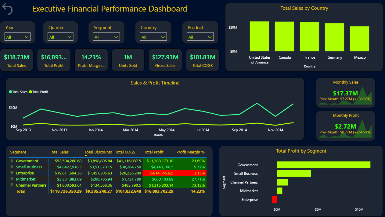
Introduction: This Power BI Executive Financial Performance Dashboard delivers a complete multi-dimensional P&L view across five customer segments, five countries, and 15 months of sales history — all on a single dark-themed executive page. It combines a segment-level profit table with conditional formatting, a sales and profit timeline, geographic distribution, and MoM growth cards, making it the reference template for CFOs and finance directors who present board-level performance without drilling into operational detail.
What's Inside This Template
Filter Bar Five slicers at the top: Year, Quarter, Segment, Country, Product — all set to "All" in this view. This filter combination allows any executive to instantly re-scope the entire dashboard to a specific product line in a specific country for a specific quarter without touching the underlying data model.
Top KPI Banner
| MetricValue | |
| Total Sales | $118.73M |
| Total Profit | $16,893...M (truncated, ~$16.89M) |
| Profit Margin | 14.23% |
| Units Sold | 1M |
| Gross Sales | $127.93M |
| Total COGS | $101.83M |
The gap between Gross Sales ($127.93M) and Total Sales ($118.73M) — a $9.2M difference — matches exactly the Total Discounts figure in the segment table ($9,205,248.27), confirming that Net Sales = Gross Sales minus Discounts. This is a clean, internally consistent data model. The COGS-to-Gross-Sales ratio is 79.6% — meaning gross margin is only 20.4% before operating expenses, leaving the 14.23% net margin achievable only through tight overhead control.
Total Sales by Country (Bar Chart)
All five countries show bars clustered near $20M with minimal visible differentiation — the chart scale compresses the differences. Approximate values based on bar heights:
| CountryEst. Sales | |
| United States | ~$23–24M |
| Canada | ~$22–23M |
| France | ~$22–23M |
| Germany | ~$22–23M |
| Mexico | ~$21–22M |
The near-uniform distribution across all five countries (~20% each) is atypical for international businesses where home markets typically dominate. This either reflects deliberate market diversification strategy, a dataset designed for demonstration purposes, or a business model where country operations are independently structured with similar scale targets.
Sales & Profit Timeline (Sep 2013 – Dec 2014)
Two lines tracked monthly — Total Sales (brighter green) and Total Profit (darker green, near-flat):
Sales trend:
- Sep 2013: ~$5M baseline
- Gradual climb through late 2013 to ~$6–7M range
- Significant spike in Jul–Aug 2014: ~$10M peak
- Dip to ~$4M in Sep–Oct 2014
- Strong recovery to ~$10M in Nov–Dec 2014
Profit line: Remains nearly flat across the entire 15-month period at close to $0M relative to the sales scale — visually confirming that profit margins are thin and do not amplify proportionally with revenue spikes. High-revenue months do not produce proportionally higher profits, which points to variable cost structures (COGS, discounts) scaling with revenue rather than fixed-cost leverage.
Monthly Sales MoM Cards (right panel):
- Monthly Sales: $17.37M — Prev Month: $7.27M (+138.98% MoM)
- Monthly Profit: $2.72M — Prev Month: $0.77M (+254.97% MoM)
A +138.98% MoM sales jump is extraordinary — this is the most striking number in the entire dashboard. It indicates either a major seasonal event, a large one-time contract close, or a promotional campaign that drove outsized volume in the most recent month. The profit jump of +254.97% MoM outpacing the sales jump confirms positive operating leverage in that specific month — costs did not scale proportionally with revenue, delivering disproportionate profit.
Segment P&L Table
| SegmentTotal SalesTotal DiscountsTotal COGSTotal ProfitProfit Margin % | |||||
| Government | $52,504,260.68 | $3,898,805.84 | $41,116,087.5 | $11,388,173.18 | 21.69% |
| Small Business | $42,427,918.5 | $3,513,781.5 | $38,284,750 | $4,143,168.5 | 9.77% |
| Enterprise | $19,611,694.38 | $1,457,305.63 | $20,226,240 | ($614,545.62) | -3.13% |
| Midmarket | $2,381,883.09 | $200,786.94 | $1,721,780 | $660,103.09 | 27.71% |
| Channel Partners | $1,800,593.64 | $134,568.36 | $483,790.5 | $1,316,803.14 | 73.13% |
| Total | $118,726,350.29 | $9,205,248.27 | $101,832,648 | $16,893,702.29 | 14.23% |
The conditional formatting on Profit Margin % — green for positive, red for negative — immediately draws attention to the Enterprise segment loss. The table uses expandable rows (+ icons visible) for drill-down within each segment.
Total Profit by Segment (Bar Chart, right panel) Visually confirms the table: Government bar dominates (~$11M), Small Business second (~$4M), Channel Partners third (small but visible), Midmarket minimal, Enterprise shown in red as the only loss-making segment.
Key Insights
- Enterprise is the only loss-making segment at -3.13% margin (-$614,545) despite being the 3rd largest by revenue ($19.6M). The cause is structural: COGS of $20.2M exceeds revenue of $19.6M — meaning the business is selling to Enterprise customers below cost before accounting for any operating overhead. This is not a discount problem ($1.46M in discounts is the lowest ratio of any segment) — it is a pricing or cost-structure problem. Enterprise contracts are likely being won on price at terms that guarantee a loss.
- Channel Partners deliver the highest margin at 73.13% on the smallest revenue base ($1.8M). COGS is only $483K against $1.8M revenue — a 73% gross contribution. This is a fundamentally different cost structure from direct segments, consistent with a reseller or licensing model where the channel partner absorbs fulfillment costs. Scaling Channel Partners revenue from $1.8M toward Small Business scale ($42M) while maintaining margin structure would transform overall portfolio profitability.
- Government is carrying the business — $52.5M revenue (44.2% of total) at 21.69% margin generating $11.39M profit (67.4% of total profit). Without Government, the remaining four segments would produce only $5.5M in total profit on $66.2M revenue — a 8.3% blended margin. The portfolio is dangerously concentrated in a single segment that is subject to budget cycles, procurement timelines, and political risk.
- The +138.98% MoM sales spike to $17.37M is the highest single-month figure in the 15-month timeline — more than double most prior months. At 14.23% margin, this month would have generated approximately $2.47M in profit, consistent with the $2.72M reported. This spike is almost certainly event-driven (quarter-end push, contract close, or promotional campaign) rather than structural demand growth. If it does not repeat, next month's MoM comparison will show a severe decline that requires pre-emptive communication to stakeholders.
- Total Discounts of $9.2M represent 7.2% of Gross Sales ($127.93M) — a meaningful discount rate that varies significantly by segment. Government discounts ($3.9M / $52.5M = 7.4%) and Small Business ($3.5M / $42.4M = 8.3%) carry the highest absolute discount loads. Midmarket and Channel Partners discount rates are proportionally lower, contributing to their superior margins. A targeted discount reduction strategy in Small Business — even 2 percentage points — would recover ~$850K in annual profit.
- The 15-month sales timeline shows two distinct peaks (Jul–Aug 2014 and Nov–Dec 2014) with a sharp valley in Sep–Oct 2014. This bimodal seasonal pattern suggests fiscal-year-end purchasing cycles — both mid-year (June 30 fiscal year ends common in government and enterprise) and calendar-year-end (December) driving concentrated buying. The Sep–Oct valley is the predictable post-fiscal-close demand trough. Sales and marketing investment in that period is structurally inefficient; operational teams should plan capacity around the two peak windows instead.
Who This Template Is For
- CFOs and Finance Directors presenting board-level financial performance across business segments and geographies, who need a single-page executive view that shows both the headline numbers and the segment-level profitability decomposition without requiring drill-through navigation
- Sales Operations and Revenue Analysts monitoring month-over-month sales trajectory, identifying which segments are growing profitably vs which are growing at a loss, and tracking discount impact on net margin by customer type
- BI Developers building executive financial dashboards who need a production-ready dark-theme template combining timeline analysis, geographic distribution, segment P&L table with conditional formatting, and MoM growth cards in one cohesive layout
How to Use
- Download the PBIX file
- Open in Power BI Desktop
- Connect your financial data source — the model requires a transactions table with date, country, segment, product, gross sales, discounts, COGS, and units fields (compatible with Excel, SQL Server, or any structured financial data source)
- All KPI cards, the timeline, country chart, segment table, and profit bar chart update automatically; use the Year/Quarter/Segment/Country/Product slicers to scope any view
"The segment P&L table in this dashboard is a native Power BI matrix — adding collapsible account hierarchies, variance-to-budget columns, and traffic-light conditional formatting per segment would require Flexa Tables, a Microsoft-certified Power BI visual purpose-built for executive financial statement reporting with full drill-down and formatting control."
Other Templates
 Free Finance & Accounting
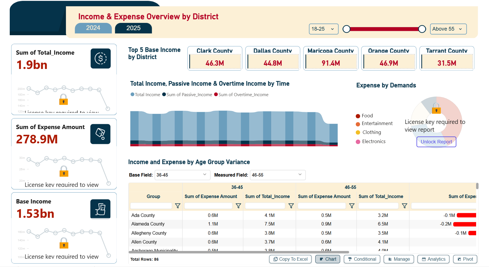
Income & Expense Overview by District – Key Insights (2025 YTD)
 Free Sales & Revenue
Power BI Sales Dashboard with Variance Analysis — Contoso BI Template (Free PBIX Download)
 Free Finance & Accounting
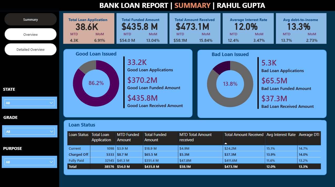
Power BI Bank Loan Report Dashboard Template (Free PBIX Download)
If you find this website helpful, share it with friends and colleagues to boost their Power BI skills and work efficiency!
Like this site? Share it