Power BI Coffee Shop Sales Dashboard Template (Free PBIX Download)

Introduction: This Power BI Coffee Shop Sales dashboard analyzes $184.30K in revenue across three New York City store locations (Astoria, Hell's Kitchen, Lower Manhattan) covering January through June. With 54K transactions at a $3.38 average unit price, it tracks sales and quantity distribution by store, product category breakdown with margin proxy data, and monthly performance against average — making it a practical reference template for F&B operators, café chain managers, and retail analysts working with multi-location point-of-sale data.
What's Inside This Template
Top KPI Banner
| MetricValue | |
| Total Sales | 184.30K |
| Total Transaction Qty | 54K |
| Average Unit Price | $3.38 |
The $3.38 average unit price across 54K transactions yielding $184.30K confirms the math: 54,158 × $3.38 ≈ $183K ✓ — internally consistent. This is a high-frequency, low-ticket operation characteristic of café businesses: volume compensates for thin per-transaction revenue. At $3.38 average, the product mix is skewed toward coffee and tea drinks rather than food items — consistent with the category breakdown below.
Three-Tab Navigation: Overview (active) | Monthly Sales | Shopper Behavior — standard drill-down from portfolio summary to time-series analysis to customer behavior patterns.
Month Selector (top right): Jan | Feb | Mar | Apr | May | Jun (active, highlighted) — filters all visuals to the selected month while the Sales by Month chart shows the full 6-month context.
Filters: Store (All) | Product (All) | Clear all slicers button — enabling instant store-level or product-level isolation.
Sales by Store (Donut) and Quantity by Store (Donut)
| StoreSalesSales %QtyQty % | ||||
| Astoria | ~$63.3K | 34.34% | ~18.5K | 34.32% |
| Hell's Kitchen | ~$62.8K | 34.06% | ~18.2K | 33.78% |
| Lower Manhattan | ~$58.3K | 31.60% | ~17.2K | 31.90% |
All three stores show near-identical revenue and quantity shares — within a 2.74 percentage point range across both metrics. This near-perfect three-way split is operationally rare in multi-location retail and suggests either quota-managed territory sizing, comparable foot traffic across all three locations, or a dataset structured around balanced store formats. The revenue share and quantity share percentages mirror each other almost exactly for each store — confirming uniform average unit price across locations, meaning no store is skewing higher on premium items or lower on discounts.
Lower Manhattan at 31.60% is the weakest performer by both revenue and quantity — a 2.74pp gap below Astoria. In NYC real estate context, this is counterintuitive: Lower Manhattan (Financial District) typically commands higher foot traffic and willingness-to-pay than Astoria (Queens) or Hell's Kitchen. The underperformance could reflect store size, operating hours, or competitive density in the FiDi area.
Sales by Month (Bar Chart — June highlighted)
The chart shows only June rendered as a visible bar at approximately $184K with a +5.68% label (vs average), against a dashed average line at $184,299. This indicates the month selector is set to June and the bar represents June's contribution — the +5.68% confirms June is performing above the 6-month average.
The dashed average line at $184,299 represents the average monthly sales across all 6 months — meaning total 6-month revenue is approximately $184,299 × 6 = $1.105M total, with $184.30K being June specifically. The KPI card "184.30K Total Sales" therefore represents June's sales, not the full 6-month total — an important disambiguation for anyone reading the dashboard in month-filtered mode.
Sales by Product Category (Horizontal Bar + Detail Table)
| CategorySales% TotalAvg Unit PriceQty Sold | ||||
| Coffee | $64.70K | 35.11% | $3.02 | 21,422 |
| Tea | $45.58K | 24.73% | $2.82 | 16,164 |
| Bakery | $29.21K | 15.85% | $3.55 | 8,242 |
| Drinking Chocolate | $17.13K | 9.29% | $4.15 | 4,123 |
| Coffee beans | $14.03K | 7.61% | $21.49 | 652 |
| Branded | $5.63K | 3.05% | $17.78 | 311 |
| Loose Tea | $4.36K | 2.37% | $9.30 | 469 |
| Flavours | $2.08K | 1.13% | $0.60 | 2,601 |
| Packaged Chocolate | $1.58K | 0.86% | $8.94 | 174 |
| Total | $184.30K | 100% | $3.38 | 54,158 |
Key Insights
- Coffee beans at $21.49 average unit price — 6.4x the portfolio average — is the highest-margin category by far, but only 652 units sold (1.2% of transactions). This is a classic retail "whale SKU" pattern: a low-volume, high-ticket item that punches above its weight in revenue contribution (7.61% of sales from 1.2% of transactions). Growing coffee bean sales by even 20% (+130 units) would add ~$2.8K in revenue — equivalent to adding 826 additional coffee drink transactions. The strategic priority for this category is clear: increase visibility, upsell at point of purchase, and potentially introduce subscription or bulk options.
- Coffee (35.11%) + Tea (24.73%) = 59.84% of all revenue from 69.3% of all transactions — confirming the business is fundamentally a beverages operation, not a café-bakery hybrid. Bakery at 15.85% is meaningful but secondary. The implication for operations: beverage quality, speed of service, and drink menu innovation drive the business; food is a complement, not a driver. Investment in barista training and coffee/tea sourcing has higher ROI than expanding the food menu.
- Flavours at $0.60 average unit price is a pricing anomaly — it is almost certainly a modifier or add-on (flavored syrups, shots) rather than a standalone product, explaining the $0.60 price and 2,601 units sold. At 4.8% of total transactions but only 1.13% of revenue, it is a high-frequency, negligible-revenue item whose primary value is as an upsell attachment to coffee and tea orders. This category should not be managed for standalone revenue but for attachment rate — every flavour add-on to a $3.02 coffee increases that transaction's revenue by 20%.
- Three stores within 2.74pp of each other in both revenue and quantity share is operationally exceptional — but masks the Lower Manhattan underperformance story. At $58.3K vs Astoria's $63.3K, Lower Manhattan leaves approximately $5K on the table per month relative to the top store. Over 12 months that's $60K — roughly one store's monthly revenue — in unrealized potential. The Shopper Behavior tab is the right place to investigate whether this gap is driven by lower footfall, lower average basket size, or lower visit frequency.
- June at +5.68% above the 6-month average ($184K vs $184.3K average) confirms seasonality is modest in this dataset — the business does not show dramatic summer spikes or winter dips within the January–June window. For a NYC café, this is consistent: cold brew/iced coffee demand increases in summer but hot beverage demand decreases proportionally, keeping total revenue relatively stable month-to-month. The Monthly Sales tab would reveal whether any individual month showed a meaningful deviation from this flat pattern.
- Drinking Chocolate at $4.15 average unit price — the highest among drink categories — and 9.29% revenue share from only 4,123 units signals a premium positioning opportunity. At $4.15 vs Coffee's $3.02, drinking chocolate commands a 37% price premium but only 19.2% of coffee's transaction volume. Seasonal promotion (winter months, Valentine's Day) could meaningfully shift this mix without requiring any pricing or product development investment — the product and the margin structure are already there.
Who This Template Is For
- F&B Operations Managers and Café Chain Owners running multi-location coffee businesses who need a single-page dashboard showing store-level revenue distribution, product category mix, monthly trend performance, and average unit price by SKU — replacing manual Excel sales summaries from POS exports
- Retail Analysts and Business Analysts in food & beverage who need a production-ready Power BI template for analyzing quick-service restaurant or café sales data with store comparison, category breakdown, and time-period filtering
- BI Developers building hospitality and F&B dashboards who want a clean, branded multi-tab template (Overview, Monthly Sales, Shopper Behavior) with donut charts for store share, horizontal bar + table combo for category analysis, and month-selector navigation
How to Use
- Download the PBIX file
- Open in Power BI Desktop
- Connect your POS data source — the model requires a transactions table with date, store location, product name, product category, unit price, and quantity fields (compatible with Square, Toast, Lightspeed, or any café POS CSV export)
- Use the Store and Product slicers to isolate any location or SKU; use the month buttons (Jan–Jun) to filter to a specific period; navigate to Monthly Sales and Shopper Behavior tabs for time-series and customer behavior analysis
"The product category breakdown table in this dashboard uses a native Power BI matrix. To add expandable category hierarchies (Category → Product → SKU variant), variance-to-prior-month columns per category, and conditional formatting flagging underperforming products by revenue or margin threshold — Flexa Tables is a Microsoft-certified Power BI visual purpose-built for structured retail product performance reporting."
Other Templates
 Free Sales & Revenue
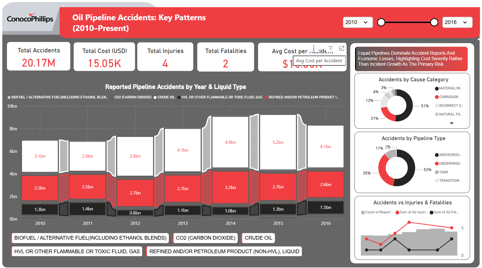
ConocoPhillips Oil Pipeline Accidents: Key Patterns (2010–Present) – Key Insights
 Free Retail & E-commerce
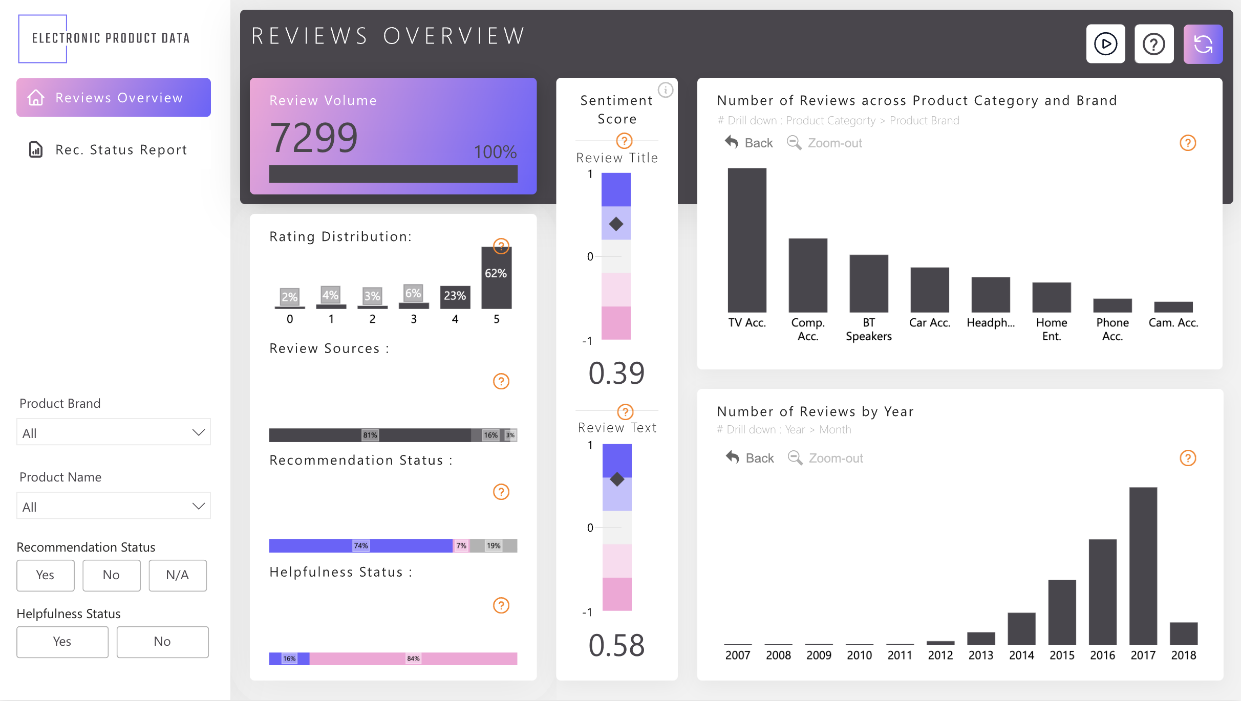
Power BI Electronic Product Reviews Dashboard Template (Free PBIX Download)
 Free Sales & Revenue
CRM Pipeline Analysis Dashboard
If you find this website helpful, share it with friends and colleagues to boost their Power BI skills and work efficiency!
Like this site? Share it