Power BI Chocolate Sales & Distribution Dashboard Template (Free PBIX Download)
Introduction
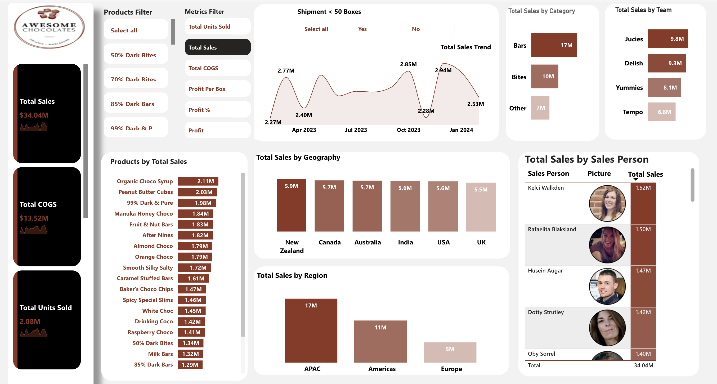
This Power BI dashboard tracks the full commercial performance of Awesome Chocolates — an organic wholesale chocolate brand — across $34.04M in total sales, 2.08M units sold, and $13.52M in COGS spanning April 2023 through January 2024. Built for FMCG Sales Directors, Category Managers, and Regional Distribution Leads, it delivers simultaneous visibility into product-level revenue ranking, six-country geographic performance, three sales team comparison, and individual sales rep contribution — all from a single interactive page with product and metric filters. The clean, warm-toned design makes it an ideal reference for BI developers building consumer goods dashboards.
What's Inside This Template
KPI Cards — Three Core Metrics with Trend Sparklines
| MetricValueDerived Insight | ||
| Total Sales | $34.04M | Full-period revenue |
| Total COGS | $13.52M | 39.7% cost ratio |
| Total Units Sold | 2.08M | $16.37 avg revenue per unit |
From these three figures, the gross profit calculates to $20.52M at a 60.3% gross margin — an exceptional result for a food wholesale business where industry averages typically sit between 30–45%.
Total Sales Trend (Line Chart, Apr 2023 – Jan 2024)
| PeriodSales | |
| Apr 2023 | $2.27M |
| May 2023 | $2.77M ← First peak |
| Jul 2023 | $2.40M ← Mid-year trough |
| Oct 2023 | $2.85M |
| Nov 2023 | $2.94M ← Highest point |
| Dec 2023 | $2.28M ← Sharp drop |
| Jan 2024 | $2.53M ← Recovery |
The trend follows a clear double-peak pattern — one in May (likely Easter/spring gifting) and one in October–November (pre-holiday corporate gifting and retail stocking). The December drop from the $2.94M November peak to $2.28M is the sharpest single-month decline in the period and warrants investigation.
Total Sales by Category
| CategorySalesShare | ||
| Bars | $17M | 50.0% |
| Bites | $10M | 29.4% |
| Other | $7M | 20.6% |
Total Sales by Team
| TeamSalesShare | ||
| Jucies | $9.8M | 28.8% |
| Delish | $9.3M | 27.3% |
| Yummies | $8.1M | 23.8% |
| Tempo | $6.8M | 20.0% |
Products by Total Sales (Top 18 visible)
| RankProductSales | ||
| 1 | Organic Choco Syrup | $2.11M |
| 2 | Peanut Butter Cubes | $2.03M |
| 3 | 99% Dark & Pure | $1.98M |
| 4 | Manuka Honey Choco | $1.84M |
| 5 | Fruit & Nut Bars | $1.83M |
| 6 | After Nines | $1.82M |
| 7 | Almond Choco | $1.79M |
| 8 | Orange Choco | $1.79M |
| 9 | Smooth Silky Salty | $1.72M |
| 10 | Caramel Stuffed Bars | $1.61M |
| 11 | Baker's Choco Chips | $1.47M |
| 12 | Spicy Special Slims | $1.46M |
| 13 | White Choc | $1.45M |
| 14 | Drinking Coco | $1.42M |
| 15 | Raspberry Choco | $1.41M |
| 16 | 50% Dark Bites | $1.34M |
| 17 | Milk Bars | $1.32M |
| 18 | 85% Dark Bars | $1.29M |
The 18 visible products total $29.68M, leaving approximately $4.36M distributed across additional SKUs below the scroll line.
Total Sales by Geography
| CountrySales | |
| New Zealand | $5.9M |
| Canada | $5.7M |
| Australia | $5.7M |
| India | $5.6M |
| USA | $5.6M |
| UK | $5.5M |
Total Sales by Region
| RegionSales | |
| APAC | $17M |
| Americas | $11M |
| Europe | $5M |
Total Sales by Sales Person (Top 5 visible)
| Sales PersonTotal Sales | |
| Kelci Walkden | $1.52M |
| Rafaelita Blaksland | $1.50M |
| Husein Augar | $1.47M |
| Dotty Strutley | $1.42M |
| Oby Sorrel | $1.40M |
| Total (all reps) | $34.04M |
Key Insights
- At 60.3% gross margin, Awesome Chocolates operates at nearly double the typical food wholesale benchmark of 30–45%. With $20.52M in gross profit on $34.04M in sales, the brand's pricing power and COGS discipline are exceptional. Either the product mix skews heavily toward premium SKUs (the 99% Dark, Manuka Honey, and organic lines confirm this), or supplier relationships provide structural cost advantages. This margin level needs to be protected — any shift toward lower-priced volume SKUs risks compressing it rapidly.
- The December 2023 sales drop from $2.94M to $2.28M — a 22.4% single-month decline — is the most operationally significant anomaly in the dataset. December should be a peak gifting month for a premium chocolate brand. A collapse of this magnitude in what should be the highest-demand period points to one of three causes: a fulfillment or supply chain disruption, a loss of a major wholesale account, or a channel mix shift that reduced recorded revenue. The Shipment < 50 Boxes filter on the dashboard is the right starting point — filtering to "Yes" (small shipments) in December may isolate whether the drop was concentrated in small retail accounts going unserviced.
- The geographic distribution across six countries is the flattest in any multi-country dashboard in this gallery — only $400K separates the top market (New Zealand $5.9M) from the bottom (UK $5.5M). This 6.8% spread between the highest and lowest markets indicates either a deliberate balanced-territory sales model or that the company has hit a growth ceiling simultaneously across all markets. There is no breakout market pulling ahead, which also means there is no obvious "next NZ" story to tell to investors or the board — geographic concentration risk is low, but upside concentration is also absent.
- Jucies team outperforms Tempo by 44% ($9.8M vs $6.8M) — the largest performance gap in any dimension of this dashboard. Given that individual sales reps across teams show very tight variance (only $120K between the top 5 visible reps), the Tempo underperformance is almost certainly a team-level issue — territory assignment, category allocation, or account portfolio — rather than individual rep quality. Reallocating Tempo's territory or assigning them APAC accounts (the highest-revenue region) could close the gap without hiring.
- Organic Choco Syrup ($2.11M) leads all SKUs, but the product curve is remarkably flat — the #1 product outsells the #18 product by only 63.6%. In most FMCG portfolios, the top 3 SKUs generate 40–60% of revenue. Here, the top 18 generate $29.68M with no runaway winner. This is either a sign of a well-curated, balanced portfolio where every SKU earns its shelf space — or a sign that no product has achieved the brand momentum to break out. The Metrics Filter (switchable to Profit Per Box and Profit %) would immediately reveal if margin concentration is as flat as revenue concentration, or if certain SKUs like 99% Dark & Pure carry disproportionate profit weight.
- APAC drives 50% of total sales ($17M) and perfectly mirrors the Bars category ($17M) — the highest-revenue region and highest-revenue category are the same size, raising the question of whether Bars are disproportionately an APAC product. If Australia, New Zealand, and India are the primary buyers of Bar SKUs while Americas and Europe skew toward Bites and Other, then any supply disruption in APAC simultaneously hits the top region and the top category — a double concentration risk that the regional and category filters can confirm in seconds.
Who This Template Is For
- FMCG Sales Directors and National Account Managers who need a single-page view of product-level revenue ranking, regional performance, and individual sales rep contribution — with the ability to filter by product line and toggle between revenue, COGS, profit margin, and units sold without rebuilding their analysis.
- Category Managers and Brand Managers in food and beverage companies who want a ready-made Power BI template structured around SKU-level revenue ranking, category share (Bars vs Bites vs Other), and a seasonal trend line — that they can connect to their own ERP or sales data extract in under an hour.
- BI Developers and Power BI Consultants building consumer goods dashboards who want a reference template with a warm, on-brand color scheme, photo-enabled sales rep table, interactive metric filter panel (toggle between Total Sales / COGS / Profit / Units), and a geography-to-region drill hierarchy — all production-ready in a single PBIX file.
How to Use
- Download the PBIX file from the Flexa Intel gallery.
- Open in Power BI Desktop — the template uses only native visuals and requires no custom visual installs.
- Connect your data source — the underlying schema requires a sales transactions table with: Date, Product Name, Category, Units Sold, Revenue, COGS, Sales Person, Team, Country, and Region columns. Common sources include ERP exports (SAP, NetSuite), Excel order files, or a SQL sales database.
- All visuals — the trend line, product ranking bar, geography bars, regional totals, team comparison, and sales rep table — refresh automatically. The Products Filter, Metrics Filter, and Shipment < 50 Boxes toggle update every visual simultaneously on selection.
The product ranking bar shows revenue by SKU, and the geography bar shows revenue by country — but neither visual lets you see which products are selling in which countries, or which SKU-country combinations are most and least profitable. Flexa Tables is a Microsoft-certified Power BI visual that adds an expandable product-by-region matrix with conditional formatting by profit margin tier — instantly surfacing whether Organic Choco Syrup leads in APAC or Americas, and whether the 60.3% blended gross margin holds evenly across all six countries or is carried by one or two high-margin markets.
Other Templates
 Free Sales & Revenue
ConocoPhillips Oil Pipeline Accidents: Key Patterns (2010–Present) – Key Insights
 Free
Free Power BI Supply Chain Management Overview Dashboard Template (Free PBIX Download)
 Free Executive / C-Level
Power BI Executive Overview Dashboard Template (Free PBIX Download)
If you find this website helpful, share it with friends and colleagues to boost their Power BI skills and work efficiency!
Like this site? Share it