Power BI Car Sales Dashboard Template — Automotive Overview (Free PBIX Download)
Introduction
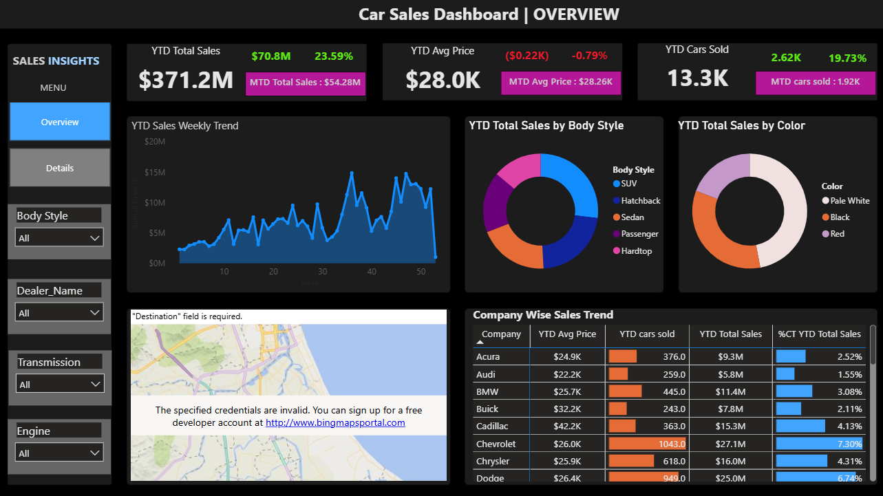
This automotive sales dashboard gives dealership groups, sales directors, and BI teams a full-year performance snapshot across revenue, unit volume, pricing, and brand contribution — all in a single Executive Overview page. The dashboard pairs YTD vs MTD comparisons with YoY growth indicators, segmentation by body style and color, and a company-level table with inline bar charts for volume and market share contribution. A Details page (accessible via left nav) enables drill-down beyond the overview. Four slicers (Body Style, Dealer Name, Transmission, Engine) allow real-time filtering without report rebuilding.
5. What's Inside This Template
KPI Cards — YTD vs MTD with YoY Variance
| MetricYTD ValueMTD ValueYoY Change | |||
| Total Sales | $371.2M | $54.28M | +$70.8M / +23.59% |
| Avg Price | $28.0K | $28.26K | -$0.22K / -0.79% |
| Cars Sold | 13.3K | 1.92K | +2.62K / +19.73% |
Three findings are immediately visible: revenue grew 23.59% YoY, unit volume grew 19.73% YoY, but average price declined 0.79%. This means the business grew primarily through volume, not pricing power — a critical strategic distinction.
YTD Sales Weekly Trend — Line Chart Weekly granularity across ~52 weeks. The chart shows a consistent ramp from ~$2–3M/week in early weeks to a peak of approximately $15–17M in weeks 40–45, followed by a moderate pullback. The acceleration begins around week 25–28, suggesting a mid-year demand shift or inventory release event. The final weeks show tapering but remain well above the H1 baseline.
YTD Total Sales by Body Style — Donut Chart
| Body StyleApproximate Share | |
| SUV | ~35–40% (largest teal segment) |
| Sedan | ~25–30% (orange) |
| Hatchback | ~15–20% (dark blue) |
| Passenger | ~10% (purple) |
| Hardtop | ~5% (pink, smallest) |
SUV is the dominant body style — consistent with broader automotive market trends. Hardtop is the smallest segment and likely a niche or legacy category.
YTD Total Sales by Color — Donut Chart
| ColorApproximate Share | |
| Pale White | ~50%+ (dominant) |
| Black | ~30% (orange segment) |
| Red | ~15–20% (light purple) |
Pale White is the clear preference across the fleet — a standard finding in mass-market automotive, but relevant for inventory planning and procurement decisions.
Company Wise Sales Trend — Table with Inline Bar Charts
| CompanyYTD Avg PriceYTD Cars SoldYTD Total Sales% Contribution | ||||
| Acura | $24.9K | 376 | $9.3M | 2.52% |
| Audi | $22.2K | 259 | $5.8M | 1.55% |
| BMW | $25.7K | 445 | $11.4M | 3.08% |
| Buick | $32.2K | 243 | $7.8M | 2.11% |
| Cadillac | $42.2K | 363 | $15.3M | 4.13% |
| Chevrolet | $26.0K | 1,043 | $27.1M | 7.30% |
| Chrysler | $25.9K | 618 | $16.0M | 4.31% |
| Dodge | $26.4K | 949 | $25.0M | 6.74% |
The table includes two inline visualisations: orange bar charts for cars sold volume, and blue bar charts for % contribution — enabling instant visual comparison without reading numbers.
Left Navigation Panel Two-page structure: Overview (current) and Details. Four filter slicers visible: Body Style, Dealer Name, Transmission, Engine — all set to "All" by default.
Map Visual Bing Maps integration — currently showing a credential error ("The specified credentials are invalid"). This is a known Power BI issue when Bing Maps is not authenticated in the target tenant. The map is designed to show dealer or geographic sales distribution.
6. Key Insights
1. Chevrolet is the volume engine of the entire portfolio — 1,043 units sold, nearly 2× the next competitor. Dodge is second at 949 units, Chrysler third at 618. Chevrolet's 1,043 units represent approximately 7.8% of all 13.3K units sold. At $26.0K average price, Chevrolet generates $27.1M — the highest absolute revenue of any brand visible. Any inventory, pricing, or channel decision affecting Chevrolet directly impacts overall dashboard numbers.
2. Cadillac is the highest-priced brand at $42.2K avg but only 4.13% revenue contribution — a premium positioning that isn't translating to volume. At 363 units and $42.2K avg price, Cadillac generates $15.3M. If it sold at Chevrolet's volume (1,043 units), it would generate $44M — 62% more than Chevrolet at a fraction of the unit count. The gap between Cadillac's price premium and its unit volume is the clearest sign of either constrained supply, limited dealer reach, or weak demand at that price point.
3. Audi has the worst revenue efficiency in the visible table — lowest avg price ($22.2K) and lowest unit volume (259). $5.8M on 259 units at $22.2K average is the weakest combination visible. Audi typically commands premium pricing in real markets — if this data is accurate, it suggests either fleet/discount sales distorting the average, or a data quality issue in the Audi segment specifically.
4. Revenue grew 23.59% YoY but average price fell 0.79% — the entire growth story is volume-driven. This is the most strategically important finding in the dashboard. Volume grew 19.73% YoY (2,620 additional units). Revenue grew 23.59%. The slight revenue-per-unit improvement comes from mix shift (more SUVs, more premium brands) rather than pricing power. If the volume growth driver is temporary (incentives, dealer expansion), the YoY comp will be difficult to repeat next year.
5. Weekly sales peaked in weeks 40–45 at ~$15–17M/week — 5–6× the H1 weekly baseline. The weekly trend line shows H1 running at $2–4M/week with a dramatic acceleration starting around week 25–28. This is not a smooth seasonal ramp — it has the shape of a specific demand or supply event (new model year release, incentive program, inventory availability). Understanding the week-40 driver is critical to forecasting the following year.
6. MTD Total Sales ($54.28M) implies the current month is tracking to be the strongest single month of the year. With 13.3K cars sold YTD and $371.2M in revenue, the monthly average is approximately $30.9M/month. MTD at $54.28M is 75% above the monthly average — suggesting either the report is captured near month-end of a peak month, or October/November is seasonally 2–3× the average month. Either way this month is an outlier worth isolating.
7. Who This Template Is For
- Automotive dealership group managers and Sales Directors who need a consolidated YTD performance view across brands, body styles, and dealer locations — updated daily from their DMS (Dealer Management System) without manual Excel reporting.
- Finance Analysts at car distributors or OEM regional offices who need to track average selling price trends, volume by brand, and market share contribution across a multi-brand portfolio in a single dashboard.
- BI Developers building automotive sales reports for dealer clients who need a polished, dark-themed template with multi-level slicers, inline bar charts, map integration, and YoY variance cards — ready to connect to any SQL or CSV sales export.
8. How to Use
- Download the PBIX file from this page.
- Open in Power BI Desktop (2023 or later recommended for map and inline chart support).
- Connect your data source — replace sample data with your DMS export (CDK, Reynolds & Reynolds, Dealertrack), SQL sales table, or Excel/CSV. Map fields: Brand/Company, Body Style, Color, Transmission, Engine, Sale Date, Sale Price, Dealer Name.
- All visuals update automatically — KPI cards with YoY variance, weekly trend, donut charts, company table, and map repopulate. For the map visual, ensure Bing Maps is authenticated in your Power BI tenant settings or replace with a custom map visual from AppSource.
9. Soft CTA (Flexa Tables)
The Company Wise Sales Trend table is a strong start, but it shows only 8 brands at a time with no ability to drill into model-level or dealer-level breakdowns without navigating to the Details page. Flexa Tables is a Microsoft-certified Power BI visual that adds expandable brand → model → dealer hierarchies with MoM and YoY variance columns built in — letting sales teams drill from Chevrolet's 1,043 units down to specific model performance and dealer contribution, directly in the published report without switching pages.
Other Templates
 Free
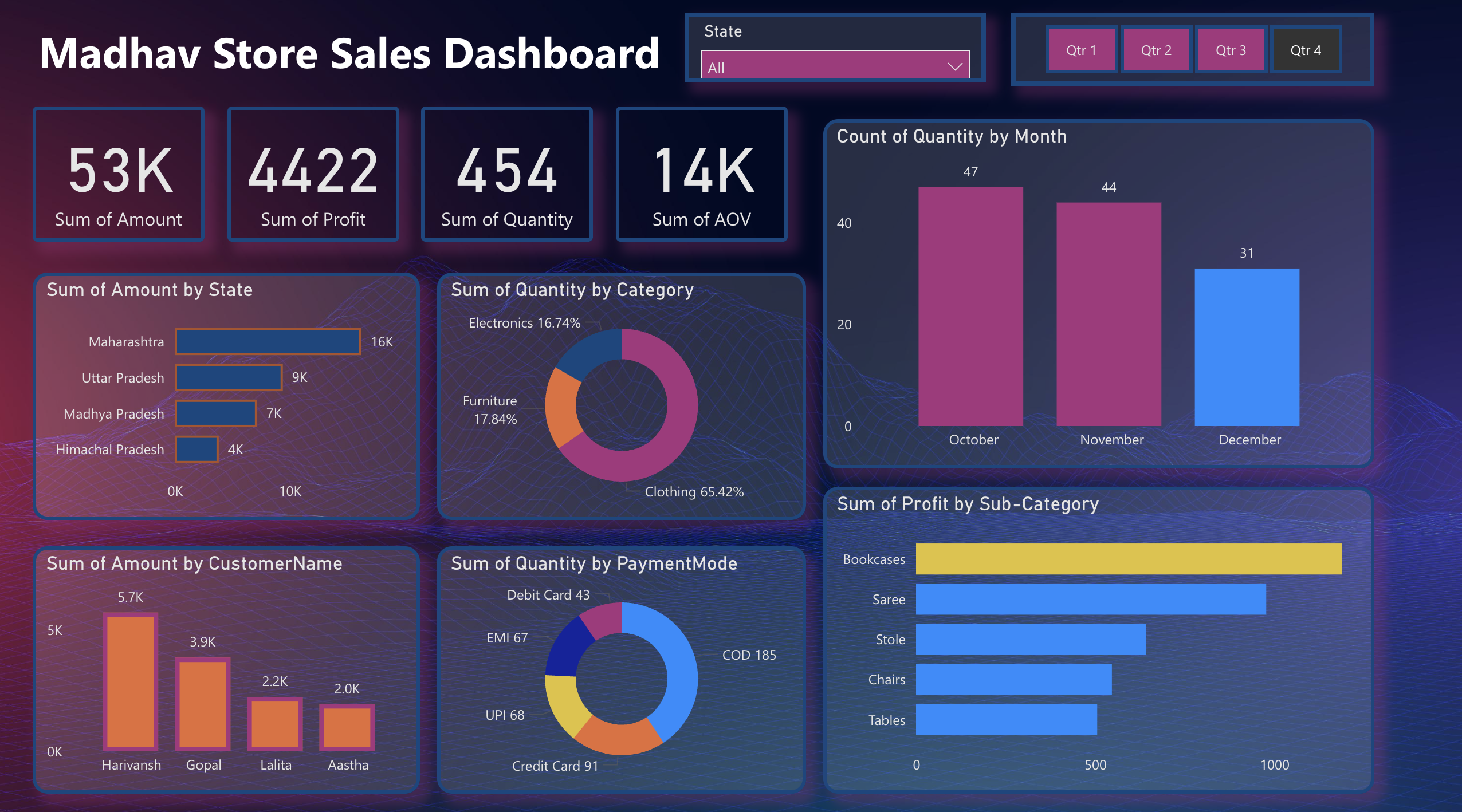
Free Power BI Madhav Store Sales Dashboard Template (Free PBIX Download)
 Free Operations & Production
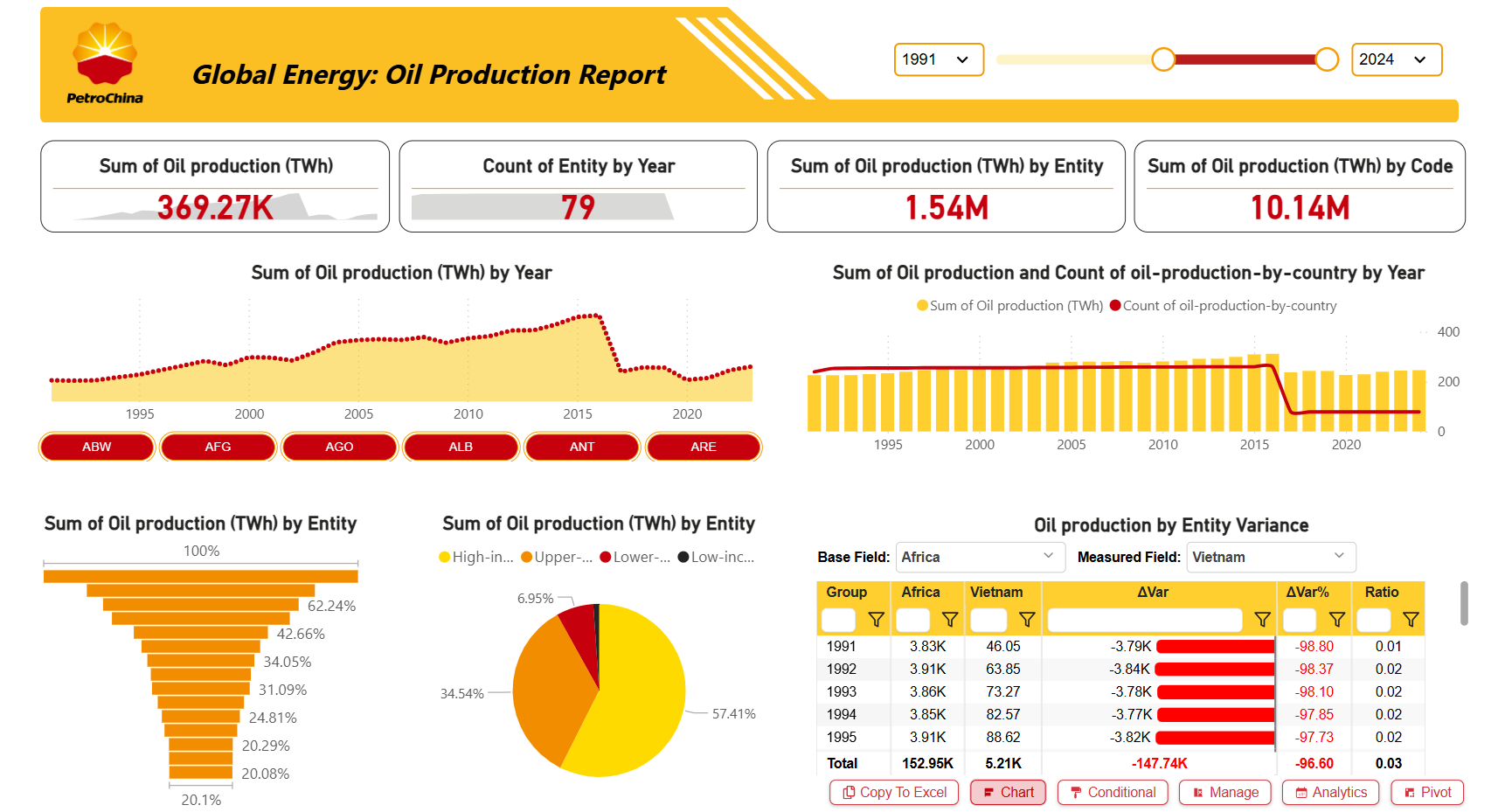
PetroChina Global Energy: Oil Production Report – Key Insights (1991–2024)
 Free Sales & Revenue
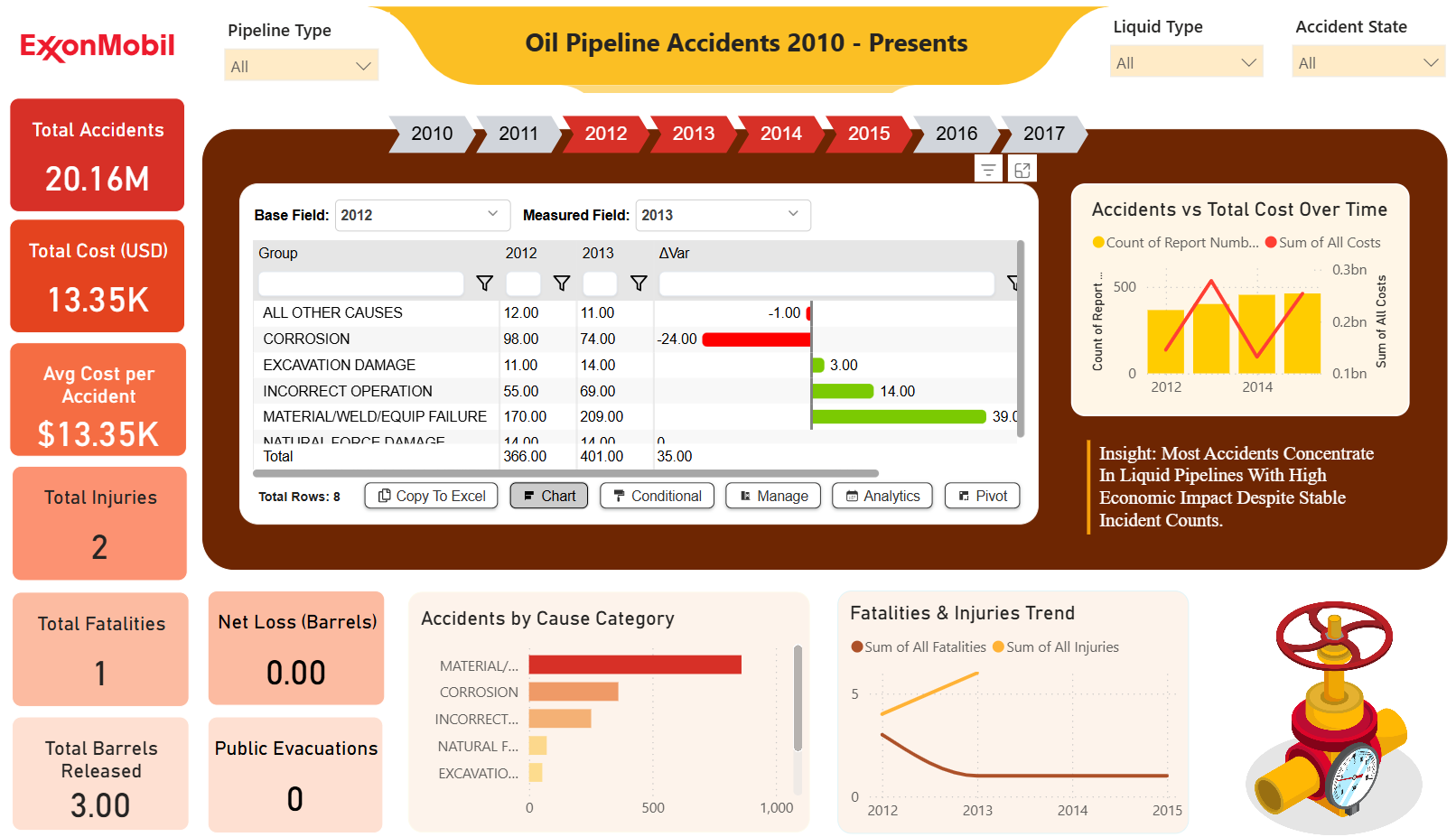
ExxonMobil Oil Pipeline Accidents Dashboard (2010–Present) – Key Insights
If you find this website helpful, share it with friends and colleagues to boost their Power BI skills and work efficiency!
Like this site? Share it