Power BI Blinkit Grocery Sales Dashboard Template (Free PBIX Download)
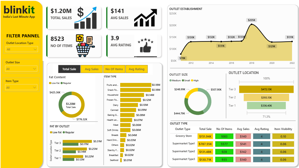
Introduction: This Power BI dashboard analyzes Blinkit (India's quick-commerce grocery platform) sales data across outlet types, location tiers, item categories, and fat content classifications. Covering $1.20M in total sales across 8,523 items with a 10-year outlet establishment timeline (2012–2022), it gives retail operations analysts and category managers a complete view of how outlet size, location tier, and product type interact to drive sales performance — a strong reference template for any FMCG, grocery, or quick-commerce retail analytics use case.
What's Inside This Template
Top KPI Banner
| MetricValue | |
| Total Sales | $1.20M |
| Avg Sales | $141 |
| No of Items | 8,523 |
| Avg Rating | 3.9 |
The $141 average sales per item across 8,523 items is a basket-size metric — it reflects average revenue per SKU across the portfolio, not per transaction. The 3.9 average rating sits below the 4.0 threshold that typically signals a healthy customer experience in grocery/delivery apps — a marginal gap but one that compounds across millions of orders. Four-tab toggle (Total Sale | Avg Sales | No Of Items | Avg Rating) recontextualizes all lower visuals around the selected metric dimension.
Outlet Establishment Timeline (2012–2022)
| YearSales | |
| 2012 | $78K |
| 2014 | $130K |
| 2016 | $131K |
| 2017 | $131K |
| 2018 | $132K (pre-peak) |
| 2018 peak | $205K |
| 2019 | $133K |
| 2020 | $129K |
| 2021 | $131K |
| 2022 | $131K |
The 2018 peak at $205K is 56% above every other year in the dataset — a sharp spike followed by immediate normalization to the $129–133K band. This is not organic growth — it is a single-year event: a major outlet expansion wave, a platform rebranding (Grofers → Blinkit transition era), or a promotional campaign that inflated 2018 numbers. The rapid reversion to the flat $130–132K band in 2019–2022 confirms the spike was non-structural. Post-2018, sales have been completely flat for four consecutive years — zero growth in a quick-commerce market that was exploding nationally during COVID. This flatness is the most analytically significant pattern in the entire dashboard.
Fat Content Analysis
Donut Chart — Total Sale by Fat Content:
| Fat TypeSalesShare | ||
| Regular | $776.32K | 64.7% |
| Low Fat | $425.36K | 35.3% |
Regular fat products outsell Low Fat by nearly 2:1. For a quick-commerce grocery platform in India where health-consciousness is a growing but not yet dominant consumer trend, this split reflects the current reality: the majority of grocery purchases remain conventional products. Low Fat's 35.3% share is meaningful enough to require dedicated category management but not dominant enough to justify restructuring the assortment around it.
Fat by Outlet (Stacked Bar — Tier 1/2/3):
| TierLow FatRegularTotal | |||
| Tier 3 | $0.17M | $0.31M | $0.48M |
| Tier 2 | $0.14M | $0.25M | $0.39M |
| Tier 1 | $0.12M | $0.22M | $0.34M |
The Low Fat/Regular ratio is consistent across all three tiers at approximately 35/65 — fat content preference does not vary meaningfully by city tier. This rules out the hypothesis that metro (Tier 1) consumers prefer healthier options over smaller city (Tier 3) consumers — at least in this dataset.
Item Type Sales Breakdown (Horizontal Bar)
| Item TypeSales | |
| Fruits and Vegetables | $0.18M |
| Snack Foods | $0.18M |
| Household | $0.14M |
| Frozen Foods | $0.12M |
| Dairy | $0.10M |
| Canned | $0.09M |
| Baking Goods | $0.08M |
| Health and Hygiene | $0.07M |
| Meat | $0.06M |
| Soft Drinks | $0.06M |
| Breads | $0.04M |
| Hard Drinks | $0.03M |
| Others | $0.02M |
| Starchy Foods | $0.02M |
| Breakfast | $0.02M |
| Seafood | $0.01M |
Fruits & Vegetables and Snack Foods are tied at $0.18M each — the co-leaders of the category mix. This pairing is characteristic of quick-commerce: fresh produce (high-frequency, habitual purchase) and impulse snacks (high-margin, convenience-driven) are the two demand anchors of any grocery delivery platform. Together they account for 30% of total sales. Seafood at $0.01M is the weakest category — 18x smaller than the top categories, reflecting the fundamental challenge of fresh seafood logistics in quick-commerce.
Outlet Size
Donut Chart:
| SizeSales | |
| Medium | $507.90K |
| Small | $444.79K |
| High (Large) | $248.99K |
Medium outlets generate the most sales despite not being the largest format — a counterintuitive result. Large outlets (High) generate the least sales at 20.7%, suggesting that in quick-commerce, outlet size beyond a certain threshold does not translate to proportionally higher sales volume. The medium format appears to be the optimal configuration balancing inventory breadth with operational efficiency.
Outlet Location (Tier Distribution)
| TierSalesShare | ||
| Tier 3 | $472.13K | 39.3% |
| Tier 2 | $393.15K | 32.7% |
| Tier 1 | $336.40K | 28.0% |
Tier 3 cities generate the most sales at $472.13K — higher than Tier 1 metros ($336.40K). The 71.3% label likely refers to the combined Tier 2 + Tier 3 share (67.3% + rounding, or Tier 3 alone as percentage of some sub-total). This geographic reversal — smaller cities outperforming metros — is the most counterintuitive finding in the geographic data and reflects Blinkit's actual market penetration reality: Tier 1 metros have intense competition from Zepto, Swiggy Instamart, and Dunzo, while Tier 3 cities had less competition at the time of this dataset, allowing Blinkit to capture disproportionate share.
Outlet Type Performance Table
| Outlet TypeTotal SaleNo of ItemsAvg SalesAvg RatingItem Visibility | |||||
| Grocery Store | $151.94K | 1,083 | $140 | 4 | 0.10 |
| Supermarket Type1 | $787.55K | 5,577 | $141 | 4 | 0.06 |
| Supermarket Type2 | $131.48K | 928 | $142 | 4 | 0.06 |
| Supermarket Type3 | $130.71K | 935 | $140 | 4 | 0.06 |
Supermarket Type1 dominates at $787.55K — 65.6% of total portfolio sales. With 5,577 items (65.4% of total SKUs), it is the primary format by both volume and assortment breadth. The three remaining formats (Grocery Store, Supermarket Type2, Type3) each generate $130–152K — nearly identical to each other and collectively less than 20% of Type1's revenue.
Item Visibility of 0.10 for Grocery Stores vs 0.06 for all Supermarket types is a significant operational signal. Higher item visibility means products in Grocery Stores are more discoverable per item — but this doesn't translate to higher average sales ($140 vs $141–142). In quick-commerce, visibility without conversion suggests either browse-without-purchase behavior or that the Grocery Store format attracts more exploratory shopping while Supermarket formats drive habitual purchase.
Key Insights
- The 2018 spike to $205K followed by four years of flat $129–133K sales is the most important business signal in the dataset. In a period (2019–2022) when Indian quick-commerce grew 300–400% nationally (COVID accelerated the entire sector), this outlet's sales were completely flat. This suggests the dataset represents a specific subset of outlets or geographies that did not benefit from the sector tailwind — or that the data captures a period before Blinkit's 2021–2022 aggressive expansion into dark stores and 10-minute delivery, which is the platform's current identity.
- Tier 3 cities ($472.13K) outperforming Tier 1 metros ($336.40K) by 40% is structurally significant for quick-commerce expansion strategy. The conventional assumption — that metro consumers are more likely to use app-based grocery delivery — is inverted in this data. Tier 3 cities likely have fewer organized retail alternatives (no large supermarket chains), making Blinkit's assortment relatively more attractive and sticky versus metros where physical retail competition is intense.
- Supermarket Type1 concentration at 65.6% of total sales creates single-format dependency risk. If Type1 outlets face operational disruption (supply chain issues, regulatory challenges, dark store license problems), the portfolio has limited revenue cushion from the three other formats which collectively generate only 34.4%. Format diversification is the primary strategic gap visible in this outlet type table.
- Medium outlets outperforming Large outlets ($507.9K vs $248.99K) challenges the standard retail assumption that larger formats generate more revenue. In quick-commerce, large inventory depth has diminishing returns because consumer purchase occasions are typically need-based (ran out of milk, want a snack now) rather than full weekly shop. Medium outlets likely achieve better inventory turnover and lower wastage while serving the same demand occasions — making them the economically superior format for this business model.
- Fruits & Vegetables and Snack Foods tied at $0.18M each confirms quick-commerce's dual demand engine. Fresh produce drives daily habit formation (high frequency, moderate basket) while snack foods drive impulse and convenience occasions (lower frequency, high margin). A platform optimizing only for one would underperform on the other. The near-equal revenue split suggests the assortment is well-balanced for the platform's use case — though Seafood at $0.01M indicates meaningful category gaps in fresh protein beyond basic meat ($0.06M).
- Average rating of 3.9 across all outlet types (consistently 4 in the table, which rounds up from 3.9) sits at the minimum acceptable threshold for an app-based platform. In India's quick-commerce market where Zepto, Swiggy Instamart, and BigBasket compete aggressively, a sub-4.0 average rating is a churn risk. Grocery delivery ratings are primarily driven by delivery speed, item freshness, and substitution quality — all operational variables the outlet-level data in this dashboard can help diagnose when filtered by outlet type and location tier.
Who This Template Is For
- Retail Operations Analysts and Category Managers at quick-commerce, grocery delivery, or FMCG distribution companies who need outlet-level performance analysis segmented by location tier, outlet size, item type, and fat content classification
- E-commerce and Marketplace Strategists analyzing which outlet formats, city tiers, and product categories drive disproportionate sales in a multi-tier Indian retail market
- BI Developers building grocery or FMCG dashboards who need a production-ready template combining establishment timeline, fat content analysis, item category breakdown, outlet size/type performance table, and geographic tier distribution in a single-page layout
How to Use
- Download the PBIX file
- Open in Power BI Desktop
- Connect your outlet sales data source — the model requires a transactions table with outlet ID, outlet type, outlet size, location tier, establishment year, item type, fat content, sales amount, rating, and item visibility fields
- Use the Outlet Location Type, Outlet Size, and Item Type slicers (left panel) to cross-filter all visuals; switch between Total Sale, Avg Sales, No of Items, and Avg Rating tabs to recontextualize the item type and fat content charts
"The outlet type performance table in this dashboard uses a native Power BI matrix. To add expandable outlet hierarchies (Type → Size → Tier), variance-to-target columns per outlet, and conditional formatting flagging underperforming locations by sales or rating threshold — Flexa Tables is a Microsoft-certified Power BI visual purpose-built for structured retail outlet performance reporting."
Other Templates
 Free Sales & Revenue
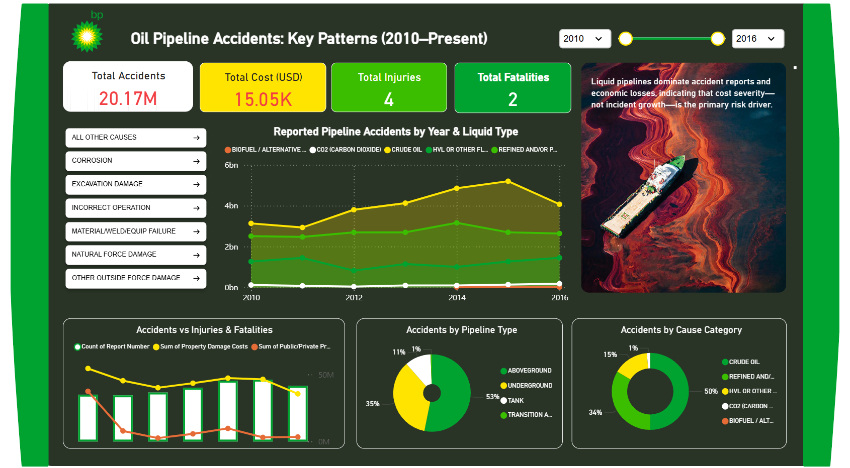
BP Oil Pipeline Accidents: Key Patterns (2010–Present) – Key Insights
 Free Sales & Revenue
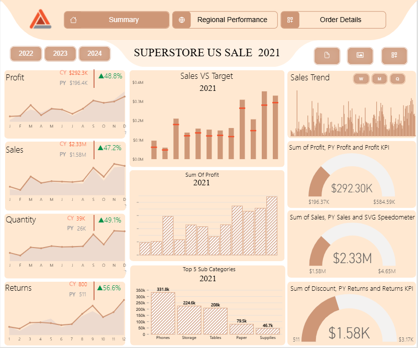
Superstore US Sale
 Free Sales & Revenue
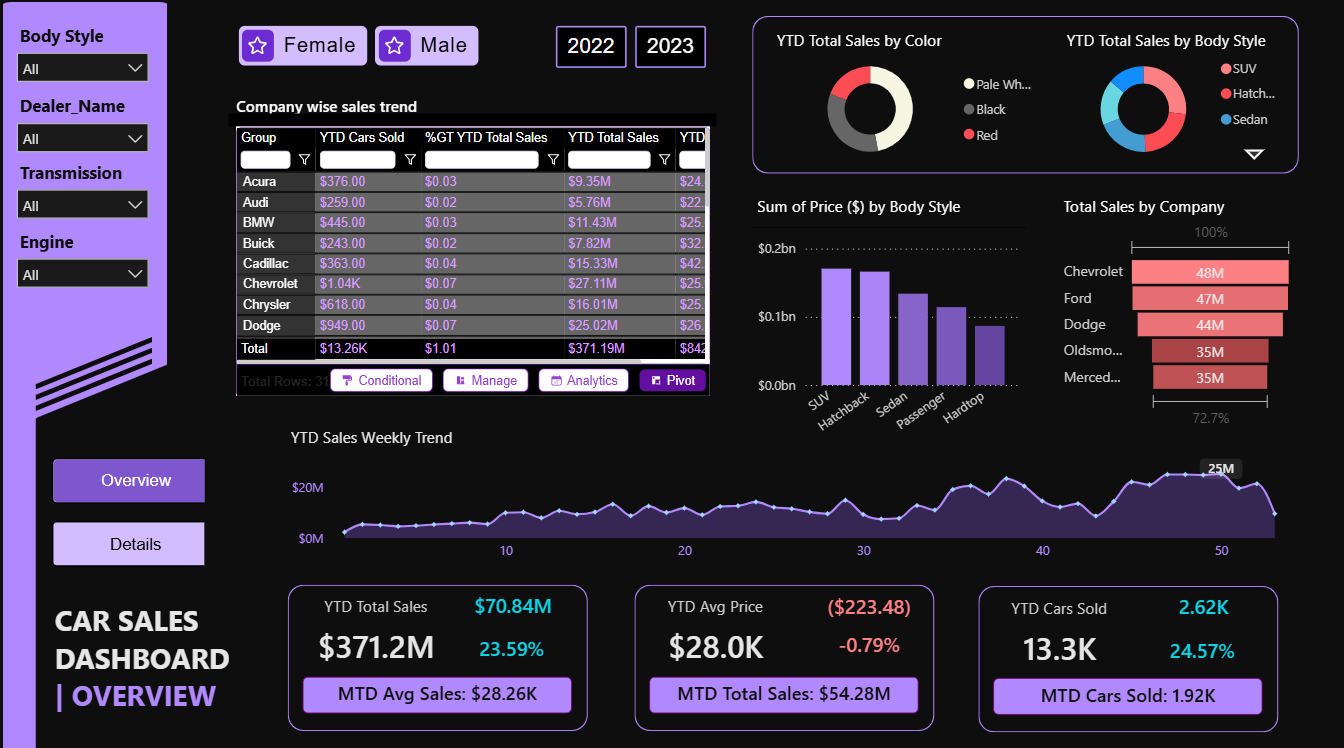
Car Sales Dashboard – Key Insights (YTD 2023)
If you find this website helpful, share it with friends and colleagues to boost their Power BI skills and work efficiency!
Like this site? Share it