Power BI Bank Loan Report Dashboard Template (Free PBIX Download)
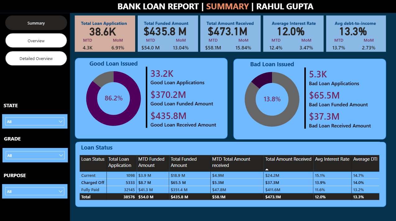
Introduction: This Power BI Bank Loan Report dashboard gives credit analysts and banking operations teams a complete portfolio health view across 38,576 loan applications totaling $435.8M funded. The Summary page shown here focuses on the most critical risk metric in any lending portfolio — the Good vs Bad Loan split — alongside a three-status loan performance table (Current, Charged Off, Fully Paid) with MTD and total funded/received breakdowns. Three-tab structure (Summary, Overview, Detailed Overview) allows drill-down from executive summary to application-level detail.
What's Inside This Template
Top KPI Banner — MTD and MoM for every metric
| MetricTotalMTDMoM | |||
| Total Loan Applications | 38.6K | 4.3K | +6.91% |
| Total Funded Amount | $435.8M | $54.0M | +13.04% |
| Total Amount Received | $473.1M | $58.1M | +15.84% |
| Average Interest Rate | 12.0% | 12.4% | +3.47% |
| Avg Debt-to-Income | 13.3% | 13.7% | +2.73% |
Three compounding signals in the MoM column deserve immediate attention together: loan applications growing +6.91%, funded amount growing faster at +13.04%, and amount received growing fastest at +15.84%. This divergence means the average loan size is increasing (more dollars funded per application) and collections are accelerating (received growing faster than funded). Both are positive signals. However, the MTD average interest rate (12.4%) is above the overall portfolio average (12.0%) — meaning new loans being issued this month carry higher rates than the existing book, which could reflect risk repricing or a shift toward higher-risk borrower segments.
Three-Tab Navigation: Summary (active) | Overview | Detailed Overview — standard drill-down hierarchy from portfolio summary to segment analysis to individual loan detail.
Filters: State | Grade | Purpose — three slicers that cross-filter the entire dashboard, enabling instant portfolio segmentation by geography, creditworthiness tier, or loan use case.
Good Loan vs Bad Loan
Good Loan (86.2%):
| MetricValue | |
| Good Loan Applications | 33.2K |
| Good Loan Funded Amount | $370.2M |
| Good Loan Received Amount | $435.8M |
Bad Loan (13.8%):
| MetricValue | |
| Bad Loan Applications | 5.3K |
| Bad Loan Funded Amount | $65.5M |
| Bad Loan Received Amount | $37.3M |
The Good/Bad split of 86.2%/13.8% is the headline risk metric. For context, the US personal loan charge-off rate typically runs 3–5% annually for prime lenders and 8–12% for subprime/fintech lenders. A 13.8% bad loan rate classifies this portfolio in the subprime/high-risk lending segment — not abnormal for consumer or P2P lending platforms, but a meaningful risk concentration.
The most critical number in the entire dashboard is hidden in the Bad Loan panel: Bad Loan Received ($37.3M) vs Bad Loan Funded ($65.5M) = a $28.2M recovery shortfall (43.1% unrecovered). The portfolio has funded $65.5M in loans that are now classified as bad, but has only received $37.3M back — meaning $28.2M in principal is at risk of permanent loss. This is not just a rate problem; it is a dollar-loss problem of material scale.
Conversely, Good Loan Received ($435.8M) vs Good Loan Funded ($370.2M) = $65.6M in excess receipts — confirming that good loan borrowers are paying back more than the funded principal (interest payments), and this excess is more than offsetting the bad loan shortfall at the portfolio level. Net portfolio position: $65.6M excess from good loans − $28.2M shortfall from bad loans = $37.4M net positive cash position above funded principal.
Loan Status Table
| Loan StatusApplicationsMTD FundedTotal FundedMTD ReceivedTotal ReceivedAvg Interest RateAvg DTI | |||||||
| Current | 1,098 | $3.9M | $18.9M | $4.9M | $24.2M | 15.1% | 14.7% |
| Charged Off | 5,333 | $8.7M | $65.5M | $5.3M | $37.3M | 13.9% | 14.0% |
| Fully Paid | 32,145 | $41.3M | $351.4M | $47.8M | $411.6M | 11.6% | 13.2% |
| Total | 38,576 | $54.0M | $435.8M | $58.1M | $473.1M | 12.0% | 13.3% |
Three loan statuses map directly to the Good/Bad framework:
- Fully Paid = Good Loans (32,145 applications, $351.4M funded)
- Charged Off = Bad Loans (5,333 applications, $65.5M funded)
- Current = Active/In-repayment (1,098 applications, $18.9M funded — not yet classified as good or bad)
Note: Good Loan applications (33.2K) = Fully Paid (32,145) + Current (1,098) = 33,243 ✓. The math confirms Current loans are classified as "Good" pending final repayment outcome.
Key Insights
- The Charged Off portfolio's $28.2M unrecovered principal is the single largest financial risk in this dashboard. $65.5M funded to borrowers now classified as charged off, with only $37.3M recovered = 43.1% permanent loss rate on bad loans. At the portfolio level this is manageable because good loan interest income covers the loss, but the absolute dollar exposure requires active collection and recovery strategy. The MTD Charged Off funded amount ($8.7M) being the second-largest MTD funding category after Fully Paid ($41.3M) suggests new charge-offs are still being recognized at scale.
- Current loans carry the highest interest rate (15.1%) but also the highest DTI (14.7%). Active borrowers paying 15.1% average interest are the highest-rate segment in the book — 3.5 percentage points above Fully Paid borrowers (11.6%). This rate premium reflects the risk profile of borrowers still in repayment: they haven't proven full repayment yet and were priced accordingly. The elevated DTI (14.7% vs 13.2% for Fully Paid) confirms these are structurally more leveraged borrowers — the segment most at risk of migrating from Current to Charged Off if economic conditions deteriorate.
- Fully Paid borrowers have the lowest average interest rate (11.6%) and lowest DTI (13.2%) — confirming the fundamental credit risk axiom: lower-risk borrowers get better rates AND are more likely to fully repay. The 3.5 percentage point interest rate gap between Fully Paid (11.6%) and Current (15.1%) is the risk premium the portfolio charges for uncertainty — and the data validates that pricing is working: lower-rate borrowers default less.
- MoM funded amount growth (+13.04%) significantly outpacing application growth (+6.91%) means average loan size is increasing. Simple math: if applications grew 6.91% but funded amount grew 13.04%, the average funded amount per application grew approximately 5.7% MoM. This could reflect deliberate product strategy (pushing larger loan products), borrower mix shift toward higher-value use cases, or loosening underwriting standards to approve larger amounts. Given the already-elevated bad loan rate (13.8%), accelerating loan size without corresponding tightening of credit standards would amplify loss severity in future charge-off cycles.
- Amount Received growing fastest at +15.84% MoM — faster than both applications (+6.91%) and funded (+13.04%) — is the most positive signal in the dashboard. Collections are outpacing new issuance, meaning the existing book is performing better than the growth rate of new originations. This could reflect seasonal payment behavior, successful collections campaigns on delinquent accounts, or maturing loans entering their highest-payment phase. It is the primary indicator that near-term portfolio cash flow is healthy.
- 13.8% bad loan rate with 12.0% average interest rate creates a structural profitability question. At 13.8% bad loan rate with 43.1% unrecovered principal on bad loans, the effective loss rate per dollar funded is approximately 5.9% (13.8% × 43.1%). Against a 12.0% average interest rate, the net spread after credit losses is approximately 6.1% — thin but positive. Any deterioration in bad loan rate above ~17% or recovery rate below ~30% would push the portfolio into net loss territory at current interest rate levels.
Who This Template Is For
- Credit Risk Analysts and Loan Portfolio Managers at banks, credit unions, or fintech lending platforms who need a real-time dashboard tracking portfolio health, charge-off rates, recovery rates, and borrower risk metrics (DTI, interest rate) across the full loan lifecycle from application to charge-off
- Banking Operations and Collections Teams monitoring the Charged Off vs Fully Paid vs Current breakdown to prioritize recovery efforts, flag deteriorating segments by state or loan grade, and track MTD collections performance against funded exposure
- BI Developers building financial services dashboards who need a production-ready loan reporting template with Good/Bad loan donut charts, multi-metric KPI cards with MTD/MoM comparison, and a loan status breakdown table — filterable by state, credit grade, and loan purpose
How to Use
- Download the PBIX file
- Open in Power BI Desktop
- Connect your loan origination data source — the model requires a loan table with application date, loan status (Current/Charged Off/Fully Paid), funded amount, received amount, interest rate, DTI, state, credit grade, and loan purpose fields (compatible with LendingClub dataset format or any bank loan origination system export)
- Use State, Grade, and Purpose slicers to segment all KPI cards, donut charts, and the loan status table simultaneously; navigate to Overview and Detailed Overview tabs for segment-level and application-level drill-down
"The loan status breakdown table in this dashboard uses a native Power BI matrix. To add expandable loan grade hierarchies, variance-to-prior-period columns per status, and traffic-light conditional formatting flagging charge-off rate thresholds — Flexa Tables is a Microsoft-certified Power BI visual purpose-built for structured financial portfolio reporting with full drill-down and conditional formatting control."
Other Templates
 Free Finance & Accounting
Power BI Profit & Loss Dashboard Template (Free PBIX Download)
 Free Finance & Accounting
Power BI Financial Analysis Dashboard Template (Free PBIX Download)
 Free Sales & Revenue
Power BI Executive Overview Dashboard Template — Global Sales & Profit Target Tracking (Free PBIX Download)
If you find this website helpful, share it with friends and colleagues to boost their Power BI skills and work efficiency!
Like this site? Share it