Global Calorie Supplies
502 Downloads
Description
1. Key Insights Analysis
A. Calorie Supply Trends
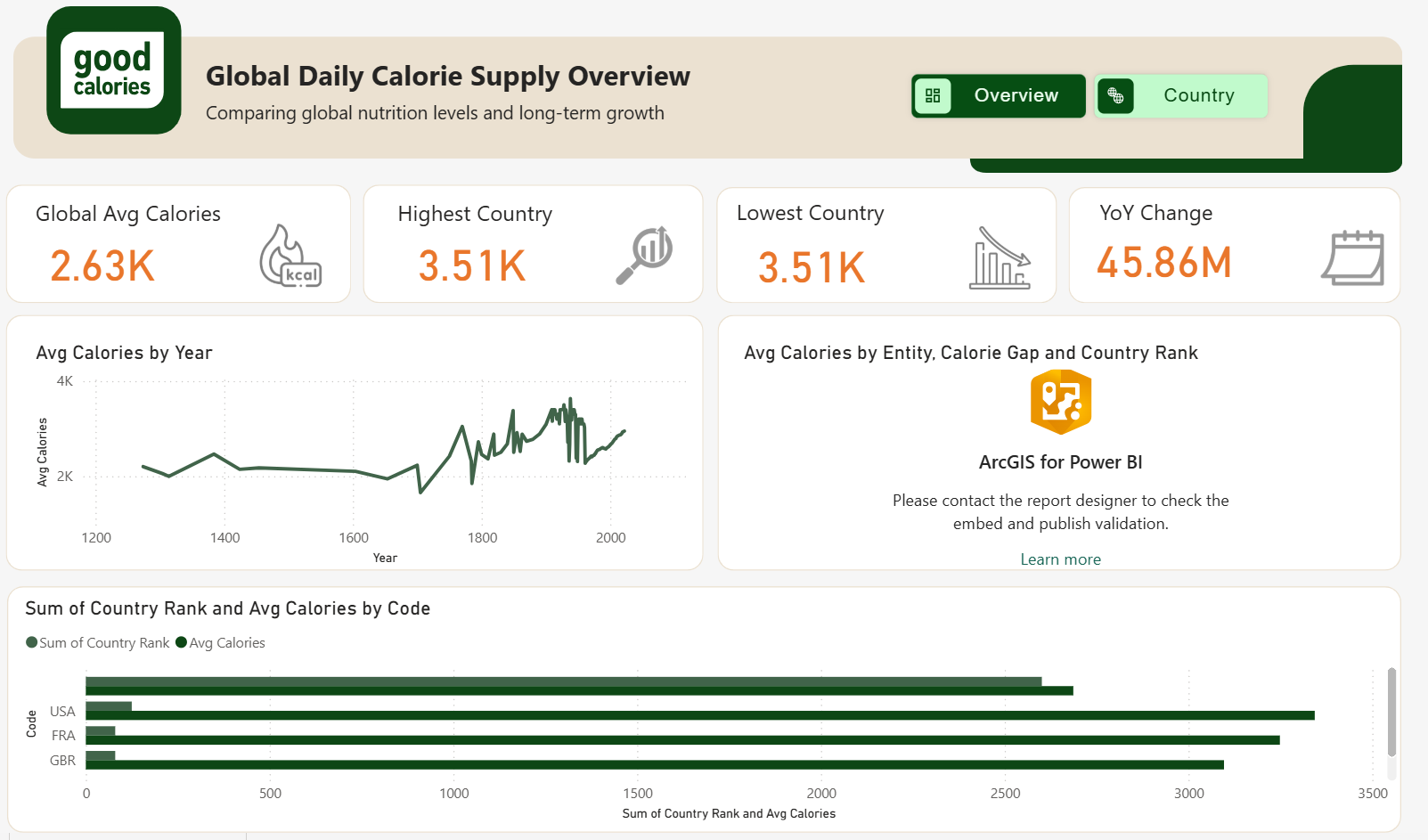
- Global Average vs. Peak: The current Global Average is 2.63K (2,630 kcal). However, top-performing countries are reaching 3.51K (3,510 kcal). This suggests a significant gap between the global average and the nutrition levels of developed nations.
- Historical Volatility: The "Avg Calories by Year" chart shows extreme fluctuations between the years 1200 and 1900. While there is a steady upward trend in the modern era (post-1950), the historical spikes suggest periods of extreme food insecurity followed by recovery, or perhaps inconsistencies in historical data collection.
- Top Consumers: Looking at the bottom bar chart, the USA leads in calorie supply, followed closely by France (FRA) and the UK (GBR). All three are significantly above the global average, hovering around the 3.1K–3.4K range.
B. Data & Visualization Red Flags (Anomalies)
- Highest vs. Lowest Discrepancy: The dashboard currently shows the Highest Country and Lowest Country both as 3.51K. This is a data error; it is likely that a filter is applied to a single country, or the "Lowest" measure is calculated incorrectly.
- YoY Change Metric: The "YoY Change" is listed as 45.86M. In the context of daily calories (usually measured in units of 10–100), a change of 45 million is statistically impossible for a daily supply. This likely indicates a "Sum" aggregation error rather than an average.
2. Strategic Recommendations
A. Technical & Data Fixes
- Fix KPI Logic: Investigate the "Lowest Country" card. Ensure the DAX formula or filter context correctly identifies the country with the minimum calorie supply.
- Correct the YoY Unit: The Year-over-Year change should be expressed as a percentage (%) or a raw calorie count (e.g., +12 kcal), not in millions (M).
B. Visualization Enhancements
- Dual-Axis for Bar Charts: In the bottom chart, "Sum of Country Rank" and "Avg Calories" are on the same scale. Because Rank is a small number (1, 2, 3...) and Calories are large (3000+), the Rank bars are almost invisible. Recommendation: Use a "Line and Clustered Column Chart" to put Rank on a secondary Y-axis.
- Clean Up Historical Data: The line chart from year 1200 to 1800 contains many "jagged" spikes that might be due to poor data quality in ancient records. Consider adding a Slicer for "Era" (e.g., Modern vs. Historical) to allow users to focus on more reliable recent data.
Other Templates
 Free Other / General
Power BI Movie Analytics Dashboard Template — TMDB Dataset (Free PBIX Download)
68
 Free Other / General
Power BI Spotify Music Analytics Dashboard Template (Free PBIX Download)
71
 Free Other / General
Intel Storage Cost Trends Dashboard – Key Insights (1956–2023)
745
If you find this website helpful, share it with friends and colleagues to boost their Power BI skills and work efficiency!
Like this site? Share it