Power BI Product Sales Analysis Dashboard Template — FMCG Product Drill-Down (Free PBIX Download)
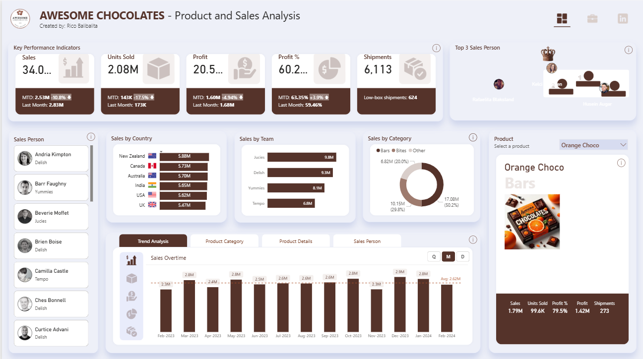
Introduction: This Power BI Product & Sales Analysis dashboard is the third template in the Awesome Chocolates series — where the Sales & Financial Performance dashboard tracks revenue KPIs by team and unit sold, and the Shipment Profitability dashboard diagnoses loss-making shipments, this template zooms into individual product performance. A product selector panel shows per-SKU metrics (Sales, Units Sold, Profit %, Profit, Shipments) alongside a top 3 salesperson podium, country and team breakdown, category mix, and a 13-month sales overtime trend — making it the reference template for category managers and product analysts who need SKU-level visibility within a multi-product FMCG portfolio.
What's Inside This Template
Top KPI Banner — MTD with MoM variance
| MetricTotalMTDvs Last MonthLast Month | ||||
| Sales | $34.0M | $2.53M | -10.8% ▼ | $2.83M |
| Units Sold | 2.08M | 143K | -17.5% ▼ | 173K |
| Profit | $20.5M | $1.60M | -4.94% ▼ | $1.68M |
| Profit % | 60.2% | 63.35% | -3.9% ▼ | 59.46% |
| Shipments | 6,113 | — | — | Low-box: 624 |
Every MTD metric is negative MoM — Sales -10.8%, Units -17.5%, Profit -4.94%. This is the most current-period signal in any of the three Awesome Chocolates dashboards. Units declining faster than sales (-17.5% vs -10.8%) means average selling price per unit is actually rising — volume compressed more than revenue, suggesting either a product mix shift toward higher-ASP items or volume discounting being reduced (consistent with the shipment profitability findings from the second dashboard).
Profit % MTD at 63.35% vs Last Month 59.46% (+3.89pp) — the one bright spot. Despite lower volume, the business is more profitable per dollar sold this month than last. This is the operating leverage signature of reducing low-margin large shipments: fewer units, higher margin rate.
Low-box shipments: 624 — the subset of shipments with fewer than 50 boxes, which the profitability dashboard confirmed are 98.7% profitable. 624 of 6,113 total shipments (10.2%) being low-box is consistent with the Low Boxes Share % KPI from the other dashboard.
Top 3 Sales Person Podium
A visual podium (crown icon, ranked 1st/2nd/3rd with profile photos) displaying the top three sales performers. Names partially visible: Natalia Dialectand (center/1st), Ken (2nd), and a third rep. This is a gamification-style UX element — turning sales ranking into a trophy podium rather than a table row — designed for team meeting displays and sales floor visibility screens.
Sales Person Roster (left panel): Scrollable list of individual reps with team assignment:
- Andria Kimpton — Delish
- Barr Faughny — Yummies
- Beverie Moffet — Jucies
- Brien Boise — Delish
- Camilla Castle — Tempo
- Ches Bonnell — Delish
- Curtice Advani — Delish
Clicking any rep name filters the entire dashboard to that salesperson's portfolio — enabling instant individual performance review without building separate reports per rep.
Sales by Country
| CountrySales | |
| New Zealand | $5.88M |
| Canada | $5.73M |
| Australia | $5.70M |
| India | $5.65M |
| USA | $5.62M |
| UK | $5.47M |
$0.41M spread across all six countries (5.47M–5.88M) — near-perfect geographic distribution consistent with the Sales & Financial Performance dashboard. New Zealand leads marginally at $5.88M, UK trails at $5.47M — a 7.5% gap between top and bottom. As noted in the prior analysis, this uniformity is characteristic of quota-managed territories rather than organic demand distribution.
Sales by Team
| TeamSales | |
| Jucies | $9.8M |
| Delish | $9.3M |
| Yummies | $8.1M |
| Tempo | $6.8M |
Jucies leads at $9.8M — 44% above Tempo ($6.8M), the widest team gap in the portfolio. Combined Jucies + Delish = $19.1M = 56.2% of total portfolio sales from two of four teams. Tempo at $6.8M is the only team clearly below the $8M threshold that might indicate structural underperformance vs the others.
Sales by Category (Donut)
| CategorySalesShare | ||
| Bars | $17.08M | 50.2% |
| Bites | $10.15M | 29.8% |
| Other | $6.82M | 20.0% |
Bars at exactly 50.2% confirms this is a Bars-first business — consistent with the product category data from the Sales & Financial Performance dashboard where Bars led at 1.1M units. Bites (29.8%) + Other (20.0%) fill out the remaining half with a roughly 3:2 ratio.
Product Selector Panel (right) — Orange Choco active
The product selector dropdown is the defining UX feature of this template. When "Orange Choco" is selected:
| MetricValue | |
| Sales | $1.79M |
| Units Sold | 99.6K |
| Profit % | 79.5% |
| Profit | $1.42M |
| Shipments | 273 |
Orange Choco at 79.5% profit margin is the highest-margin product visible in any of the three Awesome Chocolates dashboards — 19.3 percentage points above the portfolio average (60.2%). With $1.79M sales generating $1.42M profit, Orange Choco converts 79.5 cents of every revenue dollar to profit. The product image (orange + dark chocolate visual) and category label "Bars" confirms it as a premium flavored bar likely commanding higher ASP than commodity chocolate bars.
The product panel also displays a product photo — making this a catalog-style product detail view, not just a metrics table. Switching between products in the dropdown updates all metrics, the photo, and the category label simultaneously.
Sales Overtime — 13-Month Trend (Feb 2023 – Feb 2024)
Quarterly/Monthly/Daily toggle (Q | M | D), currently set to Monthly:
| MonthSales | |
| Feb 2023 | $2.3M |
| Mar 2023 | $2.8M |
| Apr 2023 | $2.4M |
| May 2023 | $2.8M |
| Jun 2023 | $2.5M |
| Jul 2023 | $2.6M |
| Aug 2023 | $2.6M |
| Sep 2023 | $2.6M |
| Oct 2023 | $2.3M |
| Nov 2023 | $2.8M |
| Dec 2023 | $2.9M |
| Jan 2024 | $2.6M |
| Feb 2024 | (MTD, lower) |
| Average | $2.62M |
The dashed average line at $2.62M provides immediate above/below context for each month. Five months are at or above $2.8M (Mar, May, Nov, Dec + one more) while three months fall below $2.4M (Feb 23, Oct 23, Feb 24 MTD). The pattern shows no clear trend direction — the business oscillates around the $2.62M average without sustained acceleration or decline, which matches the flat sales narrative observed across all three dashboards.
Four bottom tabs: Trend Analysis (active) | Product Category | Product Details | Sales Person — enabling the same dataset to be re-analyzed across four different analytical lenses from a single page.
Key Insights
- This dashboard completes the three-template analytical triangle for Awesome Chocolates. The Sales & Financial Performance dashboard answers "How is the business performing overall?" The Shipment Profitability dashboard answers "Where are we losing money?" This template answers "Which products and reps are driving performance?" Together, the three dashboards cover the full commercial analytics stack — from board-level KPIs to operational shipment decisions to individual SKU and rep accountability.
- Orange Choco's 79.5% profit margin vs 60.2% portfolio average (+19.3pp) makes it the benchmark product for pricing and margin analysis. At 273 shipments generating $1.42M profit, Orange Choco averages $5,201 profit per shipment — significantly higher than the portfolio's $9.88 per box average (which implies much larger shipment sizes for other products). The question for category management: what makes Orange Choco's margin so high? If it's pricing power (premium flavor, lower competition), that insight should inform the pricing strategy for other flavored bar variants.
- MTD Units declining -17.5% while MTD Profit % improving from 59.46% to 63.35% (+3.89pp) is the clearest evidence yet that the shipment profitability intervention is working. Fewer units sold at better margins = the business is selectively refusing or repricing large loss-making shipments (identified in the profitability dashboard) and accepting the volume reduction as a deliberate trade-off. This is the right strategic move — growing profitable volume, not total volume.
- Tempo at $6.8M vs Jucies at $9.8M — a $3.0M gap (44%) — is the largest team performance gap across all three Awesome Chocolates dashboards. In the Sales & Financial Performance dashboard, team unit volumes were more compressed. The dollar gap here suggests Tempo is either handling lower-ASP products, operating in lower-revenue territories, or has a smaller headcount. Filtering the dashboard to Tempo's salesperson list and comparing their country/product mix vs Jucies would reveal whether this is a talent issue, territory issue, or product assignment issue.
- The 13-month Sales Overtime trend oscillating around $2.62M with no directional growth — despite the business being described as "profitable and stable" — confirms this is a mature, steady-state operation, not a growth-phase business. For an FMCG brand in a competitive market, flat revenue over 13 months while input costs (cocoa) are doubling is a margin compression story in slow motion. The current 60%+ margin provides buffer, but the cocoa price trajectory identified in the profitability dashboard will eventually force a choice between price increases and volume growth to offset cost inflation.
- The product photo + SKU metrics panel is the highest UX differentiation feature in this template — most Power BI product dashboards show numbers without visual product identity. Including the product image alongside metrics creates a catalog-style experience that makes the dashboard usable in commercial reviews, buyer meetings, and retail planning sessions where visual product recognition matters as much as the numbers. This UX pattern should be replicated for any FMCG, retail, or e-commerce product analytics template.
Who This Template Is For
- Category Managers and Product Analysts at FMCG, food manufacturing, or branded goods companies who need SKU-level sales, profit, and shipment metrics in a single product-selector view — enabling product portfolio reviews without building separate dashboards per SKU
- Sales Directors and Regional Managers using the salesperson roster and podium to run team performance reviews, identify which reps are driving which products in which territories, and track MTD performance against prior period at the individual rep level
- BI Developers building product analytics systems for consumer goods brands who need a production-ready multi-tab template (Trend Analysis, Product Category, Product Details, Sales Person) with product image display, dynamic product selector, top-N podium visualization, and country/team bar charts in a single-page layout
How to Use
- Download the PBIX file
- Open in Power BI Desktop
- Connect your sales transactions data source — the model requires a products table (with product name, category, image URL) linked to a transactions table with date, salesperson, team, country, units, revenue, profit, and shipment fields
- Use the Product selector dropdown to filter the right panel to any SKU; click any salesperson in the roster to filter all visuals to that rep's portfolio; use the Q/M/D toggle on the Sales Overtime chart to switch between quarterly, monthly, and daily granularity
"The Product Details and Sales Person tabs in this dashboard use native Power BI tables. To display your full product catalog or rep performance table with expandable category and team hierarchies, variance-to-target columns per SKU or rep, and conditional formatting flagging underperforming products or at-risk agents — Flexa Tables is a Microsoft-certified Power BI visual built for exactly this kind of structured FMCG product and sales performance reporting."
Other Templates
 Free Sales & Revenue
Power BI Coffee Shop Sales Dashboard Template (Free PBIX Download)
 Free Sales & Revenue
Power BI Christmas Sales & Trends Dashboard Template (Free PBIX Download)
 Free Sales & Revenue
Retail Supply Chain & Sales Analysis dashboard
If you find this website helpful, share it with friends and colleagues to boost their Power BI skills and work efficiency!
Like this site? Share it