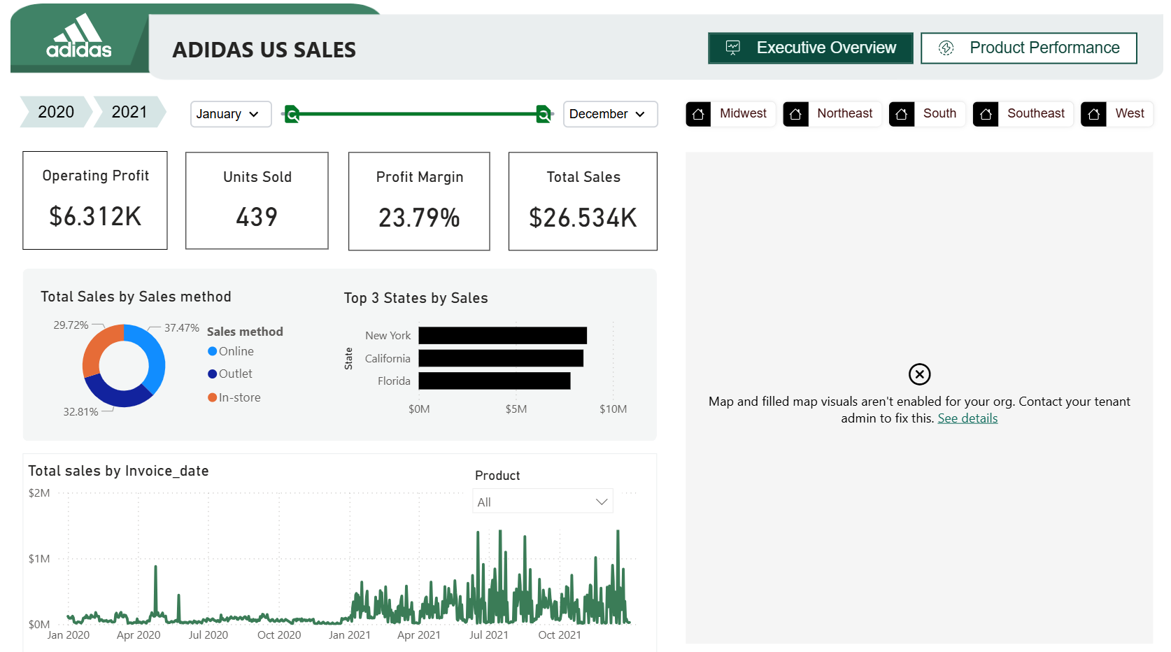
Adidas US Sales (2020–2021)
815 Downloads
Description
1. Key Insights
- Post-Pandemic Surge: The "Total sales by Invoice_date" chart reveals a massive disparity between 2020 and 2021. Sales in 2020 were relatively flat and low, while 2021 shows high-frequency, high-volume spikes, indicating a successful post-lockdown recovery or a major shift in consumer behavior.
- Omni-channel Balance: Sales are remarkably well-distributed across methods: In-store (37.5%), Outlet (32.8%), and Online (29.7%). This suggests Adidas has a healthy, balanced retail ecosystem without over-reliance on a single channel.
- Geographic Concentration: Sales are heavily driven by the "Big Three" states: New York, California, and Florida. These are likely the core hubs for Adidas US revenue.
2. Recommendations
- Deep Dive into Profit Margins: While the overall profit margin is 23.79%, it would be beneficial to see this broken down by Sales Method.
- Hypothesis: Online sales might have higher margins due to lower overhead, whereas Outlets might be dragging the average down.
- Integrate Flexa Tables for Variance: Replace the current static "Top 3 States" bar chart with a Flexa Table pivot. This would allow you to see why New York is #1—is it volume or higher-priced items?—and allow users to toggle between 2020 and 2021 variance directly in the grid.
Other Templates
 Free Sales & Revenue
Power BI Christmas Gift Sales Analysis Dashboard (Free PBIX Download)
152
 Free Sales & Revenue
Power BI Sales Dashboard with Variance Analysis — Contoso BI Template (Free PBIX Download)
83
 Free Sales & Revenue
Sales Performance Snapshot dashboard
1.3k
If you find this website helpful, share it with friends and colleagues to boost their Power BI skills and work efficiency!
Like this site? Share it